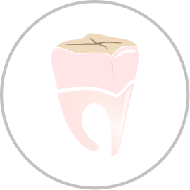
These look great. My only qualm is the pink tooth. I think our users would identify better with an all white tooth, as that is the customary portrayal of teeth. The rest look great, I especially like the fire and t bone ones
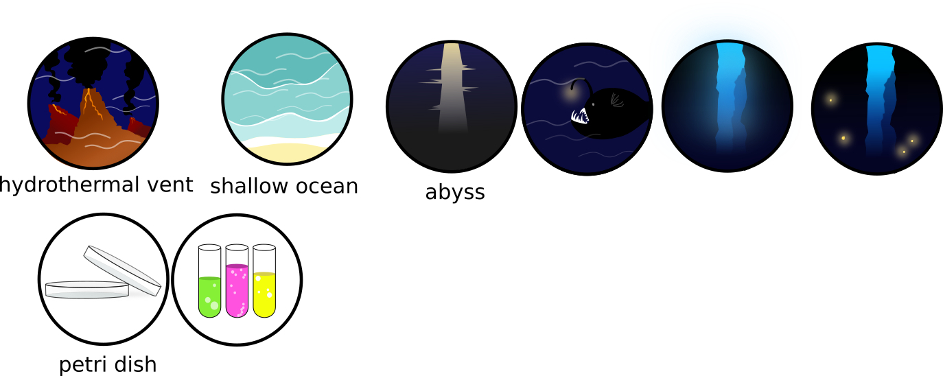
New version of the hydrothermal vents (gap removal included @Atrox  ) as well as new version for the abyss (personally I prefer the right one) and an offer for the petri dish.
I also tried to change the color of the tooth for a “beige” instead of pink, but I am not sure about that at all …
If some ( @Atrox?  ) has some idea for carbone dioxide and ammonia, I am in! According to the rest of the icons, the molecular items does not fit anymore.
PS: [quote=“Atrox, post:40, topic:207”]
I feel like my last post came off kind of dickish, so my bad.
[/quote] no problem here, don’t worry! I like constructive comments 
4 Likes
Oh yeah… I am absolutely in love with the new vent and abyss icons. Personally, I think the abyss icon would look best if you took the one on the left and made it as dark as the one on the right. Or just take the one on the right and remove the lights. Excellent work!
EDIT: Ignore everything I just said I’ve been looking at them some more and I really like the bioluminescent one.
1 Like
Your Icon art is great, They all look very nice  The teeth also looks very good (thought it would look a bit better with a third prong at the bottom though thats just me)
Those are looking great.I feel you made a good decision to homogenize them, they all looked a bit out of place with each other before. They look much cleaner now.
1 Like
Great work! For the calcium icon, it will have to be beige to match the colour of the compound cloud. Could you try making the tooth beige? Also the beige bone would work well too, I think I actually prefer it.
Can you give me the RGB value for your beige colour please? Because I tried already to put it beige in a previous post but apparently was not as beige as you would like it
1 Like
Could you use the RGB of either the beige at the top of the tooth, or of the bone?
Also I looked through the thread and I can’t find one you posted where the tooth was all beige.
But the bone is actually the icon we wanted for calcium, and it’s fantastic!

I will say I absolutely love the color scheme here.
Here’ a second version, with only one vent and modified colors and gradients.

EDIT: I made one for the Algal Bloom biome, too.

6 Likes
Damn, those look perfect. Nice work.
One thing I just noticed is that the thickness of the border should be consistent. Or don’t even include a border ¯_(ツ)_/¯ the icons are most likely going to be bordered by the gui anyway right?
1 Like
I can’t not have a border, the vectors are basically built upon it being there. I can make it consistent though.
Edit: I updated the colors on the vent one. How does it look?

2 Likes
While I like it I think the gas plume should be a bit less dense at the top, after all this smoke travels up for a long ways. Also maybe make the coloring a bit more blue to signify that it’s underwater, just a thoughhh

I really like your style! If you feel like it you can take care of the biomes if you want to because I don’t think our styles will be compatible.
I really like the algal bloom biome!
For the hydrothermal vent, you can not really distinguish it from a volcano but I really like the color too
For the record, I adore @Narotiza’s biome icons.
Would anyone be willing to make some organelle icons too?
Weren’t the organelle icons going to be thumbnail images of the organelles themselves?
Yeah I believe so.