Microbe GUI

In fact the consensus was (with ~scio’s vote as well), to forego the shard theme in favour of minimalism, which has always been the primary goal of the UI, but was kind of put to the side for the period that people were on board with the shard theme idea.

It’s up to meandmy what he wants to produce. I would suggest that we stick to minimalism for the future, but I think what he made looks very good and if he wants to use the shard theme by all means go ahead. The ultimate goal is, however, a sleek and minimalistic design.

i’d like to point out that i’m making these for the basic layout, not the designs, i’ll make up some different shapes and ideas i come out with later for you guys to look at later, but for the time being I’m using the shard design to do the layout because its easy to make in illustrator.
also i had a glance at some of the other discussions and do we need to change the hp bar and merge it to the reproduction so then it would start ~half way and as the cell gets hurt it will go down and as it ‘grows’ it will go up?

I personally like the shard design, but so far I love all of your concepts, so I trust that you’ll end with something great.

I am against merging the HP bar with the reproduction bar. They show very different things and it will be very unintuitive to the player. Plus, health and reproduction, albeit related, are still very different things, so we definitely do not need to merge the two.

Final point, it might make sense to separate out the ATP compound from the bottom of the screen with glucose, oxygen, etc. and put it below the health bar. With the new compound system, the level of ATP should stay relatively constant as long as the cell is getting all the necessary nutrients. Separating it out will, first of all, draw attention to it (and ATP is fairly important to be noticeably different from all the other compounds) and will also show the player why he cannot move/health is going down/proteins aren’t being synthesized.

1 Like

@meandmy10

Since I’ve got some free time coming up and need to find something useful to work on for Thrive, would you mind if I helped with the GUI designs? If possible I’ll try to rebuild the new GUI from the ground up using your concepts and implement it into the game. Hopefully I’ll do a better job of it than before. If you’d rather stay in charge of it, fair enough.

Is there anything pressing people want changed about the GUI? Aesthetic, layout, icons, etc. Don’t be afraid to be brutally honest, since I’ve abandoned all attachment to the clunky current version.

1 Like

Go for it, all of those designs i made was for layout so use them as a template (but by all means if you think there is a better solution show us), it would be nice to see them in action and after that we can just swap out the textures whenever we want later if we change the design.
We want to work on layout first as the design and look of the game will change throughout development so there is no point worrying about fine details, although that said the overall look of the game (for the cell stage anyway) is not going to change much from what it is now is it?
Note: so apparently i wrote this ages ago and never sent it…

1 Like

I’ve started work on creating a new GUI from scratch. So far I’ve ignored anything artistic and focused purely on components and layout, so all the drafts below feature boxy black and white buttons. More interesting shapes can be applied at a later stage.

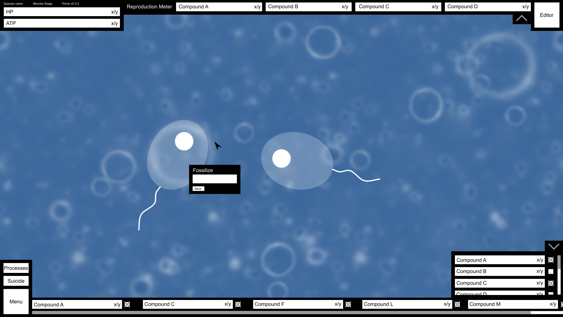
Here’s my proposal for GUI layout on a 1366x768 display, relatively small but not the smallest possible.

  • The HP and ATP bars are in the top left corner as @meandmy10 proposed. Each is labelled with its name, current value and maximum value for this generation. One thing I’m unsure about is whether there theoretically is a maximum amount of ATP, since it isn’t stored anywhere. If that’s the case, a progress bar can’t be used.

  • Above these I’ve placed a few pieces of inconsequential information, such as the version number, stage and species name, plus any other similar data anyone can think of. I know everybody was against keeping the species name, but I quite like the idea of having it on the screen, though this time far smaller than in the current GUI.

  • Across the top is the reproduction meter. From what I can gather and remember, there are certain compounds used exclusively for reproduction and repair (such as amino acids), so these will be spaced in a line to give an at-a-glance understanding of how close the player is to the next generation. Are these types of compounds stored anywhere? If so, the bar length will be maximum storage capacity with the amount needed to reproduce represented by a line somewhere in the bar. If not, the bar length will be the amount needed to reproduce. The arrow at the right of the reproduction meter hides it (see the image below for what it looks like when this happens).

  • In the top right corner is the editor button. @NickTheNick is all for having it as purely a hotkey, but most of us seem to disagree, so it can be both a hotkey and a button. Until the required compounds are collected, it will be greyed out.

  • I’ve included a basic fossilisation panel, which isn’t permanently on-screen. It appears when the player clicks another cell (or maybe just their nucleus?) and is fixed to a point in the screen until the player clicks somewhere else. Or it could have a close button.

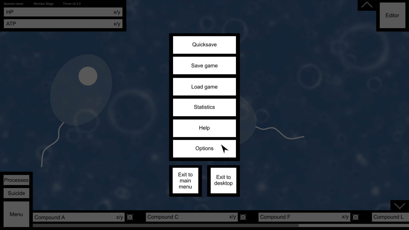
  • The bottom left still features the menu, but it’s considerably stripped down from its current version. Clicking it pauses the game, creates a grey filter over everything and shows the pause menu (see the image below). Something we haven’t really discussed with relation to the GUI is the suicide button, which kills the player’s own cell. There’ll have to be a confirmation box to prevent unwanted suicides. I’m wary about placing it so close to the menu for that reason, so if you have better suggestions I’m all for them.

  • Above the suicide button is the processes button. I think @tjwhale’s proposal for a processes display is clever and intuitive, but it’s far too big to fit on the main GUI. Instead, I propose that clicking the processes button pauses the game and shows a display of all compounds, processes and organelles in the configuration tjwhale suggested across the whole screen.

  • I’ve messed with meandmy10’s idea for compound representation a little. On the right hand side is an expandable panel (controlled using an arrow similar to that for the reproduction meter) listing every possible compound, current stores and total storage space. There’s a scroll bar to the right to navigate. Beside each is a checkbox with which the player can select the compounds they’d like to have displayed on-screen at all times. Those selected are copied to the lower bar, with a horizontal scroll bar to navigate if there are too many to display on-screen. Each can be hidden again with the checkbox. Thinking about it, there are two things about my design I’d changed already. The checkboxes aren’t needed since the player can just click a compound bar, and it might be useful to add a rescaling bar below the scoll bar so the player can optionally change how long the compound boxes in the lower bar are if they want to see many at once.

Here’s what happens when you select the menu button (with bonus reduced GUI in the background thanks to the two arrow buttons):

  • Quicksave is the save system we have now, where clicking it creates an un-nameable save file. In the future, this will sit alongside the proper save and load options, each opening a new menu over the top of the screen.

  • Statistics should show all the interesting CPA graphs and evolutionary lineages (think the evolution tree in Species: ALRE). Again, another menu should appear. This is really an option for the more dedicated players and isn’t relevant to gameplay, which is why it’s now hidden within a click.

  • In the future help should give players the option to replay the tutorial or read some documentation on various compounds, organelles and environmental features.

  • Options is options.

  • The two exit buttons are pretty self-explanatory. I’ve included two since that’s the convention for some games, and it helps for debugging to have an option to quit the game entirely with as few button presses as possible.

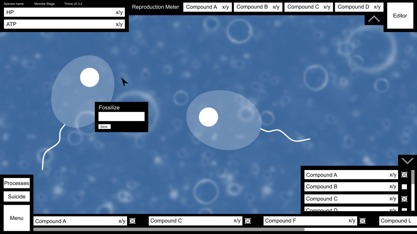
And finally, here’s how it looks on a 1920x1080 display. Not the biggest, but pretty big.

2 Likes

The ATP denominator could be a floating number calculated as your current ATP needs, while the numerator, representing current ATP turnover, only drops below it when you can’t fulfill your current ATP needs.

Yup.

I’d suggest flipping the arrow direction when the meter is hidden.

I’d suggest we also allow you to drag the compound bar sideways to scroll, unless we’re considering using the dragging action to add and remove compounds from the bar.

As for the design style, I think I actually kinda like this kind of simplistic, not-overly-decorated style. If we just made the buttons bluish and translucentish like the current gui but didn’t do any fancy patterning or shapes I think it would work very well.

Does that mean there’s a maximum storage amount?

Oops. Yeah, that was what I was going to do.

My intention is to get the dimensions and layout finished, create some replacement game files and let people test it. Once a definite layout has been decided upon, I’ll apply the same styling to everything at once, because one of my retroactive gripes with the way I did it last time was that every time I needed to add a GUI button I had to remind myself exactly how I’d styled the previous ones. One idea I’m considering is to keep the buttons and bars boxy but add shards behind them where the black currently is.

Could we roll the suicide button into the editor button? Would you ever have enough compounds to reproduce but want to suicide instead?

This is good however I’ve got a few questions and suggestions:


1.I feel these are unnecessary and a waste of time to implement, maybe you could have a watermark somewhere on the screen with the version number on it, other then that your just adding things for the sake of adding them. might look neater to not have them there too.

2.The main thing that bothers me here is you have the suicide button next to two buttons that will be used fairly often, I’m guessing it would have a ‘are you sure?’ dialogue but i feel a better solution is to have it slide out from the top left when the cell either runs out of ATP or loses some important function.
Also I’m almost 100% sure this is personal bias but i think i rather the menu button in the top right, you would be safe to ignore this though because it should be fine where it is.

3.Would this pause the game? because it should. also i would recommend putting a ‘cancel’ or X on that box so the user can get out of it.

4.What does this do? also with the editor button rather then having it there the whole time would it be better to have it slide out when you can reproduce or have the whole reproduction bar section of the UI turn into a reproduce button.

5.I’m guessing these are for toggling the compounds on and off but i feel we should only have them on the menu that slides up because the player does not need to have them there the whole time and it’s just adding complexity for no good reason. also I’m guessing that’s a scroll bar below the compounds and i feel this is not needed, can’t you just have the bars themselves to resize to the space they have?

I think that’s about it for now, i am curious to what the processes button will do though.

I think you’re asking some questions I’ve already answered.

Alright, I’ll back down on having the species name there. I don’t get why everyone is so drastically against it seeing as it’s already in the game and so won’t take much effort to copy for the new GUI, but if that’s the decision fair enough.

I did say there’d be a confirmation box. It could slide out from somewhere given certain conditions, but for the sake of player agency and choice I think it should always be an option. If they know they’re going to lose ATP gradually with no hope of recovering it, why force them to wait through the entire process? If their species is on the brink of extinction waiting will only diminish the number of individuals available to switch to. Granted, if that happens switching to another individual may not be much better, but in my opinion the player should always have the choice.

I put the editor button there so it would be next to the reproduction meter. It’s a purely aesthetic choice, but it means the player can see each bar fill up towards the goal of being able to reproduce.

Maybe, that hasn’t been decided upon. I said the way to get rid of the box would be click somewhere else (think the right-click menu on most computers), but there could be a dedicated close button.

It slides the reproduction meter in and out from the top of the screen. Some players may prefer not to have it on-screen at all times, but it needs to be quick to access. Not sure about the editor button sliding in, it feels like there should be a permanent button for such an important action (that gets greyed out when the prerequisite compounds haven’t been collected).[quote=“meandmy10, post:43, topic:111”]
5.I’m guessing these are for toggling the compounds on and off but i feel we should only have them on the menu that slides up because the player does not need to have them there the whole time and it’s just adding complexity for no good reason.
[/quote]

Perhaps that could work. The problem then is that the player has to open the compounds panel, scroll down to each of the compounds they’ve chosen and un-toggle them there, which is actually more complex a process than clicking on those already visible.

If we set a maximum number of compounds to display, yeah, otherwise with a lot of bars they’ll end up being too small to understand.[quote=“meandmy10, post:43, topic:111”]
I think that’s about it for now, i am curious to what the processes button will do though.
[/quote]

It opens a new window over the top of the game (with the game paused) showing all the compounds and the process links between them. I’ll mock up a basic design based on tjwhale’s idea, which I think is really quite neat. It’ll allow the player to turn processes/organelles on and off as well as spending locked-up compounds to repair them.[quote=“tjwhale, post:42, topic:111, full:true”]
Could we roll the suicide button into the editor button? Would you ever have enough compounds to reproduce but want to suicide instead?
[/quote]

I don’t think that’s the best idea, again because the editor button is the most important button and the player should be aware of it even when unavailable.

EDIT: Here’s that mock-up of the processes panel:

tjwhale’s original concept was a sprawl of compounds and arrows showing every process in one diagram. That might be possible but it’d be pretty damn difficult to fit everything on one diagram, and it creates a problem for modders who want to create their own organelles and processes. I’ve tried to fit the same information on something modular to solve these problems.

On the left side are the reactants for each process. Those which can be stored are represented by their storage bars, whereas others (like sunlight, and actually water now that I think about it) are just the names with arrows. In this more detailed view, the compound bars could have lines on them showing the levels above which compounds would start to be vented.

In the centre are the organelles responsible for the process. I think each process only occurs in a single type of organelle, so correct me if I’m wrong. For every organelle your cell has, another arrow is added (so in this example, the cell has four mitochondria, two chloroplasts and one of whatever the organelle is that performs pyruvate synthesis). Organelles can be turned off by clicking the black box on the arrow, becoming grey (like the first mitochondrion). If an organelle is damaged, it will be highlighted red, and clicking it gives the option to spend locked-up compounds to repair it. This removes the need for any sort of organelle healing UI in the environment itself.

2 Likes

The main reason I’m against it is that it’s not really helping the player at that time in the game and it never will, i would however see use in a subtle version number so people who see videos or images of the game know what version it’s on when it was taken/filmed.

reading this i just got an idea, when the player presses the suicide button it brings up a dialogue with three options: cancel, switch to another cell, open editor. that way we don’t need to have the editor button there all the time and we can replace it with a reproduce button that deploys when you can split.

yes and that’s fine like i said my opinion was driven my personal bias so don’t worry about it.
also i got an idea that if you wanted to be really fancy you could make it so the background behind the reproduction bars has a gradient that moves across as it gets closer to reproducing, it’s a little hard to explain in text so i might make a diagram of what I’m talking about later

ahh when i said complex i mean visually complex to the eye not to the user, also i may have underestimated how many compounds there are going to be but even then i feel like having the toggle there is bad because a player might accidentally press it which would be annoying because they would need to open the menu anyway,
also if there is going to be a lot of compounds i think the compound menu should go up higher so you don’t need to scroll as much.

yes but if this bothers the player they can disable some to get it to a level they like, it might be something we can test when it’s implemented to see if we need a scroll bar or not, the other alternative is to make it that when a certain amount is toggled it just adds another layer of bars rather then just jamming them all in.

ohh i like this, this might be the easiest ways to do this. I’m going to put my idea for this here for the sake of argument but i feel like it might be a little hard to implement.
so what i was thinking was you would have all the compounds used in processes on the left (most likely represented by symbols) and then it would be like a data flow diagram going out and showing what processes they are involved in. again, a little hard to explain in words but i might do a mock up later.

If I’m not mistaken there is set level of ATP that the CPA system will try to keep ATP at. If not, I agree with @Moopli’s suggestion of showing the rate of ATP being used over the rate of ATP being generated. If the ration is less than one the bar could be red, and if it’s more than one the bar can be green.

I feel like a better idea would be to just have one long bar for reproduction. We talked about this on the reproduction thread on this forum a while back. You simply use up fatty acids that you have (which are shown at the bottom with the normal compounds) until you replicate all of your organelles. Having many smaller ones would be more confusing and less intuitive, I think.

I have an even better idea. Why not have the Editor and the Suicide button pop on the screen when they are needed, instead of having them be grayed out? So once the reproduction meter is filled up, the editor button slides on the screen, and if you are out of compounds and cannot move, the suicide button slides in.

I agree with this. We should just have one menu button on the bottom right and clicking it brings out the on-screen menu.

I definitely agree with this, and I think we could just have a row of selected compounds, and then an up arrow on the very right that would replace the single row panel with a multiple row grid that has all of the compounds. You can then click on some of the compounds to disable them and click on others to enable them before pressing the down arrow to turn the grid back into a single row that shows the newly selected compounds. Does that make sense?

1 Like

IMO we want the gui to visually tell the player how to play the game. So I would be in favour of having a suicide button on screen all the time (I like the idea of it offering 3 options too) because what if you want to start again? Why should we tell people they can’t yet, they’re not weak enough?

Moreover I like the idea of a reproduction bar that fills up towards a grey button that says “Reproduce” or “Editor” or something. It gives a really clear signal for what the player is supposed to be doing. Having it off the screen may be cleaner but new players might get confused. They might just swim around and not realise they need to reproduce.

I don’t know if you guys agree but the basic principles are

  1. Look good

  2. Offer the player easy access to the controls

  3. Make it obvious what the player is meant to do.

Edit: Like here is a super obvious bar to tell you what to do. Do you see what I mean that it makes things super clear? (I know from a design perspective this is horrible.)

To wax lyrical a little more something I’ve been meaning to bring up recently is accessibility. So how can we help disabled players play the game? This guy’s story is interesting as I’d never really considered what it would be like to play as a disabled gamer until I read it.

Anyway what is the least number of buttons we could let someone play the game with? Is there any way we can let people play with just the mouse and leftclick? (That would be a really awesome step for accessability).

Anyway keep accessability in mind as you design. If you want to talk about it more that’s cool, I don’t really know anything about it, I’d just like to try and help people access the game.

Well, I guess we could move the editor button to the right of the reproduction bar and grey it out. It wouldn’t take too much space, and would actually fit in there pretty well. But it definetely shouldn’t be by the menu. I’m also not convinced we really need a suicide button during normal play time. You would very rarely use it, and it would clutter the UI. It should only pop up when you are close to dying or something.

What exactly is the point of suicide if you’re already going to die then?

This is quite off topic but it’s a general argument as to why a suicide button is important.

Right now I don’t believe there is any mechanism for a cell to die of starvation. You can just get lower and lower amounts of compounds, there is no point at which a catastrophe happens.

It can’t really be in terms of compounds either. Like maybe you run out of ATP and that means death. But ATP is more like “stamina”. If you are using it faster than your cell can produce it then you will burn up all your stores and then the value will sit at 0 while your cell is healthy and swimming at it’s maximum, sustainable, pace. It would make no sense to tell the player they died if they have a massive store of sugar which is being continuously thrown into the furnace as fast as it can.

In fact there’s no single compound which should really mean death when it runs out. Maybe protein is the best candidate? But again is a cell with all other compounds full + about to make a tonne of protein really dead?

We discussed having “water pumps” which have to be continuously powered or your cell will implode (I think it is an implosion, not an explosion, because it’s water rushing in) and if so then these losing power would cause a catastrophe, but we haven’t really fixed this yet.

Also what about all the annoying situations? Like when you are just stuck in a cloud of photosynthesizers and you can’t push them out the way. Or maybe a cell is following you which is continually spraying you with an agent which slows you down, but it does nothing else to harm you. We want people to have an out for these situations when their cell is healthy. Because the game is procedural we can never know if these will happen.

The suicide button could be in the pause menu for cleanliness and pop onto the screen when it’s suggested you might be done with this cell. I do think it should always be available somewhere though.

2 Likes

Thanks for the response and sorry for getting off topic! I’ve been a bit out of the loop :grin:

I’d quote tjwhale’s post and write QFT but that seems to have gone out of fashion since we left the old forum. Needless to say, that’s exactly what I was trying to get at but couldn’t quite deliver so convincingly.

This too is the right argument for having the editor button on-screen at all times. Even when buttons are unavailable the player needs to know that they’ll be available eventually, especially for what is arguably the most important action they can perform. If combined with the right reproduction meter design, they’ll get the gist that filling up those bars will enable the button without ever actually having to be told anything.

Hmm…I might have an even better solution. Have a single long bar but divide it up horizontally by compound. This seems like the most intuitive solution for me.

We should probably start considering iconography. There are two sections to decide upon: icons on buttons and panels, and the dedicated icons for compounds/organelles/biomes used throughout the GUI (and even in for game guides in the future).

I’ll make a separate thread for the latter, but we can discuss button icons here. It was another of the previous GUI’s biggest issues, leaving some players in the dark about what exactly they’re doing. The idea was to get rid of as much text as possible, but the replacement images didn’t exactly convey what they needed to.

We need icons that are relatively simple, can have their colour scheme adapted to that of the GUI as a whole, and are easily understood. Some could incorporate text.

For the moment I’ll stick with the environment and list my ideas for each of them:

  • Menu - I quite like just the “arms” of the Thrive logo for this, although I do feel it may not be the clearest thing in the world to represent a menu. Perhaps having text as well wouldn’t be so bad?
  • Processes - I’m thinking something related to chemical reactions. A test tube maybe? Or a chemical structural diagram?
  • Suicide - If we’re going for morbid, a skill and crossbones could work. I can’t really think of a better icon to represent death.
  • Editor - We could keep the cell splitting idea from the current GUI, but I think it should be clearer that’s what it is. Perhaps show a simple progression from one cell to two? Or would that be too complicated?
  • Fossilise - I remember this being discussed in the old thread, and the consensus was a fossil ammonite.
  • Quicksave - Erm…really not sure. I think the pause menu options in general should have text as well as an icon for clarity’s sake.
  • Resume (which I forgot to include in the mock-up image) - A play button.
  • Save game - Floppy disks are the universal symbol for saving, so I’m thinking a floppy disk.
  • Load game - Similarly, a slightly open folder.
  • Statistics - A simplified graph.
  • Help - A question mark.
  • Options - A gear, which was what I tried to make for the previous GUI. I used the asterisk from ~sciocont’s Thrive font, which in retrospect may not have been the best idea.
  • Exit to main menu - A cross accompanied by text saying “Main Menu”.
  • Exit to desktop - A cross accompanied by text saying “Desktop”.
1 Like

I don’t think so, it’s pretty common for pause menus to be all text (I can’t actually think of any that use icons). Also I’d suggest having the last two buttons take up a whole row each so they are not so compressed, that way you could fit “Exit to Menu” and “Exit to Desktop” in one row each.

And thus, we won’t need icons for quicksave, save, load, resume, or either of the exits.

Besides that though, I really like the draft, it’s looking good!

1 Like