My intention is to get the dimensions and layout finished, create some replacement game files and let people test it. Once a definite layout has been decided upon, I’ll apply the same styling to everything at once, because one of my retroactive gripes with the way I did it last time was that every time I needed to add a GUI button I had to remind myself exactly how I’d styled the previous ones. One idea I’m considering is to keep the buttons and bars boxy but add shards behind them where the black currently is.
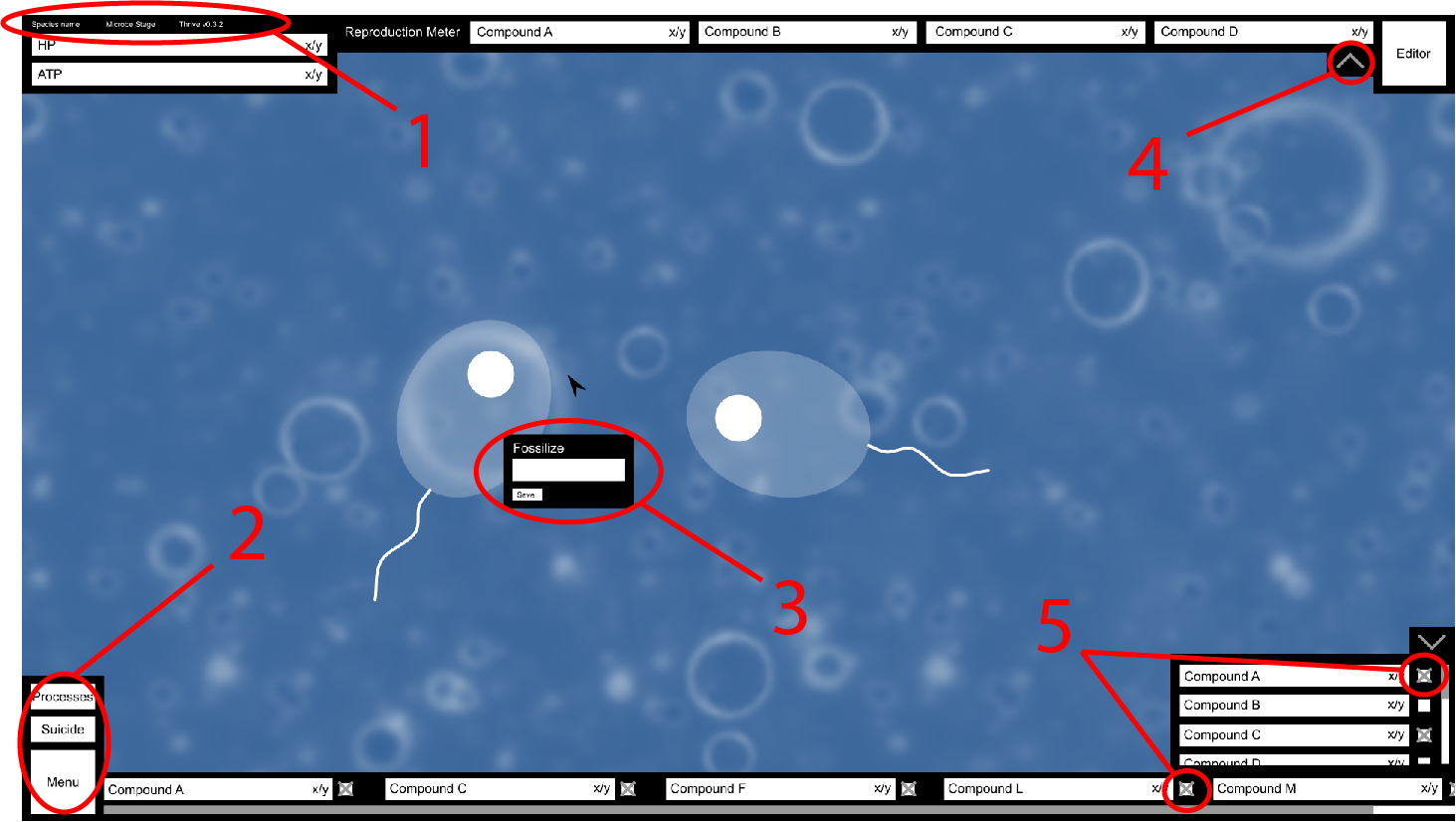
1.I feel these are unnecessary and a waste of time to implement, maybe you could have a watermark somewhere on the screen with the version number on it, other then that your just adding things for the sake of adding them. might look neater to not have them there too.
2.The main thing that bothers me here is you have the suicide button next to two buttons that will be used fairly often, I’m guessing it would have a ‘are you sure?’ dialogue but i feel a better solution is to have it slide out from the top left when the cell either runs out of ATP or loses some important function.
Also I’m almost 100% sure this is personal bias but i think i rather the menu button in the top right, you would be safe to ignore this though because it should be fine where it is.
3.Would this pause the game? because it should. also i would recommend putting a ‘cancel’ or X on that box so the user can get out of it.
4.What does this do? also with the editor button rather then having it there the whole time would it be better to have it slide out when you can reproduce or have the whole reproduction bar section of the UI turn into a reproduce button.
5.I’m guessing these are for toggling the compounds on and off but i feel we should only have them on the menu that slides up because the player does not need to have them there the whole time and it’s just adding complexity for no good reason. also I’m guessing that’s a scroll bar below the compounds and i feel this is not needed, can’t you just have the bars themselves to resize to the space they have?
I think that’s about it for now, i am curious to what the processes button will do though.
I think you’re asking some questions I’ve already answered.
Alright, I’ll back down on having the species name there. I don’t get why everyone is so drastically against it seeing as it’s already in the game and so won’t take much effort to copy for the new GUI, but if that’s the decision fair enough.
I did say there’d be a confirmation box. It could slide out from somewhere given certain conditions, but for the sake of player agency and choice I think it should always be an option. If they know they’re going to lose ATP gradually with no hope of recovering it, why force them to wait through the entire process? If their species is on the brink of extinction waiting will only diminish the number of individuals available to switch to. Granted, if that happens switching to another individual may not be much better, but in my opinion the player should always have the choice.
I put the editor button there so it would be next to the reproduction meter. It’s a purely aesthetic choice, but it means the player can see each bar fill up towards the goal of being able to reproduce.
Maybe, that hasn’t been decided upon. I said the way to get rid of the box would be click somewhere else (think the right-click menu on most computers), but there could be a dedicated close button.
It slides the reproduction meter in and out from the top of the screen. Some players may prefer not to have it on-screen at all times, but it needs to be quick to access. Not sure about the editor button sliding in, it feels like there should be a permanent button for such an important action (that gets greyed out when the prerequisite compounds haven’t been collected).[quote=“meandmy10, post:43, topic:111”]
5.I’m guessing these are for toggling the compounds on and off but i feel we should only have them on the menu that slides up because the player does not need to have them there the whole time and it’s just adding complexity for no good reason.
[/quote]
Perhaps that could work. The problem then is that the player has to open the compounds panel, scroll down to each of the compounds they’ve chosen and un-toggle them there, which is actually more complex a process than clicking on those already visible.
If we set a maximum number of compounds to display, yeah, otherwise with a lot of bars they’ll end up being too small to understand.[quote=“meandmy10, post:43, topic:111”]
I think that’s about it for now, i am curious to what the processes button will do though.
[/quote]
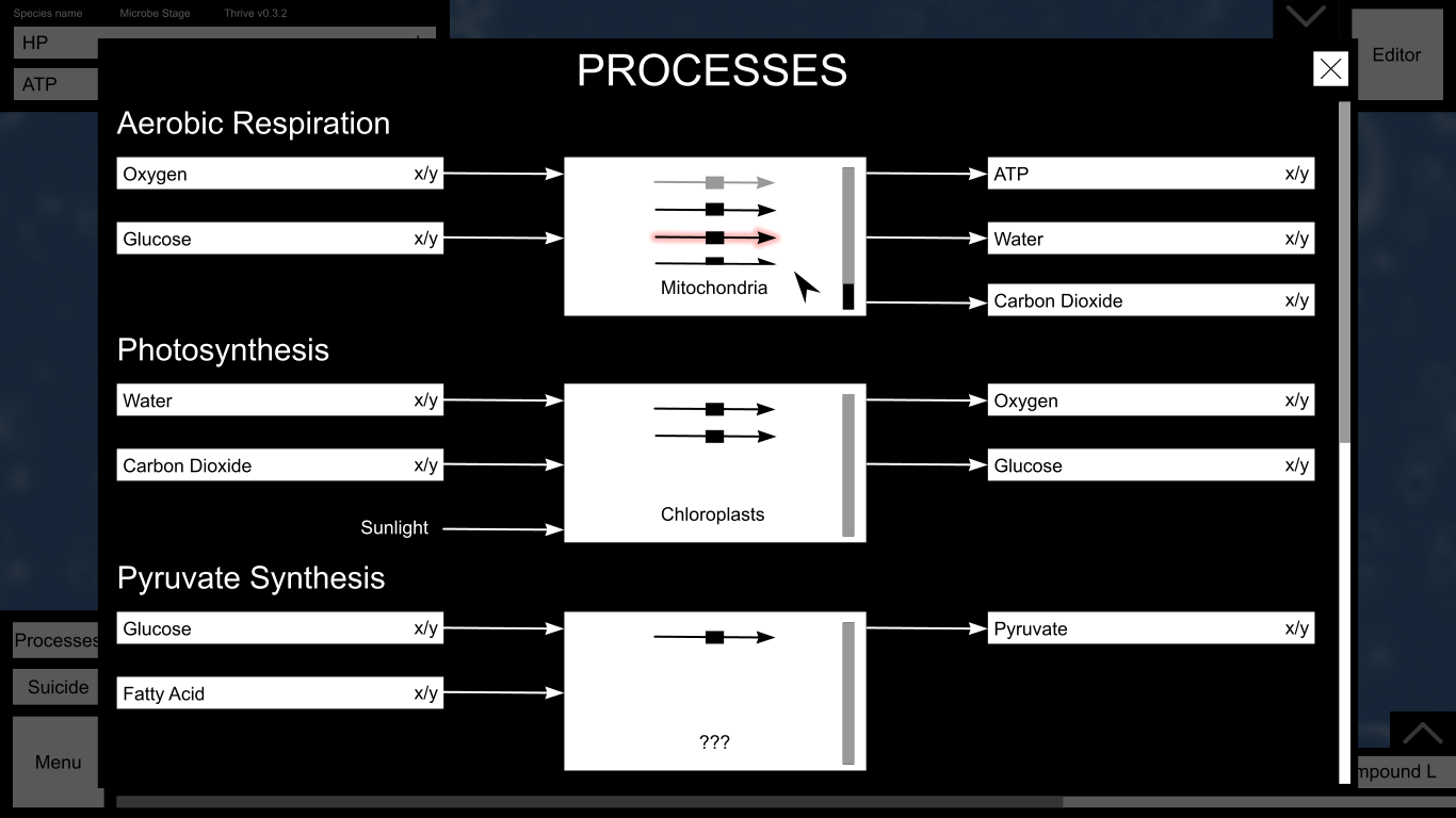
It opens a new window over the top of the game (with the game paused) showing all the compounds and the process links between them. I’ll mock up a basic design based on tjwhale’s idea, which I think is really quite neat. It’ll allow the player to turn processes/organelles on and off as well as spending locked-up compounds to repair them.[quote=“tjwhale, post:42, topic:111, full:true”]
Could we roll the suicide button into the editor button? Would you ever have enough compounds to reproduce but want to suicide instead?
[/quote]
I don’t think that’s the best idea, again because the editor button is the most important button and the player should be aware of it even when unavailable.
tjwhale’s original concept was a sprawl of compounds and arrows showing every process in one diagram. That might be possible but it’d be pretty damn difficult to fit everything on one diagram, and it creates a problem for modders who want to create their own organelles and processes. I’ve tried to fit the same information on something modular to solve these problems.
On the left side are the reactants for each process. Those which can be stored are represented by their storage bars, whereas others (like sunlight, and actually water now that I think about it) are just the names with arrows. In this more detailed view, the compound bars could have lines on them showing the levels above which compounds would start to be vented.
In the centre are the organelles responsible for the process. I think each process only occurs in a single type of organelle, so correct me if I’m wrong. For every organelle your cell has, another arrow is added (so in this example, the cell has four mitochondria, two chloroplasts and one of whatever the organelle is that performs pyruvate synthesis). Organelles can be turned off by clicking the black box on the arrow, becoming grey (like the first mitochondrion). If an organelle is damaged, it will be highlighted red, and clicking it gives the option to spend locked-up compounds to repair it. This removes the need for any sort of organelle healing UI in the environment itself.
The main reason I’m against it is that it’s not really helping the player at that time in the game and it never will, i would however see use in a subtle version number so people who see videos or images of the game know what version it’s on when it was taken/filmed.
reading this i just got an idea, when the player presses the suicide button it brings up a dialogue with three options: cancel, switch to another cell, open editor. that way we don’t need to have the editor button there all the time and we can replace it with a reproduce button that deploys when you can split.
yes and that’s fine like i said my opinion was driven my personal bias so don’t worry about it.
also i got an idea that if you wanted to be really fancy you could make it so the background behind the reproduction bars has a gradient that moves across as it gets closer to reproducing, it’s a little hard to explain in text so i might make a diagram of what I’m talking about later
ahh when i said complex i mean visually complex to the eye not to the user, also i may have underestimated how many compounds there are going to be but even then i feel like having the toggle there is bad because a player might accidentally press it which would be annoying because they would need to open the menu anyway,
also if there is going to be a lot of compounds i think the compound menu should go up higher so you don’t need to scroll as much.
yes but if this bothers the player they can disable some to get it to a level they like, it might be something we can test when it’s implemented to see if we need a scroll bar or not, the other alternative is to make it that when a certain amount is toggled it just adds another layer of bars rather then just jamming them all in.
ohh i like this, this might be the easiest ways to do this. I’m going to put my idea for this here for the sake of argument but i feel like it might be a little hard to implement.
so what i was thinking was you would have all the compounds used in processes on the left (most likely represented by symbols) and then it would be like a data flow diagram going out and showing what processes they are involved in. again, a little hard to explain in words but i might do a mock up later.
If I’m not mistaken there is set level of ATP that the CPA system will try to keep ATP at. If not, I agree with @Moopli’s suggestion of showing the rate of ATP being used over the rate of ATP being generated. If the ration is less than one the bar could be red, and if it’s more than one the bar can be green.
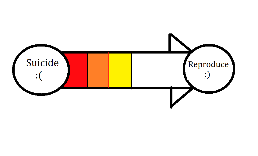
I feel like a better idea would be to just have one long bar for reproduction. We talked about this on the reproduction thread on this forum a while back. You simply use up fatty acids that you have (which are shown at the bottom with the normal compounds) until you replicate all of your organelles. Having many smaller ones would be more confusing and less intuitive, I think.
I have an even better idea. Why not have the Editor and the Suicide button pop on the screen when they are needed, instead of having them be grayed out? So once the reproduction meter is filled up, the editor button slides on the screen, and if you are out of compounds and cannot move, the suicide button slides in.
I agree with this. We should just have one menu button on the bottom right and clicking it brings out the on-screen menu.
I definitely agree with this, and I think we could just have a row of selected compounds, and then an up arrow on the very right that would replace the single row panel with a multiple row grid that has all of the compounds. You can then click on some of the compounds to disable them and click on others to enable them before pressing the down arrow to turn the grid back into a single row that shows the newly selected compounds. Does that make sense?
IMO we want the gui to visually tell the player how to play the game. So I would be in favour of having a suicide button on screen all the time (I like the idea of it offering 3 options too) because what if you want to start again? Why should we tell people they can’t yet, they’re not weak enough?
Moreover I like the idea of a reproduction bar that fills up towards a grey button that says “Reproduce” or “Editor” or something. It gives a really clear signal for what the player is supposed to be doing. Having it off the screen may be cleaner but new players might get confused. They might just swim around and not realise they need to reproduce.
I don’t know if you guys agree but the basic principles are
Look good
Offer the player easy access to the controls
Make it obvious what the player is meant to do.
Edit: Like here is a super obvious bar to tell you what to do. Do you see what I mean that it makes things super clear? (I know from a design perspective this is horrible.)
To wax lyrical a little more something I’ve been meaning to bring up recently is accessibility. So how can we help disabled players play the game? This guy’s story is interesting as I’d never really considered what it would be like to play as a disabled gamer until I read it.
Anyway what is the least number of buttons we could let someone play the game with? Is there any way we can let people play with just the mouse and leftclick? (That would be a really awesome step for accessability).
Anyway keep accessability in mind as you design. If you want to talk about it more that’s cool, I don’t really know anything about it, I’d just like to try and help people access the game.
Well, I guess we could move the editor button to the right of the reproduction bar and grey it out. It wouldn’t take too much space, and would actually fit in there pretty well. But it definetely shouldn’t be by the menu. I’m also not convinced we really need a suicide button during normal play time. You would very rarely use it, and it would clutter the UI. It should only pop up when you are close to dying or something.
This is quite off topic but it’s a general argument as to why a suicide button is important.
Right now I don’t believe there is any mechanism for a cell to die of starvation. You can just get lower and lower amounts of compounds, there is no point at which a catastrophe happens.
It can’t really be in terms of compounds either. Like maybe you run out of ATP and that means death. But ATP is more like “stamina”. If you are using it faster than your cell can produce it then you will burn up all your stores and then the value will sit at 0 while your cell is healthy and swimming at it’s maximum, sustainable, pace. It would make no sense to tell the player they died if they have a massive store of sugar which is being continuously thrown into the furnace as fast as it can.
In fact there’s no single compound which should really mean death when it runs out. Maybe protein is the best candidate? But again is a cell with all other compounds full + about to make a tonne of protein really dead?
We discussed having “water pumps” which have to be continuously powered or your cell will implode (I think it is an implosion, not an explosion, because it’s water rushing in) and if so then these losing power would cause a catastrophe, but we haven’t really fixed this yet.
Also what about all the annoying situations? Like when you are just stuck in a cloud of photosynthesizers and you can’t push them out the way. Or maybe a cell is following you which is continually spraying you with an agent which slows you down, but it does nothing else to harm you. We want people to have an out for these situations when their cell is healthy. Because the game is procedural we can never know if these will happen.
The suicide button could be in the pause menu for cleanliness and pop onto the screen when it’s suggested you might be done with this cell. I do think it should always be available somewhere though.
I’d quote tjwhale’s post and write QFT but that seems to have gone out of fashion since we left the old forum. Needless to say, that’s exactly what I was trying to get at but couldn’t quite deliver so convincingly.
This too is the right argument for having the editor button on-screen at all times. Even when buttons are unavailable the player needs to know that they’ll be available eventually, especially for what is arguably the most important action they can perform. If combined with the right reproduction meter design, they’ll get the gist that filling up those bars will enable the button without ever actually having to be told anything.
Hmm…I might have an even better solution. Have a single long bar but divide it up horizontally by compound. This seems like the most intuitive solution for me.
We should probably start considering iconography. There are two sections to decide upon: icons on buttons and panels, and the dedicated icons for compounds/organelles/biomes used throughout the GUI (and even in for game guides in the future).
I’ll make a separate thread for the latter, but we can discuss button icons here. It was another of the previous GUI’s biggest issues, leaving some players in the dark about what exactly they’re doing. The idea was to get rid of as much text as possible, but the replacement images didn’t exactly convey what they needed to.
We need icons that are relatively simple, can have their colour scheme adapted to that of the GUI as a whole, and are easily understood. Some could incorporate text.
For the moment I’ll stick with the environment and list my ideas for each of them:
Menu - I quite like just the “arms” of the Thrive logo for this, although I do feel it may not be the clearest thing in the world to represent a menu. Perhaps having text as well wouldn’t be so bad?
Processes - I’m thinking something related to chemical reactions. A test tube maybe? Or a chemical structural diagram?
Suicide - If we’re going for morbid, a skill and crossbones could work. I can’t really think of a better icon to represent death.
Editor - We could keep the cell splitting idea from the current GUI, but I think it should be clearer that’s what it is. Perhaps show a simple progression from one cell to two? Or would that be too complicated?
Fossilise - I remember this being discussed in the old thread, and the consensus was a fossil ammonite.
Quicksave - Erm…really not sure. I think the pause menu options in general should have text as well as an icon for clarity’s sake.
Resume (which I forgot to include in the mock-up image) - A play button.
Save game - Floppy disks are the universal symbol for saving, so I’m thinking a floppy disk.
Load game - Similarly, a slightly open folder.
Statistics - A simplified graph.
Help - A question mark.
Options - A gear, which was what I tried to make for the previous GUI. I used the asterisk from ~sciocont’s Thrive font, which in retrospect may not have been the best idea.
Exit to main menu - A cross accompanied by text saying “Main Menu”.
Exit to desktop - A cross accompanied by text saying “Desktop”.
I don’t think so, it’s pretty common for pause menus to be all text (I can’t actually think of any that use icons). Also I’d suggest having the last two buttons take up a whole row each so they are not so compressed, that way you could fit “Exit to Menu” and “Exit to Desktop” in one row each.
And thus, we won’t need icons for quicksave, save, load, resume, or either of the exits.
Besides that though, I really like the draft, it’s looking good!
Are there any objections to this general layout? The reproduction meter is now one long bar with all the locked up compounds represented…somehow. It’ll be divided either horizontally or vertically depending on how many there are. I also realised that we don’t actually need an HP bar, since ATP is effectively HP. If the new GUI is implemented before the switch to ATP as a health measure, it could just show HP instead.
If no one has any objections, I’ll move onto the editor, which will be a lot harder and more confusing.
I like it, but about ATP being HP, I’m not sure about that. I assume much discussion has gone on about it, but HP should really just be membrane integrity, I don’t think we should get rid of the concept of HP altogether, especially since attacks from pili wouldn’t directly affect your ATP levels.
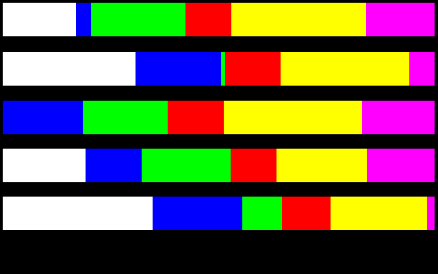
As for the reproduction meter, maybe a single bar with several dynamic sections that when filled all fill the bar? I made a picture to explain it because I don’t know how to explain it in words.
I like this a lot, but how can we make it also easily display how much more of each compound you need?
Perhaps have the bars not simply fill up sideways, but fill up vertically as well? So then, if you have all of the yellow you need but half the blue, then the blue bar is only half height. Sorta like, combining this bar idea with a histogram.
Or we could overlay numbers onto the bars, maybe toggleable as an easily-accessible setting, or on mouse hover.
I like the idea of overlaying numbers, I find that cleaner and simpler than bars, but bars look pretty, so bars with numbers on top would be the way to go imo. Of course making it toggleable or activated by mouse hover would be even better.
But I’m not so sure about the histogram thing, Especially with a bar that thin I think we should keep scaling to one dimension, otherwise we’d need to make the bar bigger vertically and take up more precious screen space.
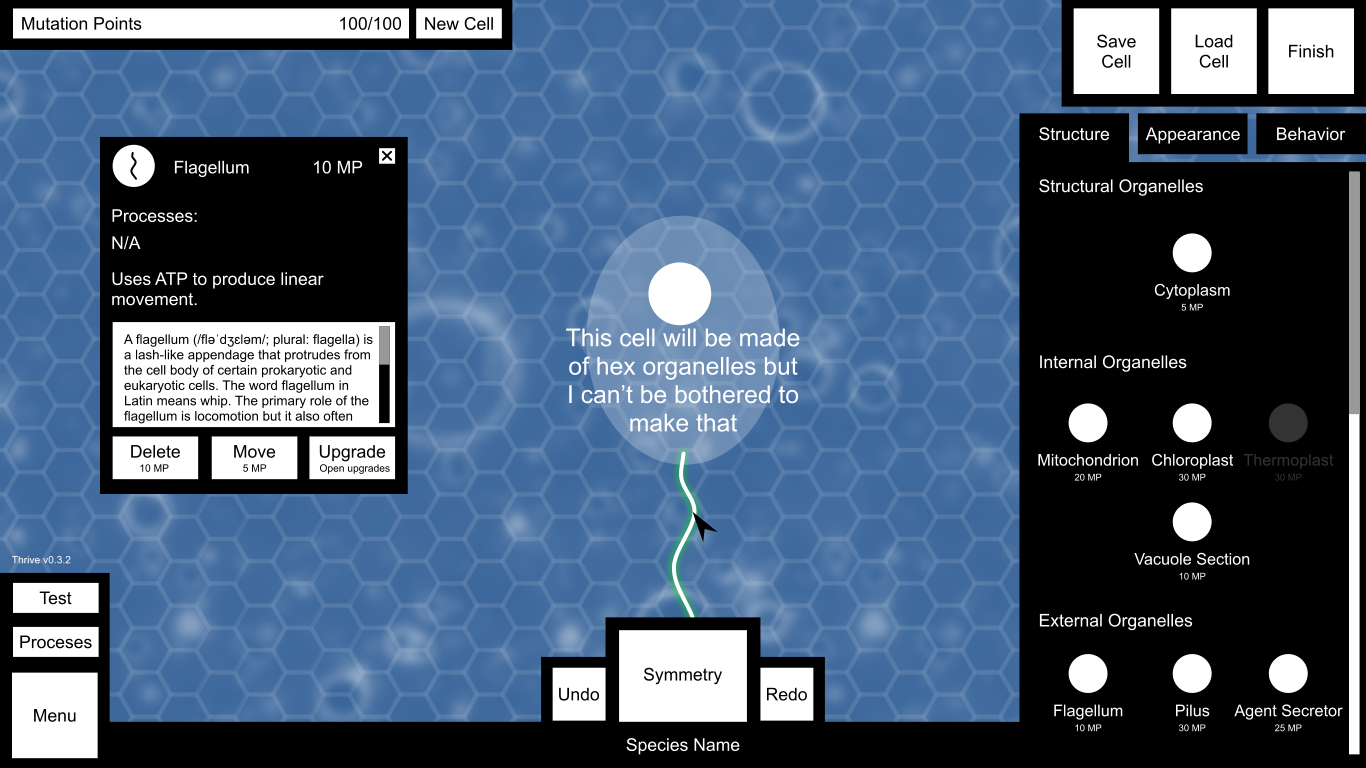
This image shows the editor GUI, the info panel and the structure tab.
I tried to keep as many elements as possible in similar positions to the environment to keep everything intuitive. The menu is in the bottom left, finish is in the top right (as editor is in the environment), processes is above menu and the ATP bar is replaced with the MP bar. Suicide is also replaced with new cell, since they kinda sorta have the same function if you think about it (but not really).
There’s a hex grid over the background for the structure tab only. With the structure tab selected, the cell will be made of hex grid organelles like those in the game now.
Save and load cell need to go somewhere and given there was free space next to finish I put them there. I’m not satisfied with it but I’ll leave it to others to give their opinion. Bear in mind all the proportions and button sizes will be fixed so everything in the top right lines up properly.
Clicking new cell, save cell or load cell will bring up another panel. In the case of new cell, it will tell you the MP cost to delete everything you already have, save will let you save and load cell will allow you to load a cell if you have enough MP to change your current cell into that one. That feels a bit confusing and unfeasible now, so I think new cell and load cell will both be deactivated when not in the free editor.
Processes here opens a similar panel to that in the environment, except you won’t be able to switch organelles on/off or repair them.
Undo, symmetry and redo work in exactly the same way they do in the game now.
Clicking the species name allows you to type a new one.
Test removes all the GUI except for a return button and allows the player to swim around with their cell in a petri dish.
Clicking an organelle in place on the cell or an organelle in the list will bring up the info box. The player can grab the top of the info box and move it around, or close it with the cross. It shows the icon, MP cost, processes, basic description, detailed scientific context (with scrollbar), and options to delete, move or upgrade an organelle.
Choosing to upgrade an organelle brings up the upgrades system described here, which is a whole other bag of GUI demons.
On the right are the three main tabs. In structural mode, organelles are listed with their icons and MP cost underneath their category.
And here’s the appearance tab, with bonus info on the nucleus.
In the appearance tab the hex grid vanishes and the hex cell is replaced by what it will look like in-game with organelle models and membrane.
The nucleus can’t be moved or deleted, so those options are deactivated. Can it have upgrades? I also have no idea what processes take place within it.
Periphery organelles sound like they should go under the structure tab, but the trouble is they’re only visible once a procedural membrane has been drawn. Perhaps there could be a border around the hex organelles in the structure tab instead to represent periphery organelles? In that case they can be moved to structure. At any rate, only one periphery organelle can ever be chosen, but each can be upgraded.
Textures change the membrane texture of the cell.
Colour shows a colour wheel where the player can choose, unsurprisingly, their cell’s colour.
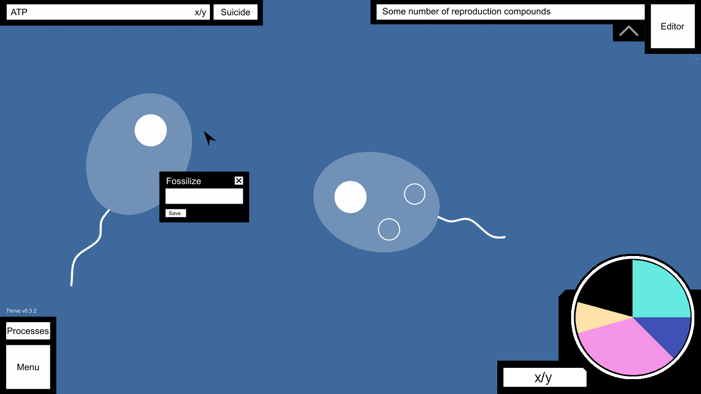
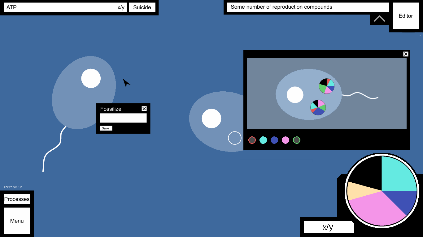
Personally, I think a pie chart would work pretty well for showing how many compounds are in the player’s vacuole(s). Clicking on it could bring up a menu showing the compounds in each individual vacuole.
EDIT: The reason I think that this would work well is because it would be clear to the player how much of a compound they have in relation to another.
Made a quick edit of Oliver’s image. The big pie chart in the corner shows all of the compounds in all of the player’s vacuoles combined. The black “slice” represents unoccupied space. Hovering over a slice gives a tooltip showing info about the compound the slice represents. (e.g: Oxygen: 50 units, 25%) Next to the pie chart is a small bar showing the amount of occupied space.
Clicking on the chart would bring up a small window like this:
Over each vacuole would be a small pie chart showing contents. Hovering over one would (somehow) show it with greater detail.
The colored dots on the bottom are ‘buttons’ that toggle visibility of certain slices on the main pie chart. In the image, the red and green compounds are ‘hidden’.
All hidden compounds are represented on the main pie chart as a beige-colored slice. Its tooltip would be “Other Compounds”