# Unified UI Color Scheme
**URL:** https://forum.revolutionarygamesstudio.com/t/unified-ui-color-scheme/786
**Category:** Graphics
**Created:** [April 11, 2021, 3:46pm UTC](https://forum.revolutionarygamesstudio.com/t/unified-ui-color-scheme/786 "2021-04-11T15:46:44Z")
**Posts on this page:** 6
**Page:** 1
### Author:  [@NathanB](https://forum.revolutionarygamesstudio.com/u/NathanB)
#### Post date: [April 11, 2021, 3:46pm UTC](https://forum.revolutionarygamesstudio.com/t/unified-ui-color-scheme/786/1 "2021-04-11T15:46:44Z")
**Opening a new topic since this really deserves its own thread.**
**Here is the current state of this conversation:**
Here are the colors I found after inspecting the current GUI.
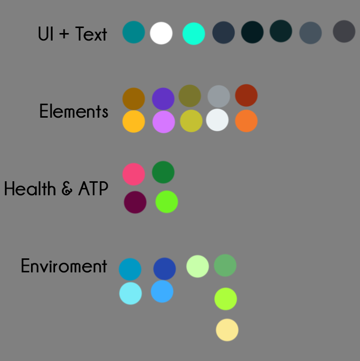
Look how many different shades of green there are. My guess is these colors were added piece meal, one at a time. And it makes the overall look feel scattered. If we crafted a style guide, the color scheme (and other art) might look a little more unified.
Just as an example, take this:
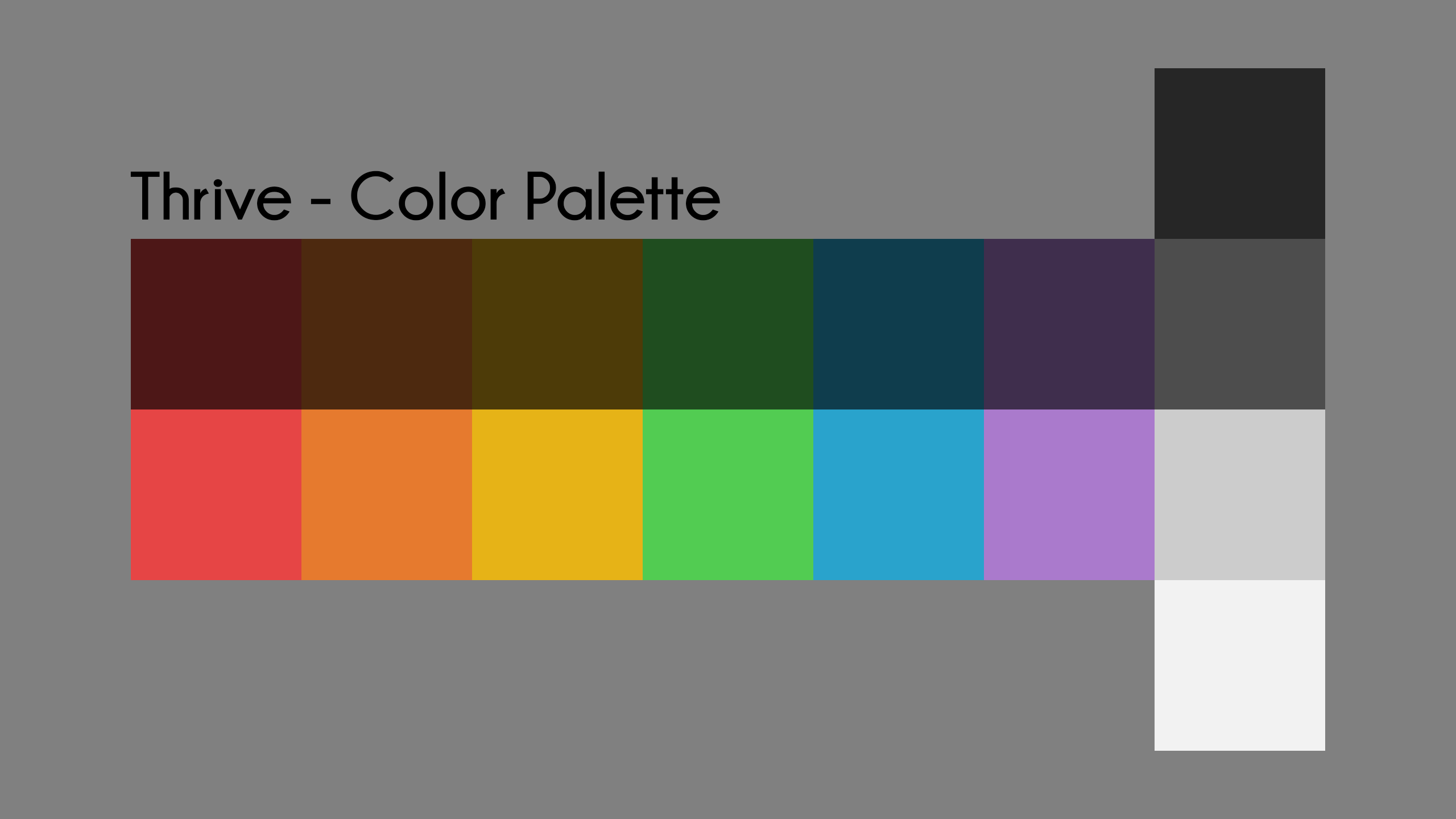
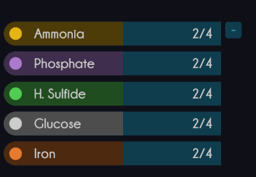
Wouldn’t the compounds look better with more consistent contrast between the colors?
And some responses:
> [@Style Guides](https://forum.revolutionarygamesstudio.com/t/style-guides/785/6):
>
> I definitely understand where you’re coming from with the desire for a more unified color palette, but it’s tricky because there’s a lot of compounds, environmental variables, and other bars that all need to be visually distinct from each other (otherwise, something like hydrogen sulfide might be the same color as ATP, which I believe would be ultimately more confusing), while also having meaningful colors in many cases. For instance, hydrogen sulfide’s yellow-green color references the color of sulfur, which also sets it apart from ATP and nitrogen. Furthermore any blue compounds will have to be distinct from oxygen and CO2, and any red compounds will have to be distinct from oxytoxy-NT and the player’s HP bar.
> [@Style Guides](https://forum.revolutionarygamesstudio.com/t/style-guides/785/9):
>
> I actually think we should side bar the unified color palette discussion for another thread…but let me just say this: we are placing too high a burden on the colors to communicate things. We also have a set of awesome icons. Let them do some of the heavy lifting. If we expect every single feature to get its own UI color, it’s going to end up looking really muddy.
>
> The color section of this article is a great inspiration for what I mean:
> [https://medium.com/ironequal/the-only-advice-you-will-need-to-make-a-great-game-ui-ux-74a0db8de642](https://medium.com/ironequal/the-only-advice-you-will-need-to-make-a-great-game-ui-ux-74a0db8de642)
## Finally, from discord on the GUI channel:
#### hhyyrylainen _—_ Today at 6:35 AM
I don’t think anyone is actively working on either redesigning the GUI or changing the implementation of the GUI to change the look
#### NathanB _—_ Today at 6:40 AM
Is this something we are interested in? The last thing I want to do is go on a goose chase that no one wants
#### hhyyrylainen _—_ Today at 7:18 AM
I think everyone is pretty happy with the overall GUI design
I think it was just 6 months ago that the latest round of GUI reworks were completed (after being drawn like 6 months to even a year prior to that)
#### NathanB _—_ Today at 7:59 AM
Ah, alright. That sounds like a pretty firm stance on needing to work within the confines of what has already been defined for the gui. No color scheme changes, for example
* * *
If there is really not any appetite for unifying and simplifying the UI color scheme, then that’s okay and I’ll shut up about it!
But, in my opinion, it is something worth doing.
---
### Author:  [@hhyyrylainen](https://forum.revolutionarygamesstudio.com/u/hhyyrylainen)
#### Post date: [April 11, 2021, 4:09pm UTC](https://forum.revolutionarygamesstudio.com/t/unified-ui-color-scheme/786/2 "2021-04-11T16:09:43Z")
Regarding the compounds colours, it might be the case that the same colour values are used in the GUI as the compound clouds use in the world. And those in-world colours have been tweaked for better visibility over the years. So there may be two choices: the GUI has different shades for the different compounds than in the game world, or the new GUI colours need to be picked to still have good visibility on the various backgrounds.
---
### Author:  [@NathanB](https://forum.revolutionarygamesstudio.com/u/NathanB)
#### Post date: [April 11, 2021, 5:01pm UTC](https://forum.revolutionarygamesstudio.com/t/unified-ui-color-scheme/786/3 "2021-04-11T17:01:51Z")
That’s a really good point.
Just so I’m clear…are there more or less than 7 compounds planned to appear on the map as collectable clouds? If 7 or less, then the same color scheme could be used for the GUI as for the compounds (ROYGBV+White)…
If there are more than 7 compounds planned, I think color is the wrong way to differentiate them.
_The new GUI colors would need to be picked to still have good visibility on the various backgrounds._
The background images should max out at a certain brightness. Then, the compound clouds will always have good contrast against them if we use the brighter colors for them.
---
### Author:  [@hhyyrylainen](https://forum.revolutionarygamesstudio.com/u/hhyyrylainen)
#### Post date: [April 11, 2021, 5:04pm UTC](https://forum.revolutionarygamesstudio.com/t/unified-ui-color-scheme/786/4 "2021-04-11T17:04:39Z")
> [@NathanB](#):
>
> If there are more than 7 compounds planned, I think color is the wrong way to differentiate them.
At least there aren’t any short term plans to add more compounds than there are currently in the game.
---
### Author:  [@NathanB](https://forum.revolutionarygamesstudio.com/u/NathanB)
#### Post date: [April 11, 2021, 5:50pm UTC](https://forum.revolutionarygamesstudio.com/t/unified-ui-color-scheme/786/5 "2021-04-11T17:50:53Z")
On the topic of compound visibility on background:
I have mocked up my ROYGBV+White color scheme on top of the 4 backgrounds I found on the wiki.
I darkened the backgrounds up a small amount, but I just wanted to show that the colors are fairly visible even without additional changes.
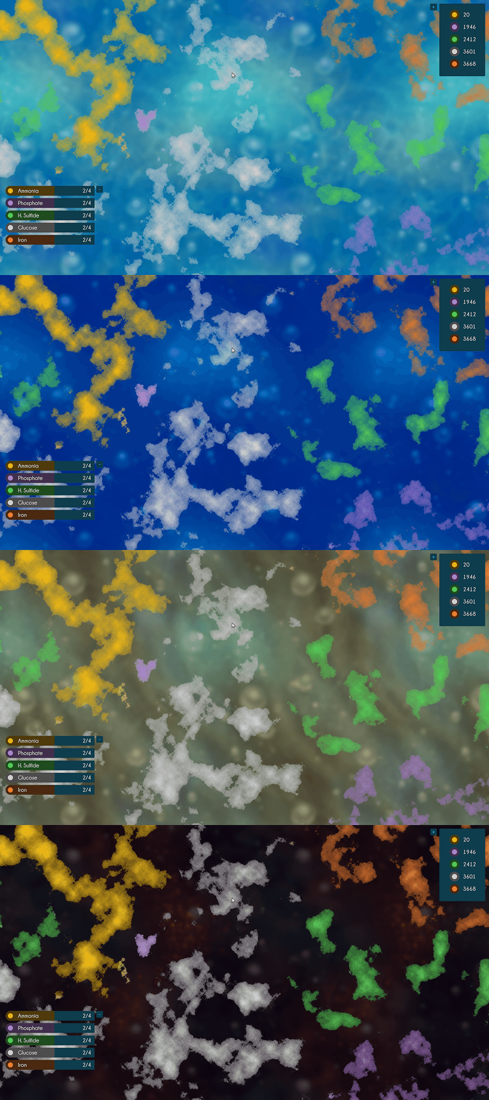
Ideally, however, once we have a simplified color palette, the backgrounds should be tweaked to follow it too. (easy enough to change the hue and brightness in photoshop)
---
### Author:  [@NathanB](https://forum.revolutionarygamesstudio.com/u/NathanB)
#### Post date: [April 11, 2021, 6:03pm UTC](https://forum.revolutionarygamesstudio.com/t/unified-ui-color-scheme/786/6 "2021-04-11T18:03:31Z")
Some more ramifications of simplifying and unifying the color palette would be that all eliminated colors would have to be replaced with something from the new color scheme.
1. Environment stats would need to become more or less monochromatic:
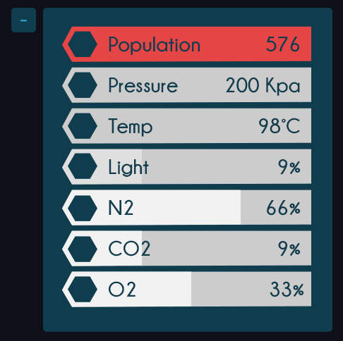
Notice, I have reserved red to be associated with health (red is not used by the compounds)
2. ATP would need to change to blue since its green color was eliminated. No compound uses blue, that is why I swapped it there.
3. The teal lines around all the UI would also need to become blue. (although if it were up to me, I would remove those lines altogether for less clutter)