Thrive Development Forum
Main Menu - Options Menu
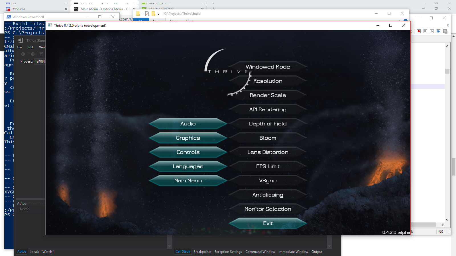
Graphics
lavathor
July 12, 2019, 5:48pm
30
Graphics
1600×900 367 KB
How does this look?
show post in topic