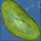
Alright! Here are three new versions of the Mitochondria:
Orange:
Blue:
Red:
What do you guys think?
EDIT:
@NickTheNick Since the old forums in unaccesible, is there a thread here that says the poly, and tri limit for models?
Alright! Here are three new versions of the Mitochondria:
Orange:
What do you guys think?
EDIT:
@NickTheNick Since the old forums in unaccesible, is there a thread here that says the poly, and tri limit for models?
The shape of the membrane is great, just the inside is a bit odd and windy. The inner structure should look something like stacked pancakes, as seen in the picture.
Could you try a render with a blue membrane and a purple structure?
I’ll go check the old forums for any specifications.
EDIT: The general consensus was around 100 polygons, but that is subject to change based off what the programmers say.
That looks excellent! Nice job. The coloring might need a bit more work. I’d prefer something with less contrast between the two pieces and I’ve always thought of mitochondria as yellow/orange, but that’s just my preference and has nothing to do with your artistic skill. I’d also suggest you subdivide the outer membrane one more time, just so it doesn’t look so blocky.
Once again, great work.
Thanks! I also personally think that the Mitochondria is yellow/orange, I’ve seen it colored yellow/orange for so long that it became what I normally think it looks like. I’ll play around with the colors for now.
Great TJ! Go with yellow and orange if that’s what you prefer, but now it’s the right shape and size. The textures look different though from the first model you made. Is that just because it was a proof of concept model?
Thanks! I actually didn’t change the textures, I guess the colors and the way the model looks just affected how the textures were applied. However I do see what you mean now that I look at it again. The color of the model can be up to debate though. Whichever looks more appealing to the player I guess. However now I’ll need to know how to use Nimet, so I can check if my model looks right within Ogre3D. I couldn’t find a good tutorial online, can anyone here teach me?
I hate to be nitpicky here, but if it wouldn’t be too much work could you try getting the textures to be like in the first pictures before finally uploading it? You’ve done a fantastic job so far.
In my opinion I personally prefer the blue-purple Mitochondra color, but I guess that just personal taste. It would fit though, with having it that color, and then the Chloroplast green and the Thermoplast red-orange-yellow, so they’ll be easily discernible from eachother by their colors. And personally I’d feel that red-orange-yellow fits more to the Thermoplast, as it deals with heat.
And, some organelles that I’ve finally finished, apologies for being so slow, dunno why.
Nucleus (vertices: 128); (There is no spoiler tag on this forum?)
Predatory Pilus (verts: 33);
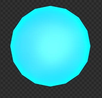
Bioluminescent Organelle (verts: 128);

I weren’t able to really find any close up reference images of it, so I just made it like glowing bulb. Anybody think it should have a more advanced shape (or another color or whatever)?
Thermoplast (verts: 540);
I still have the old Chloroplast if everybody’s okay with it (verts: 386 without the balls in it, 1036 with the balls inside it);

I’m thinking that it’d be better to just replace the balls inside the Chloroplast with a plan with a partly transparent texture, which could probably look the same anyways, and save a lot of verts (the current verts amount with the balls, of 1036 definedtly feels like too much for the way it looks).
Is the current Flagella good enough in your opinions?
I’ve used normal maps on them. Can our current engine easily use normal maps at the moment?
I still need to set up the Ogre Exporter with my Blender on my new computer.
Excellent work @Chizu_Nordenstam; my favorite is the thermoplast. If you don’t mind reading them, I have a few comments.
Overall the shape of the nucleus (including the bumpiness and positioning of the holes) is great; however, I would say that the white nuclear pores detract quite a bit from the overall appearance. Would it be possible for you to make them a color darker than the nuclear envelope?
The predator pilus looks great. I really don’t see anything wrong with it to point out. The color might need a bit more tuning to make it match the membrane, but that’s job and should be as easy as changing the RGB values in the material section (that is, unless you used a texture, then its a bit harder).
This one isn’t so much a suggestion as a question. For the bioluminescent organelle, I was thinking that we could shrink it down a bit and randomly place 3-4 copies of it in each hex with the organelle. Although it might not be worth it to spend time on this if the bioluminescent organelle turns out to be a very minor feature in the actual gameplay.
Same thing as for the pilus—you went the extra mile here. I don’t think it’s possible to make something better than this.
The chloroplast is good, but the polka-dot pattern is bugging me out a bit.
http://forum.revolutionarygamesstudio.com/uploads/default/original/1X/ea8b07b1f98f234b59acd2729cbf54f4c988be4a.jpg
Could you rework it to be similar to the above image? Pretty please?
Again, great job everyone working on the organelles. Next release is going to be epic concerning graphics.
How difficult would it be to have the organelles consist of multiple hexes in 0.2.5 relative to what we have now? If we’re adding the models it’s necessary unless we can find a way around it.
Also are there any new organelle models?
Thanks for your critique TheCreator! ^-^
And working on it Oliver.
This good with the Nucleus? (just inverted the dots texture)
The Predatory Pilus color can indeed be changed easily as you said. I also thought it’d be best having a color like the membrane, though I was not sure if the membrane is meant to have a specific color, or if it’ll be changeable by the player?
About the bioluminscent organelle, if we say we’d do as in your suggestion (not sure what’s more realistic?), would it be best if we had these copies as one model so to say, or is that not necessary?
Still working on getting the Chloroplast texture to look good, as well as finishing the other organelles (haven’t had much time this last week due to school).
Could you try making the colour of the pores for the nucleus a darker shade of purple?
@NickTheNick Do you mean as in not so close to black as now?
Yeah if it’s dark purple now could you try one with a lighter purple?
@Chizu_Nordenstam, great job, it looks so much better now, but I agree with @NickTheNick, you might want to consider making the pores a bit lighter if it’s not too hard. Also, do you know how to export these models into ogre? Since ogre does not support cycles natively, you will have UV unwrap all of your models and then bake the textures. If you want to use a normal map, just bake one as well, or send it to us if you already have it. It is a bit harder to get a material with a normal map working, but it’s possible.
@tjblazer85, how is work on the mitochondria coming along? If you’re done, I’d love to add it to the editor. If not, no problem; I’ll just use the toxin vacuole model as a placeholder instead.
@Chizu_Nordenstam, when you finish the nucleus, golgi apparatus, and endoplasmic reticulum, could you put them in three different meshes instead? The reason for this is that having them separate will allow me to animate them individually and make the golgi apparatus appear separate from the other two pieces (as it should be); secondly, it will be a lot easier to add materials and textures if they’re separate; and finally, it will be easier to add them to the game using the multiple-hex architecture I am laying out right now.
Keep up the great work everyone!
Sorry for the late reply! School’s been pilling up tests. I actually finished the Mitochondria about a week ago. I just couldn’t figure out how to test it in Nimet to see if the textures work. I can give you the file however: https://dl.dropboxusercontent.com/u/137682043/Mitochondria.rar
Hey everybody! I’m fairly new here, but I figured I’d introduce myself a second time by posting one of my models here
This is a more unrealistic, stylized version of the ER and Golgi Apparatus. Let me know what you guys think!