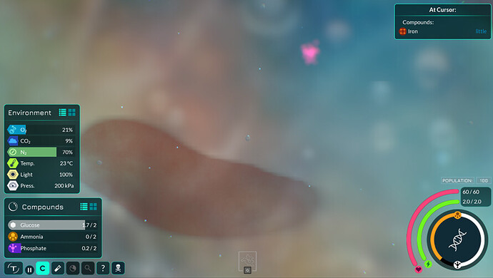
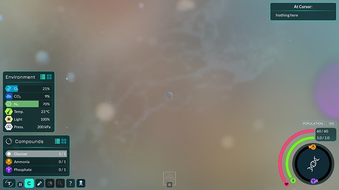
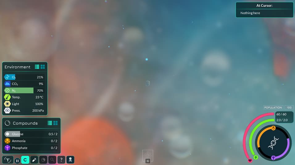
Realized this deserves a forum thread to centralize it’s discussion.
Background
We’ve talked a lot in the past about using blur, fog, and 3D objects in other layers, among other tricks, to add a lot of realism and depth to the visuals of the Microbe Stage. Some of these changes could take a lot of graphics manpower. HH currently has such a feature slotted for the 0.8.x releases.
However I think there are some quick and easy fixes we could make right now that could improve the background visuals a lot until we reach the 0.8.x releases.
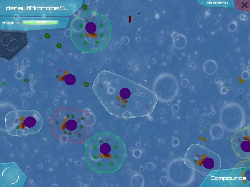
We weren’t very versed in microbial biomes or graphics back then, and had a feeling something was off but weren’t sure what. Eventually we noticed that one of the reasons is that the farthest layers at the back were as crisp as the player’s layer right up front. This made it look like the cells were just floating in the air above a bubbly wallpaper, not that they were submerged in an underwater environment. At the time I created the “Blurred Backgrounds Mod” to showcase how much blur would help.
And it had good reception. But then I left and rejoined the project several times, worked on different tasks, and didn’t follow up with implementing blur. We also had a new set of more detailed backgrounds drawn and added which looked much better than before.
Much much better than before. Lots of variation in bubble sizes and colours as well. One downside though, is that there is still a high level of detail in distant objects, which still gives the cell this airy feeling of looking like their floating through the air above a distant wallpaper. Water would blur the distant objects.
Pitch
And so I think Blur, alongside Fog, parallax, and background 3D objects, is one of the best ways we can achieve depth and realism in the Microbe Stage’s visuals. Creating shaders and filters to apply blur to objects based on their distance to the screen will likely be difficult and taxing on the performance, so for now what if we just pre-blurred the background layers? And pre-blurred any objects we know will always be in the background?
It literally only takes me a few seconds to import any layer into GIMP, and apply some level of blur to it. So it’s a really fast task I could work on to not add work to any other peoples’ plates. Here are the concepts I was looking at to understand how much blur to add:
Concept
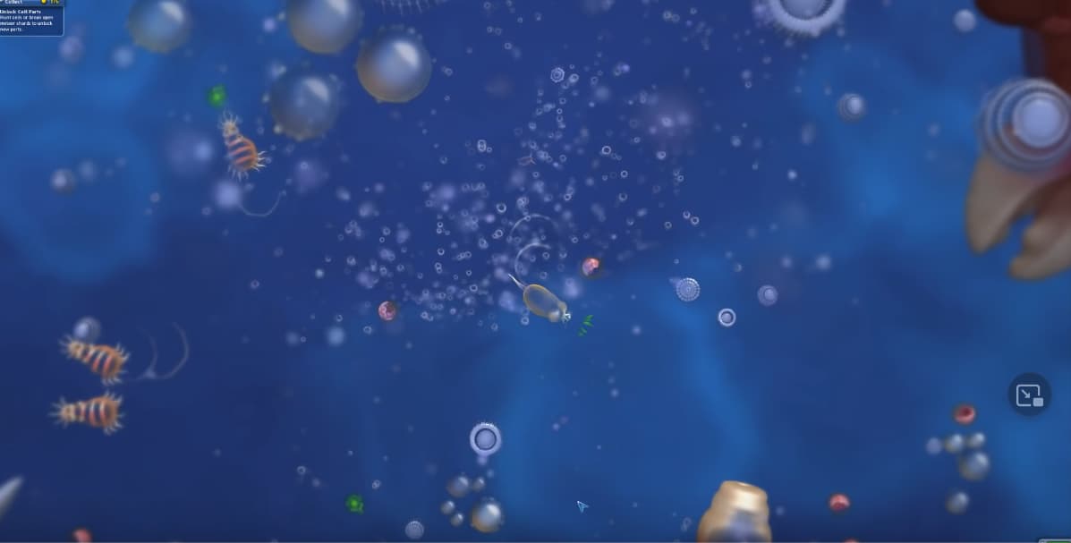
First, of course, Spore. Notice how the most distant objects are the most blurred. In Thrive, this would be the base background layer at the very back. Another thing Spore does well is that as you get larger, the camera zooms out, but the blur level of the background doesn't change, so it actually makes the looming distant objects slowly become more and more visible, showing that you are approaching macroscopic size and leaving the microscopic world.
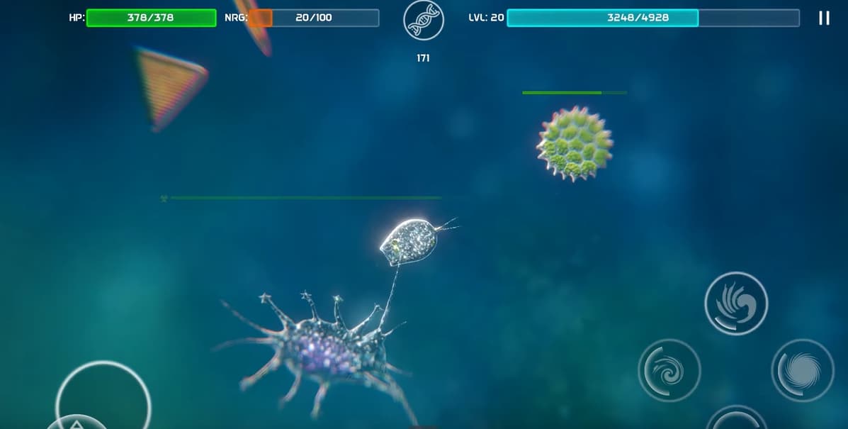
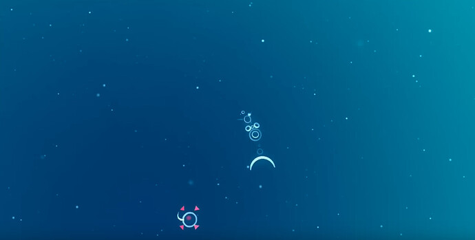
Next, flOw. They go a step further, they don't even have objects in the background. They instead just have large swaths of colour that blur into one another. This gives you the impression that the ocean is so deep below you that there are not even any visible objects. This could be a really good technique to add depth to the ocean surface biomes, as you will be looking down into the abyss of the deep ocean below you.
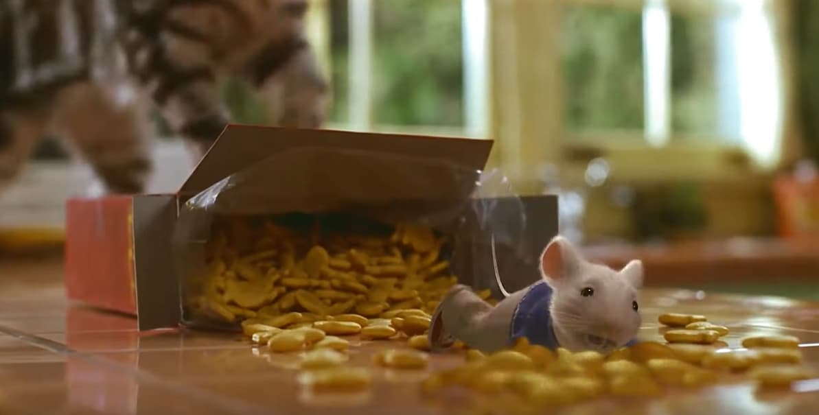
Next, surprisingly enough, Stuart Little. Just to show you that Graphics and Animation teams even outside of the microbiological setting consistently use blur and focus to show differences in scale and distance.
Testing
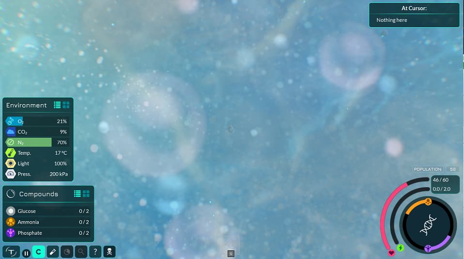
To accomplish the blurred look I loaded up the background images of the Tidepool biome into GIMP and applied a 20.0 point Gaussian blur. I applied progressively less to each layer above the far back layer, and this was the result:
I created a Draft PR so that others can test these changes. However, I made a mistake in the process and accidentally undid the blur to every layer except the far back, so only the far back layer is blurred right now. I also used a different tool to blur (which prevents tiling issues) which I think was a lot stronger. This is what it looks like as a result:
You can test the PR here:
Please let me know what you think. Based on your feedback, I can change the level of blur. I can also change how I blur the layers between the far back and the player.
