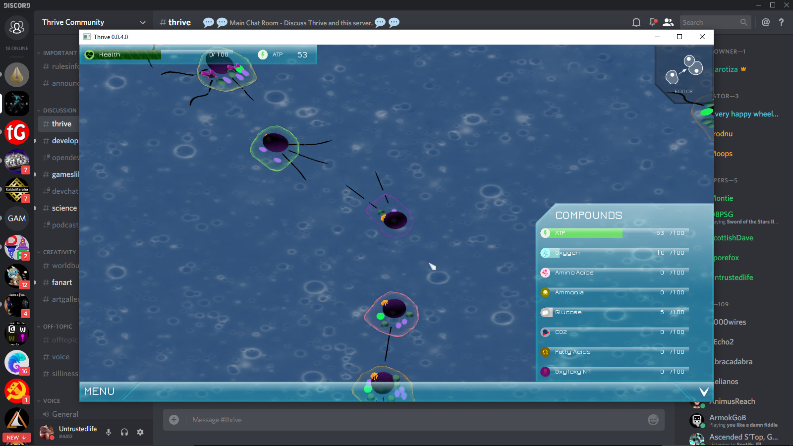
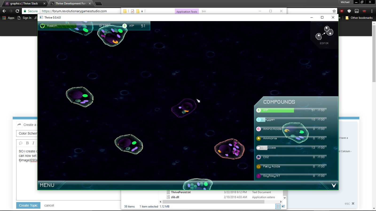
So i created this because we were clogging up slack chat with tweaking suggestions for the color scheme (we can now set brightness, saturation etc. of cells)
So what are peoples thoughts? Should we wait til we have lights to tweak these numbers more should brightness vary by biome? Should it be more or less cartoony? WHo knows.
SHould brightness be reduced etc?
Right now it desaturates them down to 75% saturation, (as suggested by @NickTheNick). But we have also tried 100% saturation, half brightness etc.
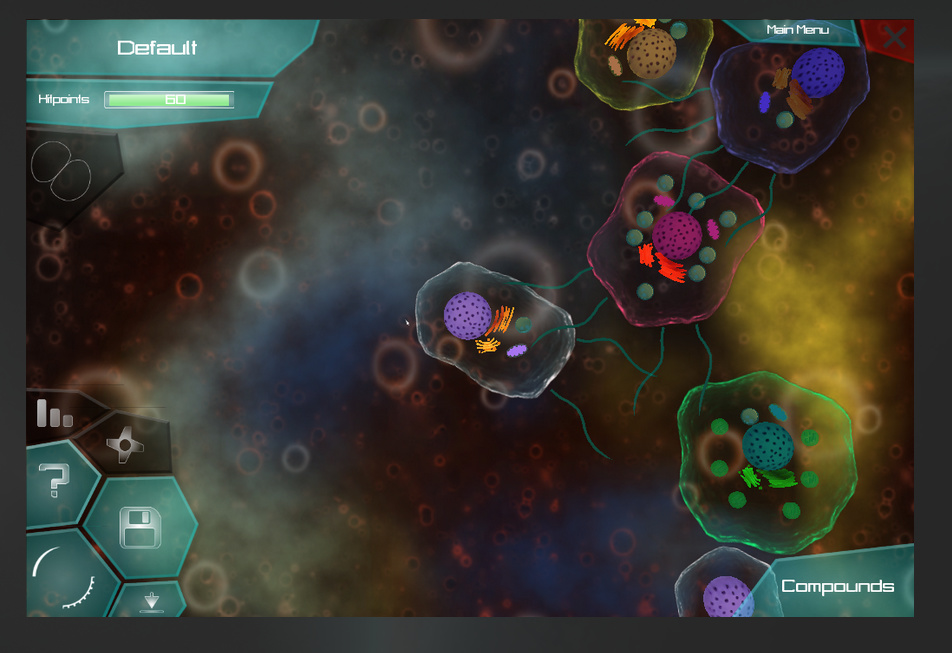
This reminds me of something that I ask myself from time to time: There‘s a series of wonderful microbe stage concept art floating around, this is one of the images:
Here the organelles of the cells are only faintly visible and don‘t really have their own coloration. In addition the cells are almost entirely opaque. While the last bit might be less realistic than transparent microbes, this look is in my opinion aesthetically superior to our current look by a mile. Because like this one cell has an uniform coloration it feels much more like one unity, one thing.
As it currently stands a cell feels rather like a collection of things rather than one thing.
Add to that the fact that most cells consist of more or less the same few organelles (nucleus, golgi apperatus, mitochondria and vacuoles are essential) and cells don‘t really differ enough from one another.
Because of these two factors the current design isn‘t only unaesthetic (imo), but also unpractical from a gameplay point of view. A look more akin to the concept image would help the player to differenciate between NPC species and quickly identify them once he knows which species to hunt and which to flee from.
This isn‘t a top priority, but I highly suggest we move more towards the look in this image than what we currently have. I‘m not saying we should make it look exactly like on this image, but maybe something in between.
What‘s the consensus about this? Is this already planned? Or do you want to stick to the current look?
I agree, I think microbes should be limited to having only one or a small handful of colors so they’re more easily identifiable and feel like one thing. I’m not sure if I like the opaqueness of the cells in the concept though.
I really like the style of this video, and I think Thrive would look a lot better if it mimicked it more closely.
I think there are three main things to make the membranes look good and match the microbial aesthetic:
Psuedo-randomness. Textures with organic order, e.g. Perlin Noise, Voronoi Textures (useful for GUI) and real-world organism texturing.
Uniform sharpness. Texture should contain sharp/bold, medium sharpness or soft edges only. Try sharp edges first and blur to desired degree. Individual objects always have uniform focus, objects blurred depending on distance from camera like microscopic image.
Light, desaturated colors. Matches real microbe pigmentation, i.e. mostly transparent (such as organelles).
Realistic color types. Avoid purples, pinks or yellows (not found in nature). Focus on blues, greens, reds and pale oranges like this color palette (accented in white). Exceptions can be made where distinction is needed, e.g. a purple nucleus.
The membrane should cover the internal organelles. This would be represented by having the organelles slightly tinted the colour of the membrane.
Lighting.
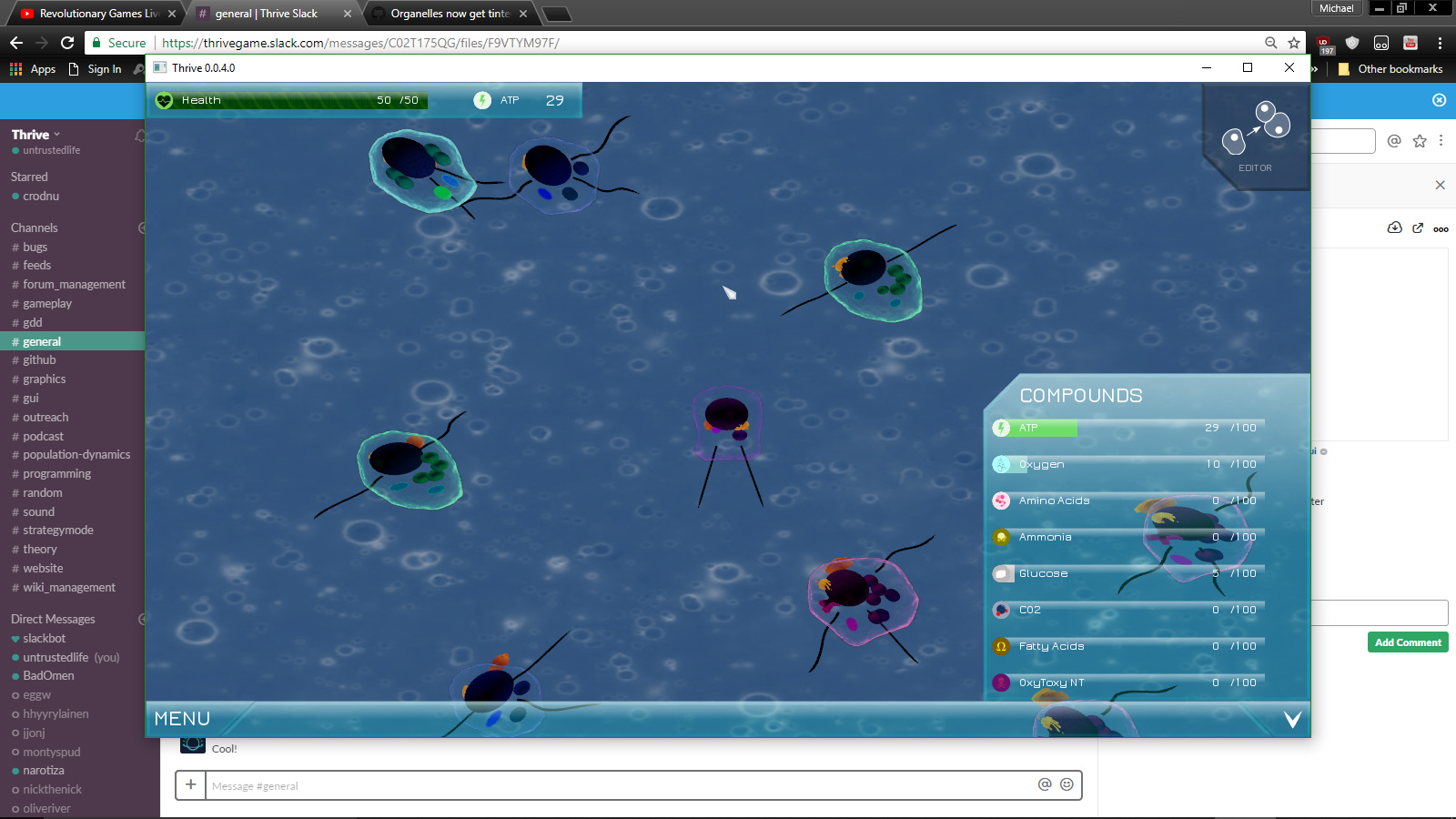
This picture from the earlier release shows the colour palette and internal tinting perfectly.
@NickTheNick yellows are most definetely found in nature, like in corn, wheat, lemons, etc.
pink and purple are also found in nature, but are rarer (lavender for example)
My only suggestions are for the models themselves: brighter nuceli, flagella and properly rotated organelles. I think we’d have a better understanding of what needs changing colour-wise with those changes in place.