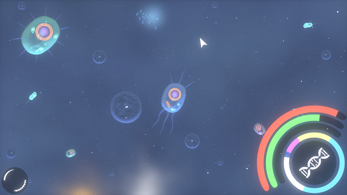
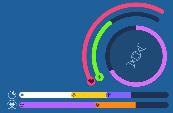
For those of you not keeping up with the conversation on Discord and Slack, some work has been going into revamping the GUI into a more minimal and streamlined layout.
The basic premise of it is that the Health, ATP, and compounds be shown as three bars, all grouped together with the reproduction button and a ring that represents reproduction progress.
Minegamer’s concept also shows the idea of having the other menu options (statistics, Thrivepedia, menu) be on the bottom left. The Thrive button would by default be off-screen, but if you hover over that corner with your mouse the Thrive button slides in from the edge. Clicking on it makes it expand to show the options and taking the cursor away leaves the expanded options there until you close them again.
The concepts are missing elements to display environmental features like temperature, sunlight intensity, etc.

