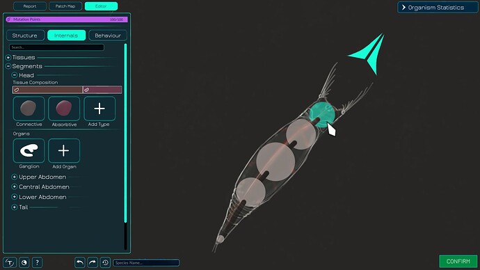
I thought about Bucklys suggested macroscopic editor interface and overall I really like it. But I have one important gripe with the internals tab: In my opinion the left panel feels a bit empty and devoid of information when it only shows the tissue types. In my opinion it could be better utilized by integrating some information about the metaballs into it instead of displaying these metaballs data in a pop-up menu.
As I understand it, this proposed metaball context menu would pop up in front of the organism. imo this is suboptimal as I think it would be better if you see the metaball you’re editing while doing so.
I therefore propose that the left panel includes a category called “segments” (I think this may be a more intuitive term for metaballs to use in-game). This category contains all the metaballs which the player can name to keep track of their function/position. As you can see, in my example the player has named them Head, Upper Abdomen, Lower Abdomen and so on.
Each segment section, when opened in the left panel, would include a list of that panels organs, as well as the tissue types which are contained within that segment but aren’t part of an organ.
The left panel functions much like a set of spoilers within spoilers which can be opened and closed as needed, much like many of our menus function. But there is an alternative way to quickly jump from segment menu to segment menu: Clicking on a segment of the organism will bring you straight to that segments menu and close all other segment menus.
Clicking on “Add Tissue Type” would send you to the top of the left panel where you can select a type to place in this segment from a library of all tissue types in the organism.
Clicking on one of the organs would open an organ pop-up window. This organ pop-up would open to the right, in front of the organism. This is consistent with the idea I layed out before: When you click on the metaball on the right side of the screen, the corresponding menu opens next to it, on the left side of the screen. When clicking on an organ on the left side of the screen, its corresponding menu opens next to it, on the right side of the screen.
I hope that I explained my suggestion as clearly as possible. I will sketch up a organ menu pop-up if needed. If I have time I may also do a simple animation of how clicking on a segment would open that segments menu and so on. Some of these things may be more easy to explain as a series of moving images rather than some rambling paragraphs.
(Btw @Heath I borrowed your critter for this concept muck-up, I hope that’s ok)
