Carrying over some interesting discussions we’ve been having recently on the Discord to here about how to make the information in the Microbe Editor more presentable to the player.
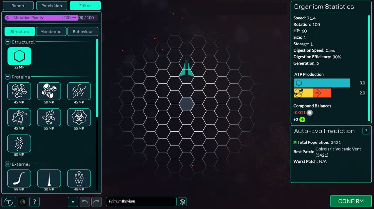
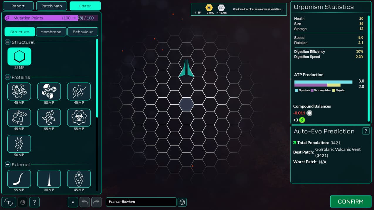
For reference, here is what the current editor looks like:
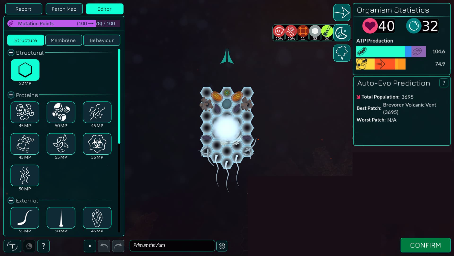
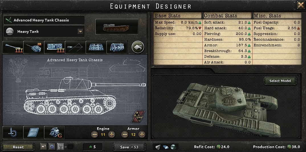
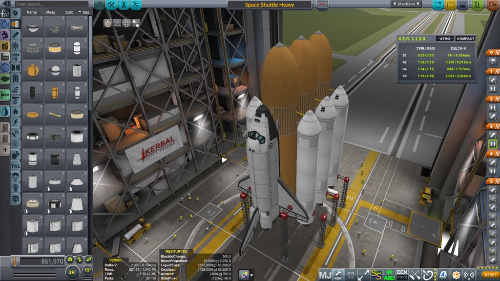
I personally think that, although I also opt for an icon heavy focus for the interface wherever possible, this is actually one of the only areas I think we need to use a lot of text. I think we just have too much information to present, with a lot of traits that are hard to represent via icons. Plus it will be many icons at once, which can be visually jarring and actually harder to interpret than a list of words. For reference, these are some other games that have “editors” and how they show their information panels.
I tried to follow the conventions used in other games to make text more presentable, namely:
Left aligning the trait names and right-aligning the values of the traits
Font colour difference between trait names and trait values.
Grouping traits into similar categories.
I can mock up a text+icon concept later and post it. I don’t know how to make a good looking icon-only concept however.
Once I get the dev environment set up, I have some experience working with the organelle tooltips from before so I could take a crack at implementing some of these different designs to see how they’d look in-game.
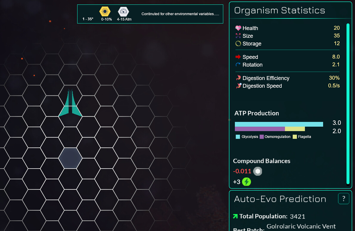
From what I’ve seen, when you have similar stats like Digestion Efficiency and Digestion Speed, a good way to show their relatedness is to have the same base icon with differing smaller icons overlaid on them. So the Digestion Efficiency icon is a stomach with fluid in it, and the Digestion Speed is the same icon but with a small clock in the top right corner. This is a trick you see a lot in Paradox games where there are tons of related stats that need separate icons.
I also came to the conclusion that having text in addition to a small icon would be the best of both worlds.
I‘d suggest keeping the icons somewhat in line with our existing icons.
Likewise to your digestion example, speed and rotation speed would also have to be visually related. But rather than having the same icon and then an overlayed different icon, I‘d suggest just making the icons the same color and have the speed icon be a straight arrow and the rorotation icon be an arrow going in a circle.
Yeah was too lazy to find the current icons for Health and Storage, but would definitely be the same ones as we have (though I think it would look better with the coloured circular backgrounds removed).
And yeah I agree that would be good for movement and rotation.
This seems perfect, I’m happy with this. It looks like it should leave plenty of room for runaway text in the event of other languages, the icons make each stat stand out and immediately recognizable, and the dividers help create a more comprehensive list.
Just wanted to add on a bit, having some icons, even if they aren’t the most aesthetically pleasing, have the effect of creating that extra layer of clarity which is usually very helpful for players with some ADHD, or even if they’re just tired.
To add on to one of the examples you brought up, in Hearts of Iron 4, in most competitive multiplayer mods they actually add icons next to the tank and division designer stats simply because it’s more comfortable on the eye.