I’ve started work on some editor GUI drafts too.
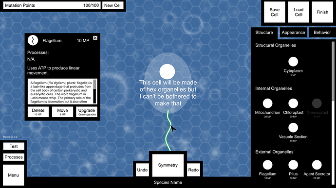
This image shows the editor GUI, the info panel and the structure tab.
- I tried to keep as many elements as possible in similar positions to the environment to keep everything intuitive. The menu is in the bottom left, finish is in the top right (as editor is in the environment), processes is above menu and the ATP bar is replaced with the MP bar. Suicide is also replaced with new cell, since they kinda sorta have the same function if you think about it (but not really).
- There’s a hex grid over the background for the structure tab only. With the structure tab selected, the cell will be made of hex grid organelles like those in the game now.
- Save and load cell need to go somewhere and given there was free space next to finish I put them there. I’m not satisfied with it but I’ll leave it to others to give their opinion. Bear in mind all the proportions and button sizes will be fixed so everything in the top right lines up properly.
- Clicking new cell, save cell or load cell will bring up another panel. In the case of new cell, it will tell you the MP cost to delete everything you already have, save will let you save and load cell will allow you to load a cell if you have enough MP to change your current cell into that one. That feels a bit confusing and unfeasible now, so I think new cell and load cell will both be deactivated when not in the free editor.
- Processes here opens a similar panel to that in the environment, except you won’t be able to switch organelles on/off or repair them.
- Undo, symmetry and redo work in exactly the same way they do in the game now.
- Clicking the species name allows you to type a new one.
- Test removes all the GUI except for a return button and allows the player to swim around with their cell in a petri dish.
- Clicking an organelle in place on the cell or an organelle in the list will bring up the info box. The player can grab the top of the info box and move it around, or close it with the cross. It shows the icon, MP cost, processes, basic description, detailed scientific context (with scrollbar), and options to delete, move or upgrade an organelle.
- Choosing to upgrade an organelle brings up the upgrades system described here, which is a whole other bag of GUI demons.
- On the right are the three main tabs. In structural mode, organelles are listed with their icons and MP cost underneath their category.
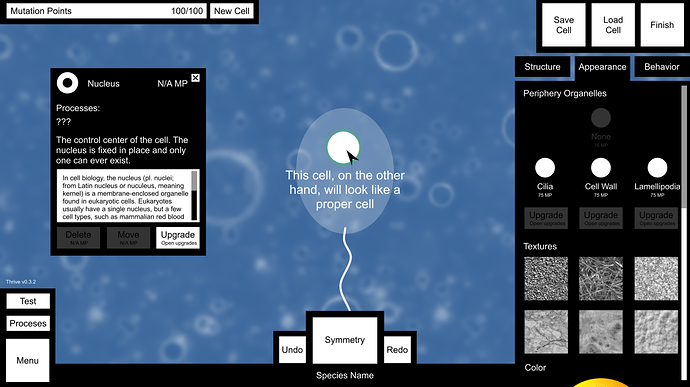
And here’s the appearance tab, with bonus info on the nucleus.
- In the appearance tab the hex grid vanishes and the hex cell is replaced by what it will look like in-game with organelle models and membrane.
- The nucleus can’t be moved or deleted, so those options are deactivated. Can it have upgrades? I also have no idea what processes take place within it.
- Periphery organelles sound like they should go under the structure tab, but the trouble is they’re only visible once a procedural membrane has been drawn. Perhaps there could be a border around the hex organelles in the structure tab instead to represent periphery organelles? In that case they can be moved to structure. At any rate, only one periphery organelle can ever be chosen, but each can be upgraded.
- Textures change the membrane texture of the cell.
- Colour shows a colour wheel where the player can choose, unsurprisingly, their cell’s colour.
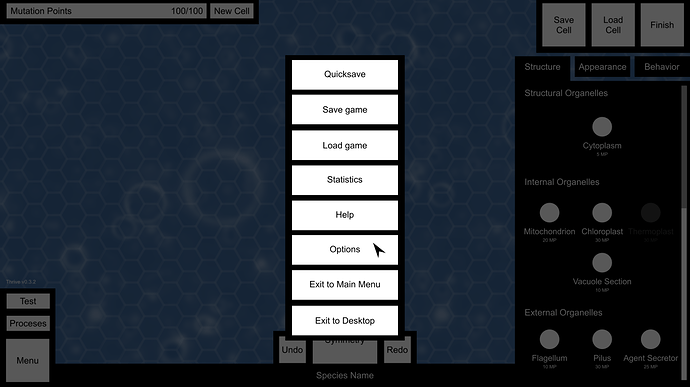
And here’s the menu, with all buttons full width this time.
I honestly still don’t know exactly what the consensus on the behaviour tab is, so I’ve left that out for now.


