A continuation of discussion from these places:
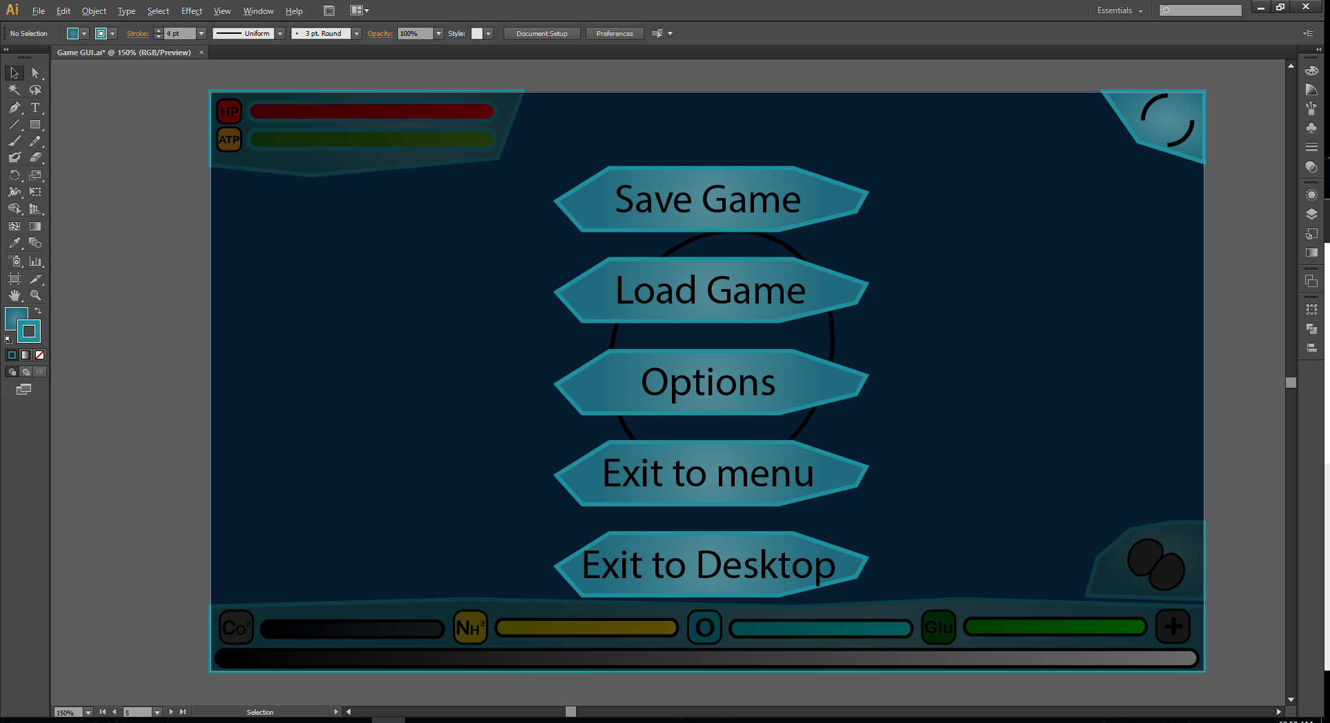
So…it seems we need a new GUI, because my old one sucks. Well, it doesn’t suck entirely, because some people like it, although I think they’re more attracted to the art style than the placement and design of individual buttons. Read my reply at the fourth link above if you want to know more.
There are a couple of different opinions floating around on what actually needs to be changed. Some people think we just need a fixed text box, others say the base design is nice but the button placement is “horrid”, and I frankly can’t stand to see any of it stay (except the main menu, because I quite like that).
I propose that, for the upcoming release, we stick to fixing the help text box. For reasons I’ll explain in a moment, only I’m actually able to do that, and it should be a pretty quick fix (should). Afterwards I think we should focus more on gameplay for the next set of releases (since the membrane and organelles should be included by then), but it wouldn’t hurt to slip in a better GUI at some point too.
The GUI exists in two locations: the first is a set of images and Lua files determining how it looks and functions in-game; the second is the actual file I used to construct the shapes, which I still have. Editing the exported bitmaps (imageset) is possible, but won’t lead to good results. To actually change the shape and appearance of the buttons, you have to edit the base file, because it consists of a set of vector shapes with applied effects like transparency and bevel. To do that, you’ll need either the software I used (Xara Designer) or something like Photoshop, because I believe you can export from Xara and edit in the same way with the same layers and vectors intact using Photoshop. Paint.net won’t cut it.
That leaves three possible options. I could make the changes myself (likely based off of others’ ideas, because I obviously can’t be trusted to make a good GUI on my own), someone else with the software above could make the changes, or the whole design could be scrapped and remade in another way. One of these is considerably more drastic than the others, but that’s actually what I was imagining would happen once we got someone on the team who knew what they were doing in regards to 2D design.
With that out of the way, we should probably start designing the next GUI iteration. The updated help panel will just be a rectangle-ish thing, so that’s easy, and the short term is sorted. Other than that…
There are a number of GUI elements which need to fit somewhere in the various scenes. I’m basing this on the final GUI to accompany the final game, because right now we have a few mechanics which will be replaced.
- All
- Cursor
- Tooltips
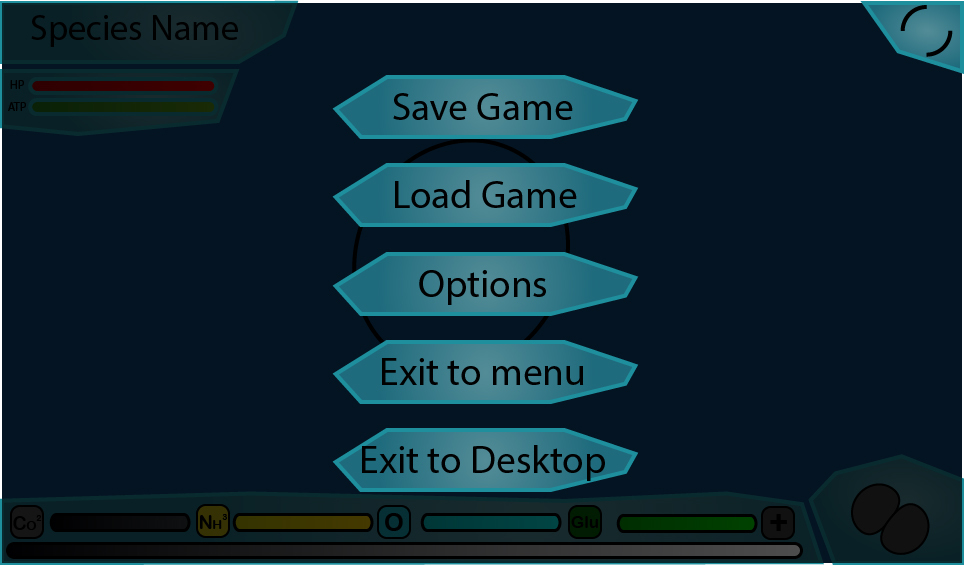
- Main menu
- New game
- Load game
- Options
- Tools
- Extras
- Credits
- Exit
- Version label
- Thrive logo
- Environment
- Species name
- Editor
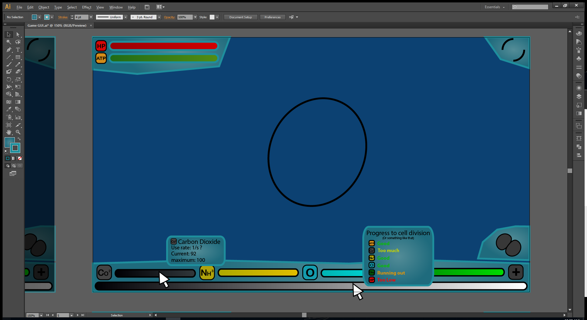
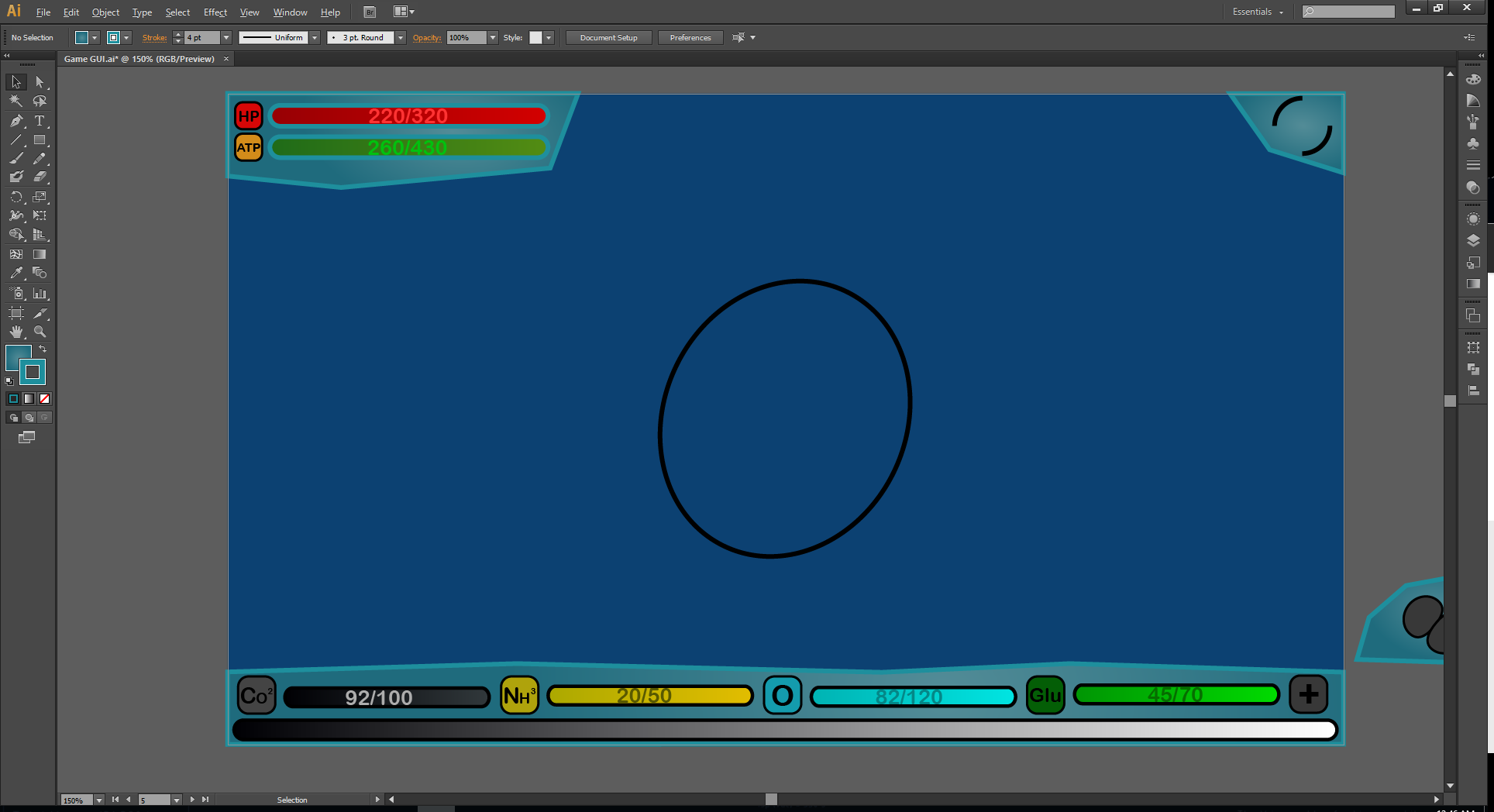
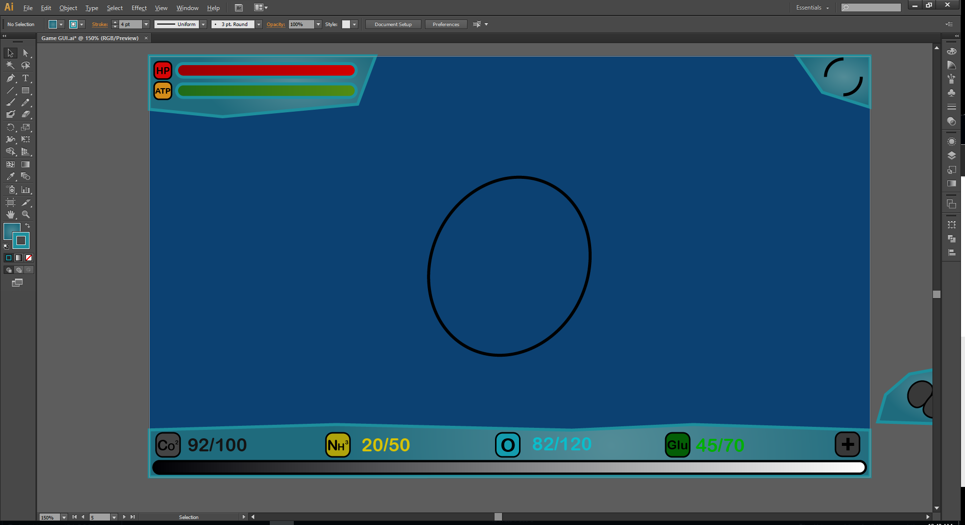
- Compounds list (with radar charts)
- ATP meter
- Locked-up compounds/reproduction meter
- Save (and save window)
- Load (and load window)
- Help (and help window)
- Options (and options window)
- Statistics (and statistics window)
- Pause menu
- Exit to main menu (and confirmation box)
- Exit to desktop (and confirmation box)
- Fossilisation
- Organelle priorities
- Suicide button (and confirmation box)
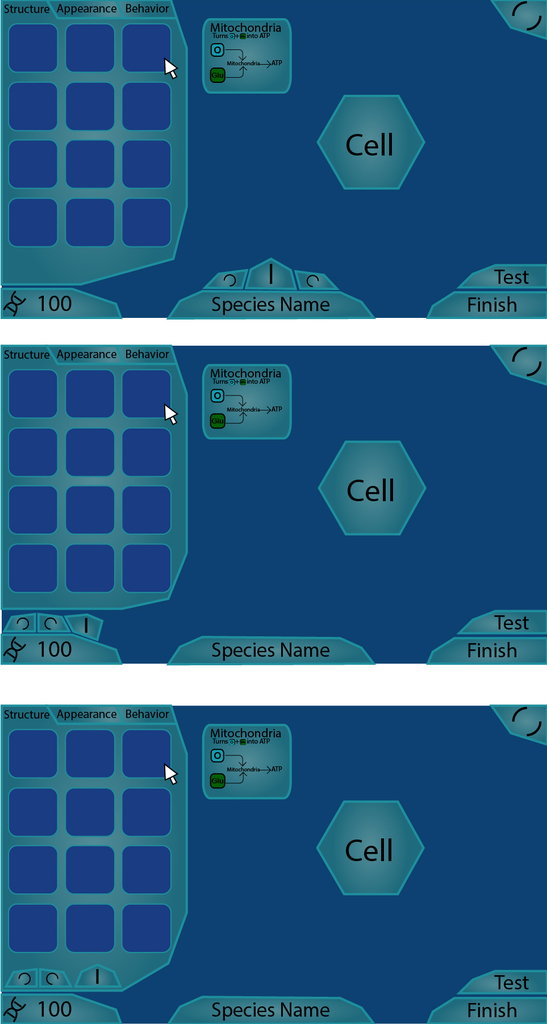
- Editor
- Secies name
- Finish
- New microbe
- Save (and save window)
- Load (and load window)
- Help (and help window)
- Options (and options window)
- Statistics (and statistics window)
- Pause menu
- Exit to main menu (and confirmation box)
- Exit to desktop (and confirmation box)
- Mutation points
- Symmetry toggle
- Undo
- Redo
- Structure tab/scroll panel
- Appearance tab/scroll panel
- Behaviour tab/scroll panel
- Test tab
- Setup page
- Play with chosen settings
- Exit to main menu
- Difficulty
- Experience level
- NPC evolution rate
- NPC evolution variance
- Natural disasters
- Compound concentration
- Start location
- Mutation budget
- LAWK toggle
- Loading page
- Play with chosen settings
- Exit to main menu
- Saved item list
- Saved item info
- Options page
- Apply chosen settings
- Exit to main menu
- Resolution
- Volume
- Difficulty
- Experience level
- Controls
- Autosave frequency
- Extras page
- Exit to main menu
- Concept art gallery
- Music list
- Tools page
- Exit to main menu
- Free edit
- Debugger
- Loading screens
- Loading animation
- Image of player cell
Bear in mind this list is based on everything which will eventually be in the game (and I’ve probably missed many things). Still, there’s a load to do. I’ll explain what something does or what it should look like if you ask, but you can search for anything you’re unsure about here:
http://thrivegame.wikidot.com/gdd-microbe:game-screens
Finally, a word on the art style. I like the transparent blue with green highlights design we already have, but there are a lot of problems with the way it’s been implemented. There’s a lot of dead space, leading to it looking unnecessarily large on small monitors. The shapes are a bit haphazard, and some important buttons are hidden while unimportant ones are displayed in full view. Again, see my reply to the fourth link at the top of this post for a rundown of everything wrong with it, and what to avoid if you’re desiging something new.


 , so we need a system that allows for all the different things, but if you can think of something better, go ahead.