I’ll just pop in to back @meandmy10 up: forget about CPA, focus on discussing the parts of the UI that actually matter right now, please.
@meandmy10 Anymore progress to report on this? It’s not critical but it’d be great to see some updates.
Yeah sorry i know its been a while and i have been meaning to do an update but I’ve been really busy with school stuff because schools starting soon and I’ve got a lot of stuff to organise, between procrastinating and getting other things put on my table that i need to finish I’m running out of time to finish it so i can’t really work on this at the moment.
anyway give me one, two weeks and i should have some time by then. also next thing I’m working on is the options menu so anything that’s not on a normal options menu that needs to be included just post it here and i’ll get back to it. thanks
@meandmy10 Ok here’s a little more on what I was thinking.
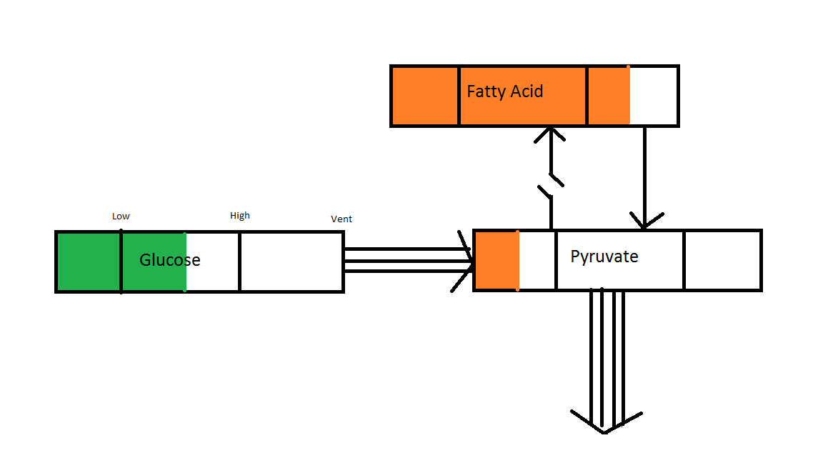
Here’s a picture. Basically the amount of compounds is displayed by a bar that can fill and empty inside the box. It goes green if it’s in the right range, amber if it’s outside this and red if it touches the ends (it could even go deeper amber as it gets towards the edge). The number of organelles that can do the process is the number of lines in the arrow. So there are 3 that can turn glucose into pyruvate (so 3 cytoplasm) and 1 that makes Fatty Acid. You can control the process by clicking on the link. You can see the process to make fatty acid is off but the process to use it is on. This is a good idea because the level is high.
Anyway the CPA system will handle all this automatically (turning processes on and off when compounds are needed / abundant) but this would let the player have control too. It would also make it easy to see which compounds are low. Any compound box that is clicked on gets added to the quick menu which is always visible at the bottom of the screen.
It’s just an idea. Take it or leave it I really don’t mind.
I think that could work very well. Instead of turning on and off organelles as was planned originally, controlling the actual processes is more intuitive. Instead of being part of the pause/escape menu, this could open up when you click on the row of compounds at the bottom of the screen (according to the new GUI concept). Furthermore, I feel like this diagram could greatly benefit from actually having the input compounds (ammonia, glucose, etc) be controlled. So you could stop your cell from absorbing ammonia if you want and you could click and drag the low high and vent thresholds. You could also have the outputs, such as flagella/movement that you could turn off (so deciding what process uses up the compounds).
Yeah that all sounds cool.
I love this idea, how to make it work for every cell is the next question but if we would get this to work it would be great as its a good way to show the player how everything is working, though i do fear this is something that nobody will know about or would be a little too complex, anyway i’ll think about that when I’m doing the designs in by the looks of it a few days from now if all goes well. I’ve also got to mull over some of the details for a while too… there is so many ways of doing this I’ve just got to work out the best way… anyway i’ll keep you posted.
Cool.
I think a good way of making it work for all cells would be to have all the boxes always present but just have some with no lines. Like if you can’t make glucose then there is no arrow into the glucose box etc. The top of the chart will always be there (like making protein and DNA) because every cell has to do that to reproduce.
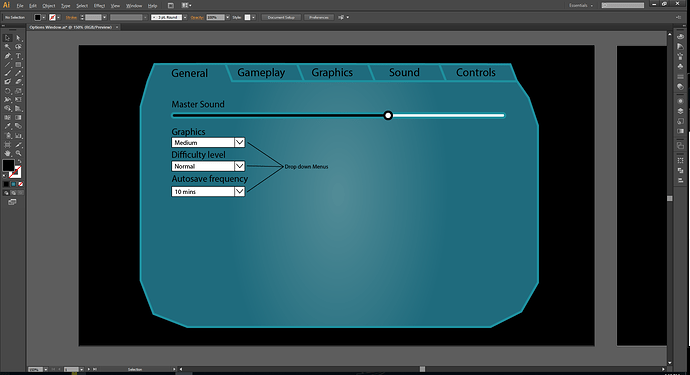
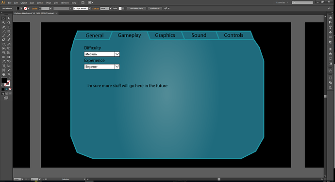
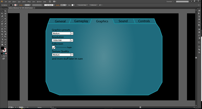
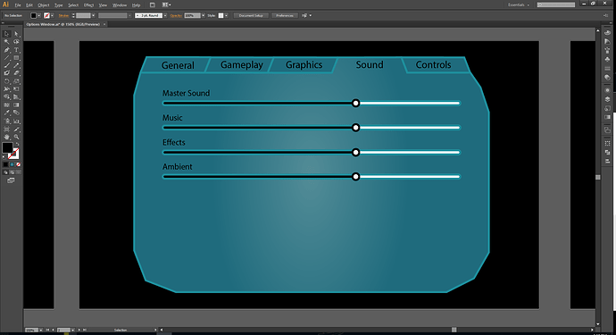
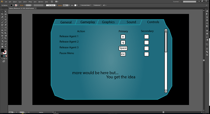
so I’ve FINALLY made some progress, I’ve designed the basic layout oh the options menu and as this is a incomplete game more stuff will be added but you get the idea.
I’d just like to remind you that colours and designs are not final and all I’m really showing here is the layout.
This is perfect in my opinion. It would be amazing if we could just get this in game. I honestly don’t see what you could do better.
I agree - it covers everything it needs to logically and concisely. I’m not taken by the shape though - I think we should probably step away from the completely organic look of the current GUI, seeing as that isn’t working.
I think it’s a bit too late to forgo shards, plus it looks really nice.
Well nothings really officially iconic yet. The first stage is still in heavy development and subject to radical visual changes. The shard idea has been around since before the game actually got into heavy development, but I feel like it’s being held onto for mostly nonstalgic reasons and maybe as a way to keep ~scio in the project despite his absence (he did come up with the shards no?) Correct me if I’m wrong
Don’t get me wrong I love the shard idea too, but as Oliver said, it seems difficult to make it work properly. We keep trying to make these uniform buttons that look the same (main menu buttons, option menu concept, parts of the gui), but the shards are supposed to be organic no? Doesn’t that call for a bit of chaos and variation? If we can’t do that I say we try something new. There’s still plenty of time to find something that works well.
In fact the consensus was (with ~scio’s vote as well), to forego the shard theme in favour of minimalism, which has always been the primary goal of the UI, but was kind of put to the side for the period that people were on board with the shard theme idea.
It’s up to meandmy what he wants to produce. I would suggest that we stick to minimalism for the future, but I think what he made looks very good and if he wants to use the shard theme by all means go ahead. The ultimate goal is, however, a sleek and minimalistic design.
i’d like to point out that i’m making these for the basic layout, not the designs, i’ll make up some different shapes and ideas i come out with later for you guys to look at later, but for the time being I’m using the shard design to do the layout because its easy to make in illustrator.
also i had a glance at some of the other discussions and do we need to change the hp bar and merge it to the reproduction so then it would start ~half way and as the cell gets hurt it will go down and as it ‘grows’ it will go up?
I personally like the shard design, but so far I love all of your concepts, so I trust that you’ll end with something great.
I am against merging the HP bar with the reproduction bar. They show very different things and it will be very unintuitive to the player. Plus, health and reproduction, albeit related, are still very different things, so we definitely do not need to merge the two.
Final point, it might make sense to separate out the ATP compound from the bottom of the screen with glucose, oxygen, etc. and put it below the health bar. With the new compound system, the level of ATP should stay relatively constant as long as the cell is getting all the necessary nutrients. Separating it out will, first of all, draw attention to it (and ATP is fairly important to be noticeably different from all the other compounds) and will also show the player why he cannot move/health is going down/proteins aren’t being synthesized.
Since I’ve got some free time coming up and need to find something useful to work on for Thrive, would you mind if I helped with the GUI designs? If possible I’ll try to rebuild the new GUI from the ground up using your concepts and implement it into the game. Hopefully I’ll do a better job of it than before. If you’d rather stay in charge of it, fair enough.
Is there anything pressing people want changed about the GUI? Aesthetic, layout, icons, etc. Don’t be afraid to be brutally honest, since I’ve abandoned all attachment to the clunky current version.
Go for it, all of those designs i made was for layout so use them as a template (but by all means if you think there is a better solution show us), it would be nice to see them in action and after that we can just swap out the textures whenever we want later if we change the design.
We want to work on layout first as the design and look of the game will change throughout development so there is no point worrying about fine details, although that said the overall look of the game (for the cell stage anyway) is not going to change much from what it is now is it?
Note: so apparently i wrote this ages ago and never sent it…
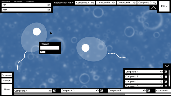
I’ve started work on creating a new GUI from scratch. So far I’ve ignored anything artistic and focused purely on components and layout, so all the drafts below feature boxy black and white buttons. More interesting shapes can be applied at a later stage.
Here’s my proposal for GUI layout on a 1366x768 display, relatively small but not the smallest possible.
-
The HP and ATP bars are in the top left corner as @meandmy10 proposed. Each is labelled with its name, current value and maximum value for this generation. One thing I’m unsure about is whether there theoretically is a maximum amount of ATP, since it isn’t stored anywhere. If that’s the case, a progress bar can’t be used.
-
Above these I’ve placed a few pieces of inconsequential information, such as the version number, stage and species name, plus any other similar data anyone can think of. I know everybody was against keeping the species name, but I quite like the idea of having it on the screen, though this time far smaller than in the current GUI.
-
Across the top is the reproduction meter. From what I can gather and remember, there are certain compounds used exclusively for reproduction and repair (such as amino acids), so these will be spaced in a line to give an at-a-glance understanding of how close the player is to the next generation. Are these types of compounds stored anywhere? If so, the bar length will be maximum storage capacity with the amount needed to reproduce represented by a line somewhere in the bar. If not, the bar length will be the amount needed to reproduce. The arrow at the right of the reproduction meter hides it (see the image below for what it looks like when this happens).
-
In the top right corner is the editor button. @NickTheNick is all for having it as purely a hotkey, but most of us seem to disagree, so it can be both a hotkey and a button. Until the required compounds are collected, it will be greyed out.
-
I’ve included a basic fossilisation panel, which isn’t permanently on-screen. It appears when the player clicks another cell (or maybe just their nucleus?) and is fixed to a point in the screen until the player clicks somewhere else. Or it could have a close button.
-
The bottom left still features the menu, but it’s considerably stripped down from its current version. Clicking it pauses the game, creates a grey filter over everything and shows the pause menu (see the image below). Something we haven’t really discussed with relation to the GUI is the suicide button, which kills the player’s own cell. There’ll have to be a confirmation box to prevent unwanted suicides. I’m wary about placing it so close to the menu for that reason, so if you have better suggestions I’m all for them.
-
Above the suicide button is the processes button. I think @tjwhale’s proposal for a processes display is clever and intuitive, but it’s far too big to fit on the main GUI. Instead, I propose that clicking the processes button pauses the game and shows a display of all compounds, processes and organelles in the configuration tjwhale suggested across the whole screen.
-
I’ve messed with meandmy10’s idea for compound representation a little. On the right hand side is an expandable panel (controlled using an arrow similar to that for the reproduction meter) listing every possible compound, current stores and total storage space. There’s a scroll bar to the right to navigate. Beside each is a checkbox with which the player can select the compounds they’d like to have displayed on-screen at all times. Those selected are copied to the lower bar, with a horizontal scroll bar to navigate if there are too many to display on-screen. Each can be hidden again with the checkbox. Thinking about it, there are two things about my design I’d changed already. The checkboxes aren’t needed since the player can just click a compound bar, and it might be useful to add a rescaling bar below the scoll bar so the player can optionally change how long the compound boxes in the lower bar are if they want to see many at once.
Here’s what happens when you select the menu button (with bonus reduced GUI in the background thanks to the two arrow buttons):
-
Quicksave is the save system we have now, where clicking it creates an un-nameable save file. In the future, this will sit alongside the proper save and load options, each opening a new menu over the top of the screen.
-
Statistics should show all the interesting CPA graphs and evolutionary lineages (think the evolution tree in Species: ALRE). Again, another menu should appear. This is really an option for the more dedicated players and isn’t relevant to gameplay, which is why it’s now hidden within a click.
-
In the future help should give players the option to replay the tutorial or read some documentation on various compounds, organelles and environmental features.
-
Options is options.
-
The two exit buttons are pretty self-explanatory. I’ve included two since that’s the convention for some games, and it helps for debugging to have an option to quit the game entirely with as few button presses as possible.
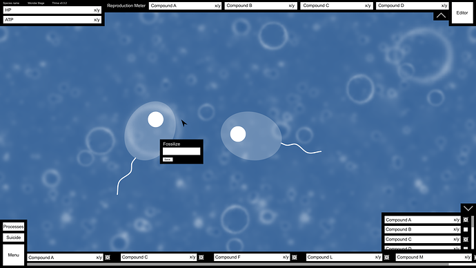
And finally, here’s how it looks on a 1920x1080 display. Not the biggest, but pretty big.
The ATP denominator could be a floating number calculated as your current ATP needs, while the numerator, representing current ATP turnover, only drops below it when you can’t fulfill your current ATP needs.
Yup.
I’d suggest flipping the arrow direction when the meter is hidden.
I’d suggest we also allow you to drag the compound bar sideways to scroll, unless we’re considering using the dragging action to add and remove compounds from the bar.
As for the design style, I think I actually kinda like this kind of simplistic, not-overly-decorated style. If we just made the buttons bluish and translucentish like the current gui but didn’t do any fancy patterning or shapes I think it would work very well.
