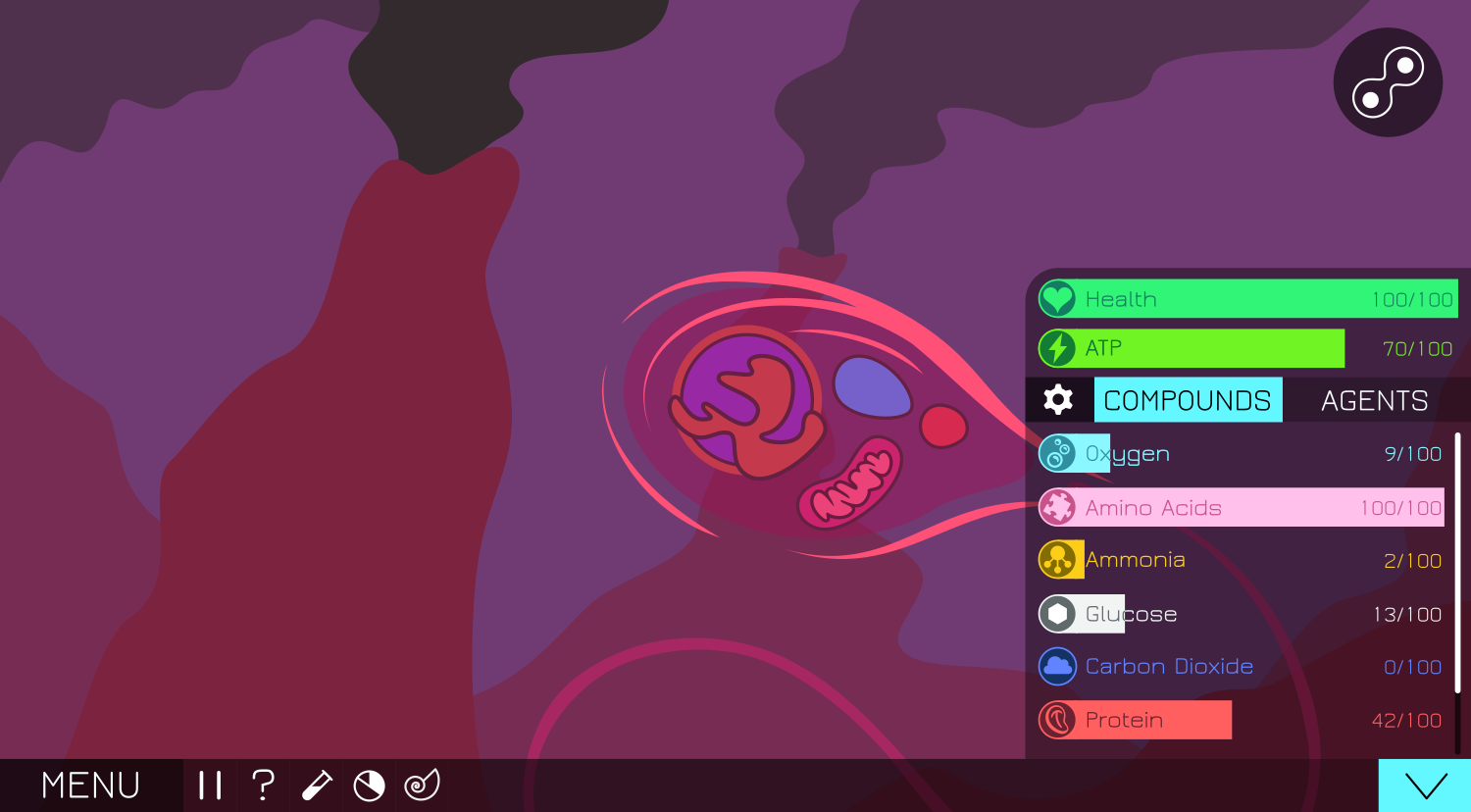
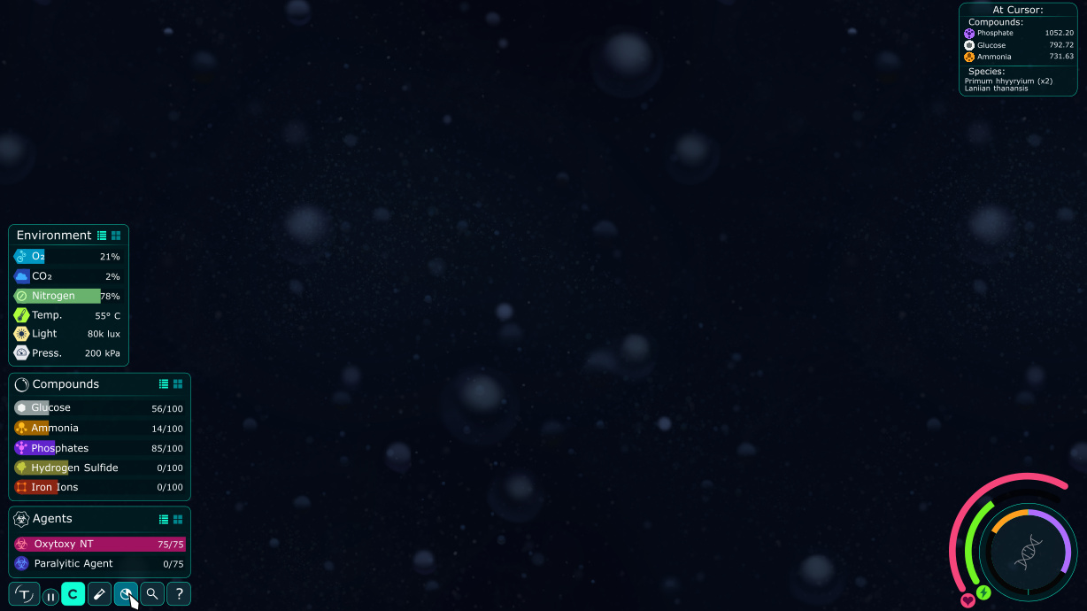
The buttons in the bottom left corner, besides the menu, are: Pause, Hints, Processes, Statistics, and Fossilize. The bottom-right button toggles the Compound Menu (which is currently on the Compounds Tab), and the gear in the compounds list lets you choose which compounds are shown and which are hidden, and possibly lets you configure the order in which compounds are shown.
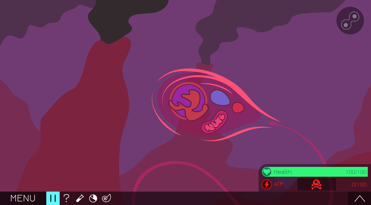
The Compounds menu is closed here, and the player has run out of ATP, which gives them an option to kill themselves immediately instead of waiting to die. The blue pause button shows that the game is paused, and the reproduce/editor button is grayed out.
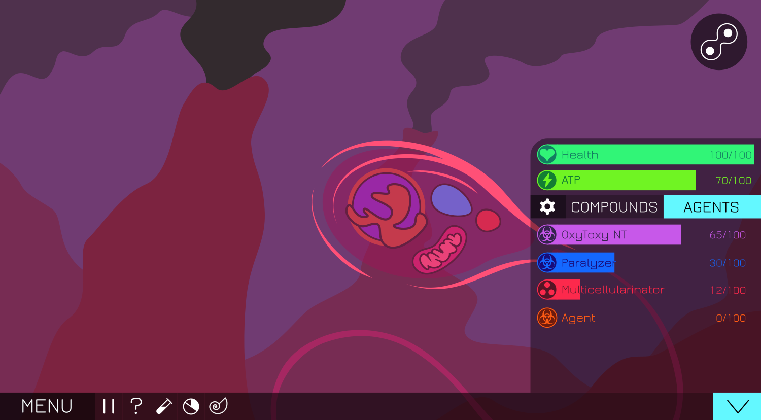
Finally, here’s the Agents tab of the compounds menu. I think it would be cool if the player could not only name their different agents, but customize their color and icon as well.
Now just edit the gui texture so we can see how well it actually works. (and probably also do a lot of tweaking to the placement etc. and add new stuff and, and …)
That’s quite a nice design, but I do have some comments.
In the original concept, fossilise would become an option only when you paused the game. A panel would appear near each NPC cell showing either the species name if you’d already saved it, or the option to add one if not. While I have nothing against having this as a permanent feature of the interface, I’d like to know how it would work, because it needs some dependency on the cells in the environment. Pausing the game is also a must, as you don’t want to go chasing cells with your mouse to fossilise them.
I think we decided somewhere above that the suicide button should be a permanent button. While I quite like the solution you’ve come up with, I still think we need that. Maybe keep your system but have a permanent option somewhere else, whether always or hidden in a menu.
Making the interface less colourful has the positive effect of improving the clarity of the compounds/agents bars, but if you’re going to do that, I think you need to go all in. By which I mean, the blue highlights on the expand arrow and header stand out far too much and kind of look like they should be related to a specific compound. I’m not sure what the best solution is here.
Otherwise, there are some innovative design decisions here, but I’m still not sold on going this flat with everything. It looks too much like a mobile or kids game for my liking. Maybe try some mild gradients or more defined edges, though obviously not to the extent I did if you’re trying to get away from that. The mixing of straight and curved edges is also an issue. The icons and compound bars are fine, but the curved corner of the compound panel in particular doesn’t really fit.
Ah when we were discussing it we thought the pause button would just pause the game without anything popping up, for screenshots and other stuff. The fossilize button would of course also pause the game, but using the fossilize button would bring up the panels on the NPC cells like you said.
I think we should also keep in mind that we’ll be phasing out the suicide button at some point, and having it disappear randomly from the GUI might be a little odd. Unless we want to keep the suicide button for all stages, but then having your species die randomly in later stages might be odd as well. A good middle ground would be to have access to the suicide button during critical moments (when you’re low on atp, when you’re fatally injured and bleeding out, etc, etc). In which thread was the suicide button discussion happening? I’d like to familiarize myself with it and the reasons for this decision a bit more.
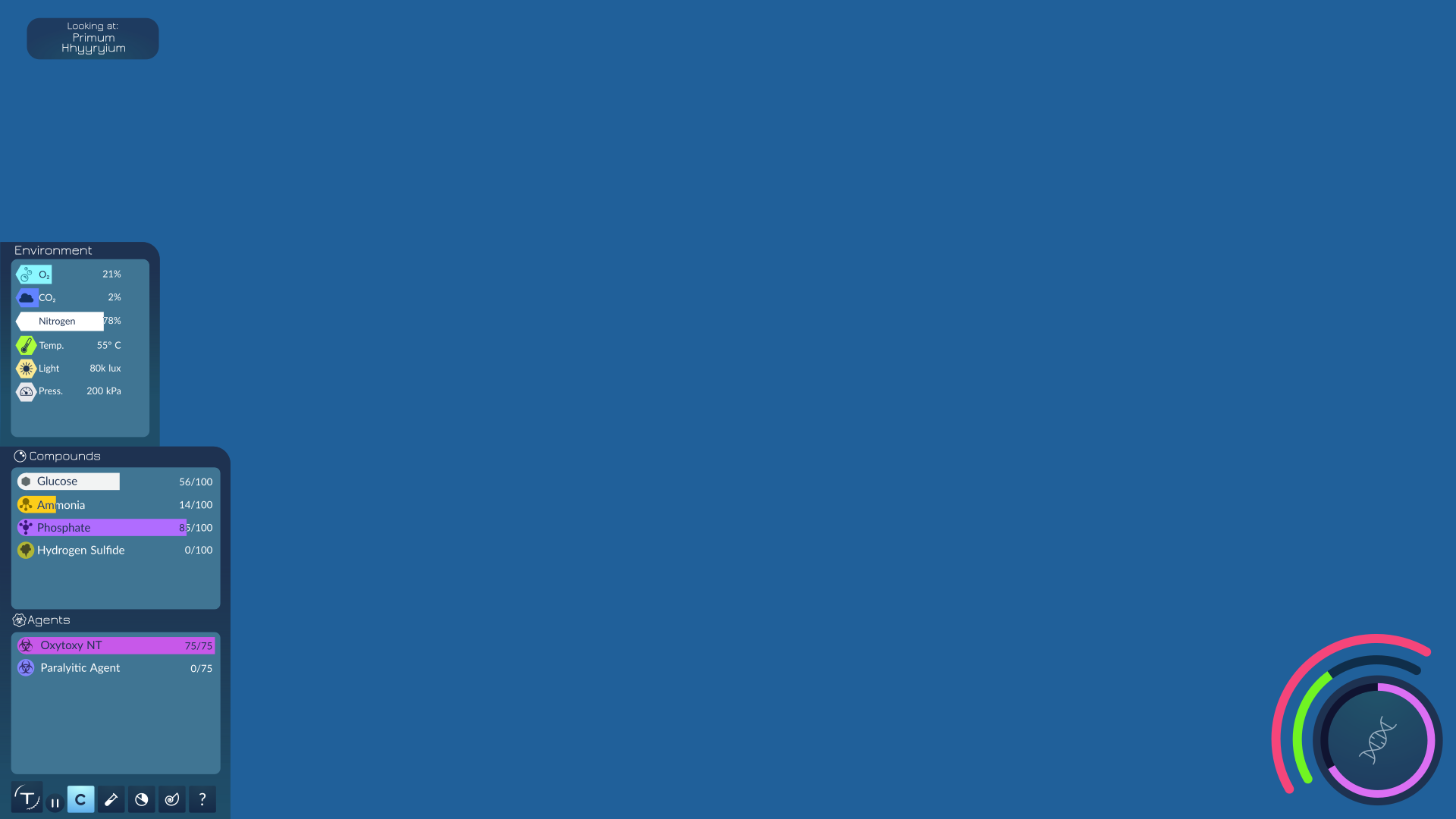
Everything here should mostly be self-explanatory, except maybe the buttons. The Thrive button opens the pause menu and the little pause button pauses the world but still lets you go through menus and such. The C button in the bottom left toggles the visibility of the compound/environment panels, and can be toggled with the C hotkey perhaps. The buttons after that are Processes, Statistics (info about the current universe), Fossilize, and Help (general game information)
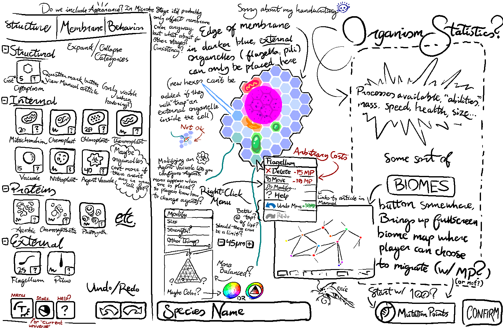
I know there’s a lot here all over the place since I tried to cram so many ideas in such a small space (a few of which are from elsewhere on here), but I tried my best to label and annotate things. Feel free to zoom in and look at the various things I drew, just be sure to bring a map with you so you don’t get lost.
Feedback is welcome for both images, as are questions about what the heck is even going on in the second because seriously this whole thing is awful
I like it, I think it all seems quite natural. I like the editor concept as it kind of has a flow towards the button in the bottom right which feels nice.