Edit: I’m restarting this thread as I think it’s the right place to put the second post. It’s two different posts with different things in them.
I didn’t quite know where to put this. It’s a thought I had while out walking today, I’m not at all wedded to it I just thought it was interesting enough to post (as you can see I am no artist  ) .
) .
So when the CPA system is build we will (hopefully) have many patches each of which contains many (possibly thousands) of species. So how should all this info be displayed? Moreover how do we display the usefulness of agents when they have a different effect on every other microbe in your patch?
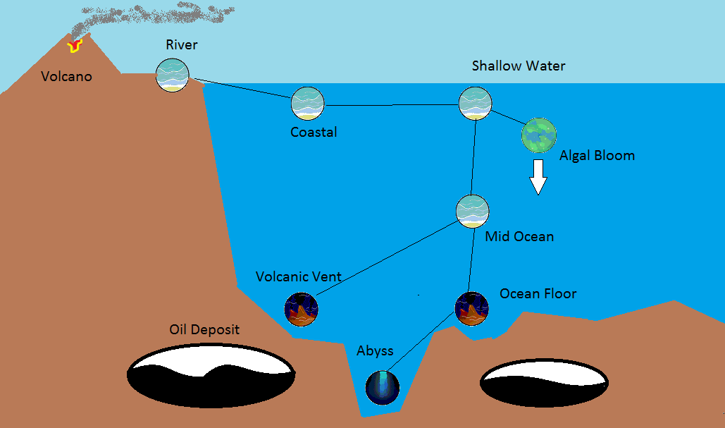
For the ocean some kind of 3D map showing where each patch is might be appropriate (this is another story). Inside each patch it might be nice to have something like a food web. However all the microbes feed on / fight with all the others so a tree diagram is going to look very messy with lines going everywhere, with thousands of microbes this might end up looking incomprehensible.
One key piece of information to work with is the predation function. Denote it F(A,B) which gives you a real number for “How much of species B is eaten by species A.” Assume for now this is anti-symmetric, which means F(B,A) = -F(A,B) (if bears eat fish and that transfers 10 protein per day then fish eat bears at the rate of -10 protein per day). Therefore for each species you can compute badassness = Sum_X F(A,X)/N(X) where N(X) is the number of species (so bears eat fish and bears eat birds and get eaten by nothing so they have +1 badassness, birds are eaten by bears but eat fish so they have 0 and fish are eaten by both so they have -1). You then display this information vertically on the screen. It gives you a measure of how often it is a predator and how often it is prey. Here is an example;
Edit: Sorry fucked up the calculation a bit here. The predation function will usually give you a very small value (like A eats 0.002% of B per timestep) and so when you average that across all species you are going to get a very small value, between -1 and +1 but usually like 0.001. I could redraw to picture, I’m not going to.

Now we can do this for all the microbes in a patch, each one displayed by an image of itself. However we have a free axis, the circles can get moved left and right freely. So we could have buttons along the bottom which allow you to select what to show on the left right axis. Maybe you want to see how many chloroplasts a cell has or maybe you want to see how fast it is, you can choose what to display, this could give you some great info, here is what you would see if medium speed was best;

Finally this could be used to show the effectiveness of agents. So if you selected “Agent - 1” along the bottom you would see all the microbes you agents worked on displayed on the left AND they would have a border which let you know which organelles they effected. That would be quite an easy way of displaying this information. Moreover it could be used to select what you want your agent to do. You could pick a microbe and say “I want my agent to affect this microbes flagella 100%” and then it could show you exactly what other effects that agent would have on other microbes (as you chose the code to line up perfectly with that one organelles but it will overlap with others). Maybe the size of the border could show the intensity of the effect. Here is an example;

What do you think? Agents may require memory and guesswork or information might be available up front, we haven’t settled that, I think this might work as a way of displaying the info the game is allowed to show you, however much that is. Moreover with zoom and a big “you are here” sign this could work nicely for arbitrarily big patches.
Edit: Also, come to think of it, it makes most sense to have both axes free. So you can left click to put something on the up down axis and right click to put something on the right left. Maybe you think there is a correlation between number of chloroplasts and speed, why not have a look?