Iconography

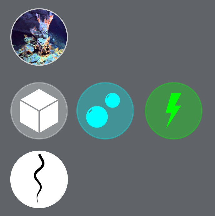
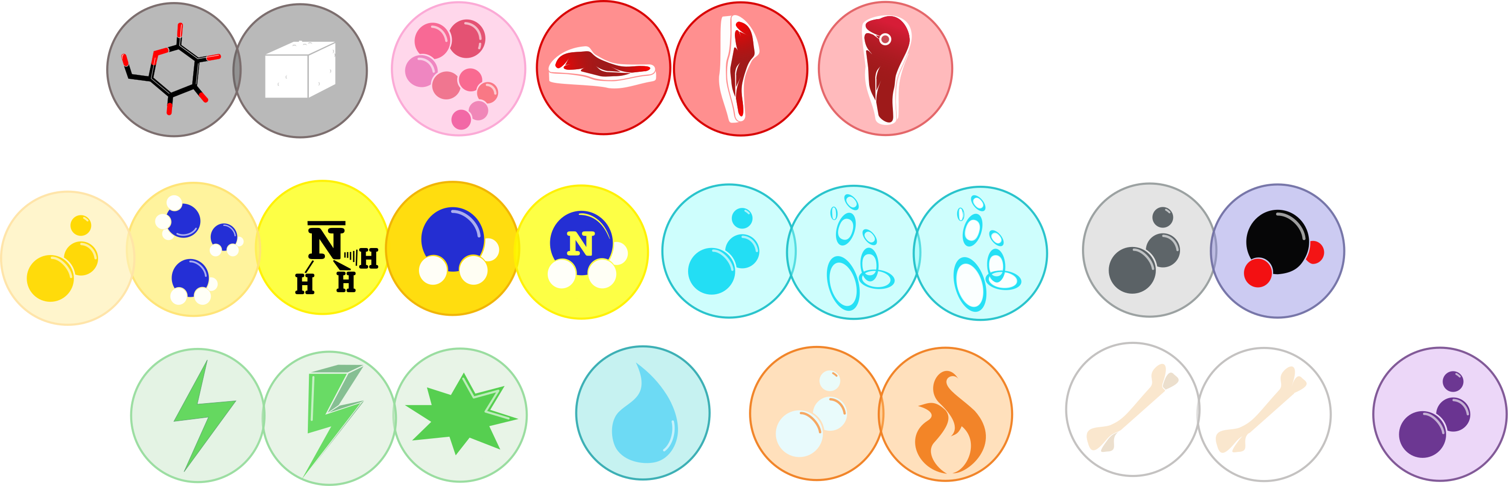
Following on from this discussion, a set of icons for various in-game elements need to be decided upon and created. Off the top of my head, the categories are biomes, compounds and organelles, but if I’ve missed anything you think should have a dedicated icon set tell me.

In general, the icons need to be small, simplistic, distinctive, representative and coloured differently. Think the beakers, coins, resource icons, etc. from Civ V, or the system icons from FTL.

Biomes

We don’t really have a proper list of biomes. We have my initial suggestions, this thread and a thread on the community forums, which, not to be mean, can probably be 90% discounted just because they got a bit too fantastical and nuanced for what was required. For instance, blood stream is a no-go since you’ll be evolving long before any complex life has appeared. I will pick some of my favourite suggestions for the list below though, and if any devs think any others have merit we can add them too. In my opinion there were quite a few good ideas that ended up being too similar to one another. Anything volcanic, for instance, can be incorporated into hydrothermal vents.

Biome icons don’t need to have a single colour since they aren’t tied to any concrete in-game visuals (as compounds are, as I’ll explain later). In my opinion they should probably all be circular and filled with a simple image representing that biome. If anyone has any better or additional suggestions, say so below.

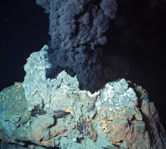
  • Hydrothermal vent - Heavily red with some grey and orange. The design should probably be an underwater volcanic vent, like this but coloured to make it distinctive and fit the biome’s visuals.
  • Shallow ocean - An image of the ocean meeting a beach should do, predominantly light blue, white and yellow. Something like this.
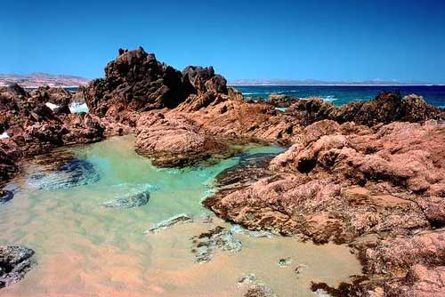
  • Tidepool - I’m going to go back on my choices for tidepool colouration from the biome visuals thread based on images like this. In my opinion the icon should show a rocky perimeter and focus on sandstone reds and oceanic greens.
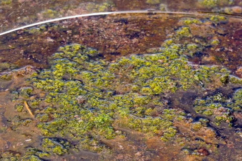
  • Cyanobacterial mat - Very green, showing a layer of bacteria. Use these sorts of images for inspiration.
  • Abyss - Minimalist black and dark blue, like this image.
  • Glacial melt - White and blue, with an icon showing a glacier or icy water. It’s not hard to imagine, but I’ll include an image here anyway.
  • Petri dish - Although it would never appear in the environment, I quite like the idea of a petri dish as the “testing” area in the editor. I’m struggling to think how it could be represented besides an image of an actual petri dish, with very little colour saturation.
  • Tectonic water fill - Browns and oranges, close in style to this.

Compounds

Compounds are probably the most in need of dedicated icons, since we want the player to know at a glance what compound they’re dealing with. Compound icons in particular are important because they’ll accompany compound clouds, coloured distinctively in the environment for the same purpose. We decided on the colours for each compound currently planned, so all that remains is to create icons using those colours. Unlike the biomes, I think compound icons should have their own distinctive shape.

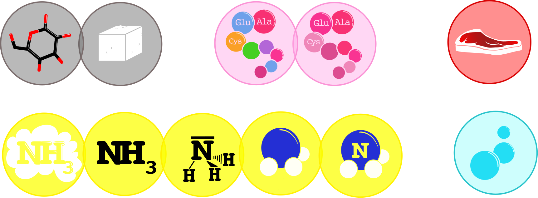
  • Glucose - White. The icon itself is difficult, since there isn’t a universally acknowledged symbol for glucose beyond its chemical structure, which is far too complex to present to the player. Instead, I’m thinking either a hexagonal ring or a sugar cube.
  • Amino acids - Pinkish red. Another annoying one for the icon itself. We could use simplified DNA, but my understanding is that would be the icon for Mutation Points. I put angular chains in the GDD appendix for compounds, but that was little more than a guess.
  • Proteins - Darkish red. The easiest thing to have represent protein is a stylised steak or slab of meat.
  • Ammonia - Yellow. Again, really quite difficult to think of a well-known symbol for ammonia. If necessary we could go with four circles arranged in the pattern of its chemical structure, since it’s quite distinctive and far simpler than most of these in chemical structure.
  • Oxygen - Light blue. Bubbles?
  • Carbon dioxide - Dark blue. Not sure, but one possible option is a cloud since most people are familiar with it as a greenhouse gas.
  • ATP - ATP doesn’t appear as a cloud in the environment but it’ll still need a colour and icon. I’m thinking a green lightning bolt.
  • Water - The icon is probably the most obvious of them all: a water droplet. Colour is more difficult, since water won’t appear as a compound cloud and can instead be thought of as transparent. Transparent icons aren’t possible though, so what do we do here?
  • Hydrogen - A colour wasn’t decided on in the thread, but I’ll propose orange. And a flame for the icon.
  • Calcium - Beige probably. A stylised bone for the icon.
  • Nitrogen - Nitrogen’s colour was never decided on and all types of blue are already taken. I don’t know for this one.

Organelles

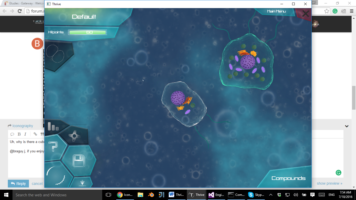
Since organelles are represented by in-game entities as compounds are, their icons should ideally match the general colour of the organelle model. The problem is distinguishing organelle and compound icons. One solution would be to have a set format for all organelle icons, such as a circle with a vector drawing of an organelle in the centre. To distinguish them chromatically, we could have organelle icons consist of two colours each, maybe even two colours related to the compounds they process. This becomes a problem for non-processing organelles though (like pili, flagella and cilia).

Perhaps a better solution is to have every organelle icon be the same colour but keep their shapes as distinctive as possible. For some, this is easy - a flagella can hardly be mistaken for a nucleus. Others might be more difficult - how can you differentiate the golgi apparatus and endoplasmic reticulum by shape alone?

Hey Oliveriver,

I am interested to work on the iconography.
As I am new on the forum, I have few questions before starting:

  1. Which format/size should be the drawings?
  2. You would like each of them in a different file? I am normally using Inskcape and I have an unlimited page so I could also just draw everything together or export them one by one, it is up to you.
  3. Where should I load the files once I finished?
  4. I will try the game, but could I also find some files to see the drawing style of the game maybe?

Few remarks on the questions you were having on the post:

Biomes
For the testing area, instead of the petri dish you could use a test tube or an erlenmeyer. Something which might refer more to the expriment (petri dish, except from scientist is not very representative of testing). Otherwise we could evolve outside the scientific world and just put something like that .

Compounds
Carbone dioxide: instead of a cloud which is a bit misleading, I would go for the atomic representation like that . I think people are starting to be used to that

Organelles
Regarding you question about the representation of the golgi and the reticulum, I think the main difference might rely on the vesicle formation from the golgi but it will be tricky to differentiate.

I think I will come up with other remarks once I will start to work on them :slight_smile:

Great to hear you’re willing to work on this!

  1. No idea, but for now they’ll need to be quite large so they can be scaled to various sizes without losing quality. In-game they’ll mostly be around the size of the profile pictures beside our posts here, with some smaller.

  2. One by one eventually, but during the design process you can just export the whole thing when looking for feedback to save time.

  3. Assuming you mean upload, you should be able to upload them here. When added to the game they’ll need to be placed in the SVN, but you don’t need to worry about that.

  4. We don’t really have one right now. I guess you could say the GUI could be considered an art style, but that’s being revamped too. There’s a gallery of concept art if you need inspiration, but it’s largely down to you to decide on the aesthetics of the icons.

Petri dishes are more relevant to bacteria and cells than test tubes, but I see your point. We’ll see what other people suggest.

That does actually look a bit like a cloud anyway. The problem is to keep it distinct from other compounds represented by their chemical structure.

Just to make sure you understand the styles of each type of icon, here are some basic mock-ups I drew. You can probably do better. They are, in order: hydrothermal vent, glucose, oxygen, ATP and flagellum. The proper biome icons will of course need to feature stylised drawings with emphasis on the colours chosen for that biome (so for hydrothermal vents, reds, oranges and greys).

1 Like

@Oliveriver: Uh, why is there a cube for glucose? Wouldn’t it make a lot more sense to just have the hexagonal ring without the three lines in the middle that make it look like a box?
Edit: oh, it’s a cube, for sugar, isn’t it? I’m dumb.

@braguy.j, if you enjoy making 2D graphic art, you could try making the actual background textures for the different biomes. Here’s an image of the background in the game right now.

It’s kind of boring, so it would be nice to have something like this. If you do decide to paint the textures, keep in mind that the image needs to be tileable and that the detail needs to be fairly small and ubiquitous (so that the player doesn’t memories specific landmarks and realize that the texture is tileable).

To answer your questions about the icons,

  1. The higher the resolution the better. After all, we can always down-res something so it doesn’t take as much space, but it’s really hard to stretch out a small image.
  2. It doesn’t really matter—you can have them all on one sprite sheet that we cut out, or you can have multiple files for each icon. The first one would probably take less space, but might be harder to maintain and edit during the prototyping process.
  3. Just post the files here and someone (probably me) will add them to the game.
  4. Check out the above screenshot for actual gameplay. Note that the GUI will likely change a lot in the upcoming releases.
1 Like

Re backgrounds I had a quick go. I went to Flickr Creative Commons, searched for microscope and then got some images and reflected 4 copies of them so they should be tillable. Pros done in 5 minutes, cons, symmetry is a bit overbearing (but mightn’t be too bad if you’re close).

I like the blue one, it’s trippy!


I think for the organelles it would be better to use a small picture of the organelle instead of a symbol representation.

Also, I really like the style of those compound icons, and I think the biome icon looks really good to. Great work!

@Oliveriver : thanks for the answer, I will try to do something tonight

@TheCreator : I kind of like the background like that but ok I could give it a try after. Regarding the text font, I don’t think this is the best because it is sometimes difficult to read as the letters are close to each other

@tjwhale : Except the first and the last ones, for me the rest is too much details that I am afraid we get lost with additional objects on the top of it. But smart move :wink:

1 Like

I started with the first 5 of the components list, following the example of @Oliveriver: glucose, amino acids, proteins, ammonia and oxygen. Please tell me if the general style is ok or if it is too classical/need more style. For some of them I put several trials for you to decide which might be the best or if I need to think about something more. Don’t pay too much attention to the text front, I will adapt it once I know which one will be used in the game.

Don’t hesitate to be critical, I will gladly welcome any comments/suggestions etc. and I won’t take it personally :wink:

@Oliveriver I have a question regarding the biomes: do you want them also in a circle as your example showed? You would prefer more simplified version or realistic one (for instance the hydrothermal vent is is really nice and not simplified at all compared to your other icons)?

4 Likes

*font not front :grin:

You can edit your own posts instead of double-posting BTW. There should be a pencil icon in the bottom right of your posts which allows editing.

Nice icons! They look pretty professional.

I’m not sure about some of the designs though - specifically, those which feature text, and those which have more than one main colour. Bear in mind these will be scaled down to just slightly bigger than this emoji :slight_smile: in some places, at which point small details become difficult to make out and players will mostly be reliant on general shape and colour. I love the protein and oxygen icons, and the second amino acids icon (the one with various shades of pink) would work really well without the text in my opinion. Not sure about any of the ammonia icons though.

About the biomes, my thought is restricting them to a circle would be best, but it could be another shape if you’d prefer. The biome icons will generally be displayed larger than those for compounds, so yes they should have more detail. It’s your choice for how realistic they are, but I think sticking to vector drawings would be best.

Awesome. I love the icons you made. Especially the 4th and 5th (and 3rd) nitrogen one. May I ask why there is a Nike shoe to the top right, though?

That said, while all the designs look great, could you try making each icon in an analogous color scheme with the colors dulled down? Usually making sure that each RGB component is at least 100 does the job.

1 Like

That would be a slab of meat.

1 Like

It seems so obvious in retrospect…

Since we’re on the topic of icons, it might be useful to make the icons the same color as the compound clouds they refer to.

Hey! I had time to work a bit on the icons again. The problem is that I can t try the game as I only have a mac … So I can’t see the compound clouds color. What we could do though is that I could send the vectorial version of my drawing and then someone else can take care of the color homogenising, what do you think?

I also got an idea for all the gaseous components: we could decide on a color for each and use the oxygen icon variating the color (I did it just to show you what it could be). I also redesigned the slack of meat as it was apparently taken for a nike shoe :wink:
Regarding the color of carbon dioxide, I think grey might be more appropriate than dark blue (and like this we could more easily differentiate it from the purple of the nitrogen)
I also thought about a new representation for gaseous compounds (represented for oxygen)

2 Likes

These actually look really good right now, although a porterhouse might be a more recognizable slab of meat to use, The rest look great. I really like the sugar cube for glucose.

Like that?

Yeah, that looks great, good job in these btw. If I may ask, what does the bone represent?

It was the suggestion of Oliveriver for the calcium

Hm, i like it, a bone or tooth is perfect

1 Like