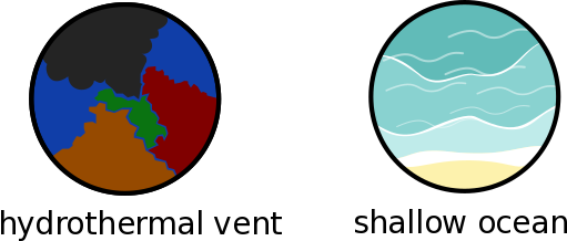
I started to work on the Biomes, tell me if I am on the right path or if I need to think/draw differently 

I love the shallows one. The hydrothermal vent one is a bit hard to make out though, lets see what the others think before making changes.
I tried looking through the code to find where compound colours are defined, but I got a bit lost. @TheCreator any chance you could give the hexadecimal or RGB colours for each?
While giving all gaseous compounds the same icon looks nice, I don’t think it’s a good idea since it will remove a lot of the distinctiveness we want to give each icon. Similarly, those which are just a bunch of circles will need to be different enough to others to make it clear at a glance which is which. I believe carbon dioxide is already in the code as dark blue (someone correct me if not), but nothing has been decided for nitrogen yet.
As for the icons themselves:
- The protein one is absolutely perfect. Awesome work on that.
- Same with calcium.
- The flame works well for hydrogen, I like it.
- I prefer the third of the oxygen icons, but they’re all good.
- Water is good but could use some more detail (maybe not though, that’s just my opinion).
- Carbon dioxide works but could be more interesting.
- I like the amino acids one but be careful it stays distinct from all the other circle-heavy icons.
- Neither of the glucose icons seem right to me. For one thing the backing circle should be closer to white than grey. A sugar cube could work but the positioning of it seems a bit…off. That might just be me.
- I still have problems with the ammonia icons. In particular the blue atom breaks the colour consistency. I think the fourth one (with one big, textless nitrogen atom) would work if the blue was change to a different shade of yellow.
- Any of the ATP icons could work but they all look a bit rough. I don’t think the 3D works on the lightning bolt.
- If you’re changing oxygen to the second or third option, the nitrogen concept could work.
As for the biomes, I agree shallow ocean is great but hydrothermal vent needs work. If you didn’t know it was a vent you wouldn’t know it by looking at it. It looks more like a patchwork quilt.
Huh, I wrote this message 12 hours ago, guess it didn’t send:
Shallow ocean is good, as are all the icons. I’m not quite sure I like the slab of meat for protein. It’s not a bad icon, I just don’t think its very intuitive. We’re in the cell stage and meat is more of a multicellular formation. I liked the polypeptide chain you had before more. For the hydrothermal vent I’d suggest making it less “puzzle-y”. If the bottom right part was one whole piece, I think it would look a lot better.
Also, should we start voting on icons yet? The second one for ammonia and third one for oxygen are just perfect in my opinion.
Here are the colors:
Glucose: 150, 170, 180
Oxygen: 60, 160, 180
CO2: 20, 50, 100
Ammonia: 255, 220, 50
Amino acids: 255, 150, 200
I do like the protein icon, despite the fact that its meat and we’re in the microbe stage. Maybe a flexing arm would work too. As for the Calcium, I think a tooth would be better than a bone. Other than that I have to agree with @TheCreator about the oxygen and amino acids. I do like @Oliveriver’s ATP and glucose icons the best right now, even if they weren’t made for actual use.
Thanks a lot for the comments, I will try to improve that in the next week then 

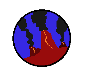
I tried my hand at the vent icon. It’s mspaint quality so i guess you could consider it concept art. if someone wants to make a nicer version go ahead.
Also does anyone know a good program to make the icons with?
I can see that being a good icon.
I’ve found that adobe illustrator creates the best icons/vector art.
It could work with a design like that, but as you said it’s not the best quality.
Look up the tool “token tool” I used to use it for making tokens in roll 20. It makes it easy to add “borders” to any image.I’ll see if I can find it again when I get home.
Hey!
I know that I said that I will improve the icons in the next week and now it has been one month and a half… Sorry for the huuuuge delay, I was busy.
I try to include the choices/corrections and improve the colours according to the RGB codes, add a tooth for the calcium and work a bit on the water drop. I find the overall a bit heterogenous according to the drawing style which might come mainly from the oxygen.
Hope to be more active now, but thanks a lot for the screenshot of the game, it helped me to have an overview as I can’t load the game on my computer 
Hey welcome back!
I tried to homogenise a bit some of them with some gradients, not sure if it is the solution though … but I like hydrogen better
Thanks 
Starting the biomes again using the idea of @Atrox for the hydrothermal vents (background a bit purple though) and added an idea for the abyss
The vents look great. The only thing I would say is maybe bridge that gap between the smokes and their stacks. I say this because I can see a slightly uneven gap on the middle one
Is the abyss icon a shaft of light beaming down?
Welcome back!
Those last 4 models you made look really good, and I just adore the first abyss one. While the smoke on the hydrothermal vents looks fine to me, the border of the left red vent sticks out to me (the one that looks like a perfect 120-degree angle). I think making it either more organic or with more irregularities would make it perfect. While you’re at it, maybe make the center one thicker at the base.
[quote=“TheCreator, post:37, topic:207”]
While the smoke on the hydrothermal vents looks fine to me
[/quote]Really? The little gap of purple between the smoke and the center vent bothers me a bit because I can SEE the little gap there. Like for the other two it looks a bit more natural it’s all wispy but I dunno… the center one seems a bit off to me. Maybe in-game I won’t notice it as much.
I will try to make two versions ![]() Then you will be able to pick
Then you will be able to pick
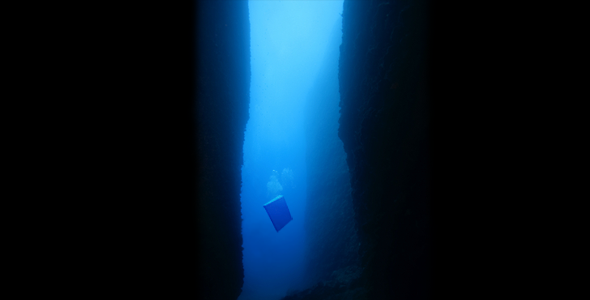
For the abyss it was actually quite tricky for me, @Oliveriver gave this picture as a direction. But if @Atrox you are not convince please fell free to make a drawing like you did for the hydrothermal vents and I could inspire myself from it. Team work ![]()
You’re a really cool person. I feel like my last post came off kind of dickish, so my bad. It is a good icon, but yeah that small gap just irks me the tiniest bit.
Alright so I can’t properly illustrate a gradient with my crappy MSPaint tools, but the main thing I see with the abyss icons is for the first one, a beam of light shouldn’t really be present I think. Kind of defeats the purpose, even if it fades into the darkness. And for the second one, I think we should try to not include real world animals into these, simply because the worlds are meant to be populated with aliens (for the most part).
If you could do something like this, with two dark walls on either end to represent say, a trench. And the bright blue slowly changing to blackness. I think that’d be perfect. Obviously, don’t include the box floating in there. Maybe also make a version with bioluminescent dots in the darkness or something? I dunno.


