That would make since we could then implement a drag and drop organelle editor in addition to the current click and place one.
I’ve made a vector of the Thrive Logo!!
It’s supposed to have the “THRIVE” text in there but I guess my browser can’t display it.
I also made a vector for the Abyss biome, based off of braguy.j’s icon.
EDIT: I also updated the colors of the Hydrothermal Vents biome to match the colors of the biome itself. Still not particularly happy with it.
A post was split to a new topic: Achievements
I forgot to mention we need a fatty acids icon and a temporary oxytoxy NT icon for the new GUI. For the moment I’ll create my versions.
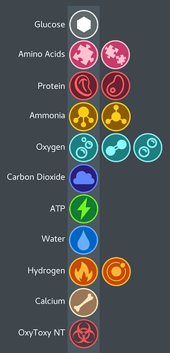
Since the guy who was doing our compound icons seeems to have left (last seen Oct. 10th of last year), I decided to try to make some slightly more minimal compound icons.
The ones in the lighter-colored column are the ones that I personally prefer.
EDIT: update on the OxyToxy NT icon:

I still quite like our existing icons, but these look great too and have a more cohesive feel.
Amino acids as a puzzle piece works, but I’m not sure about carbon dioxide as a cloud. I also think we should stay away from chemical representations where possible - connected circles can’t be differentiated from each other that well. Finding alternatives for ammonia and carbon dioxide without resorting to chemical diagrams will be pretty tricky.
You should be able to edit the game files to test how these icons work. In the GUI folder you’ll find ThriveGeneric.png. Replace the existing icons with your versions at the exact same size and overwrite the file, then you’ll have your own icons in the game.


