I feel like there are a lot of subtle (and not so subtle) changes we could make to the graphics of the game to vastly improve the aesthetics and immersion. Here are some of my suggestions, and I want to hear what suggestions you guys have as well. Below I will draft a list of everything we think of:
All of my suggestions can be seen in the next couple of pictures. Let’s take a look:
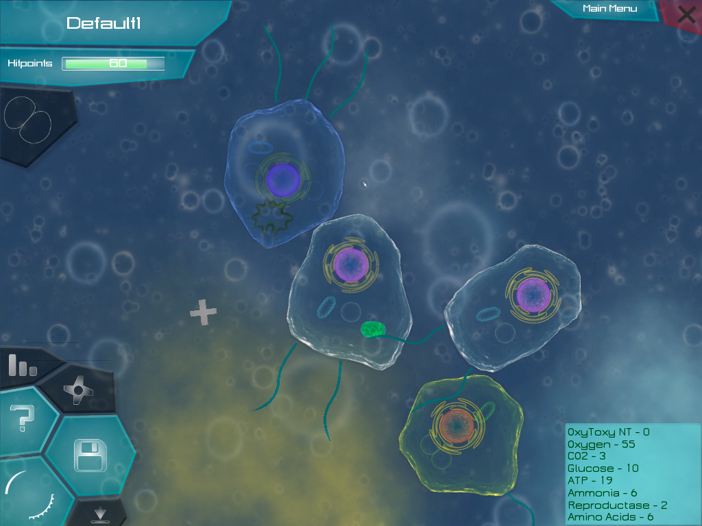
First, let’s look at Thrive in its almost current state (I believe this is 0.3.2).
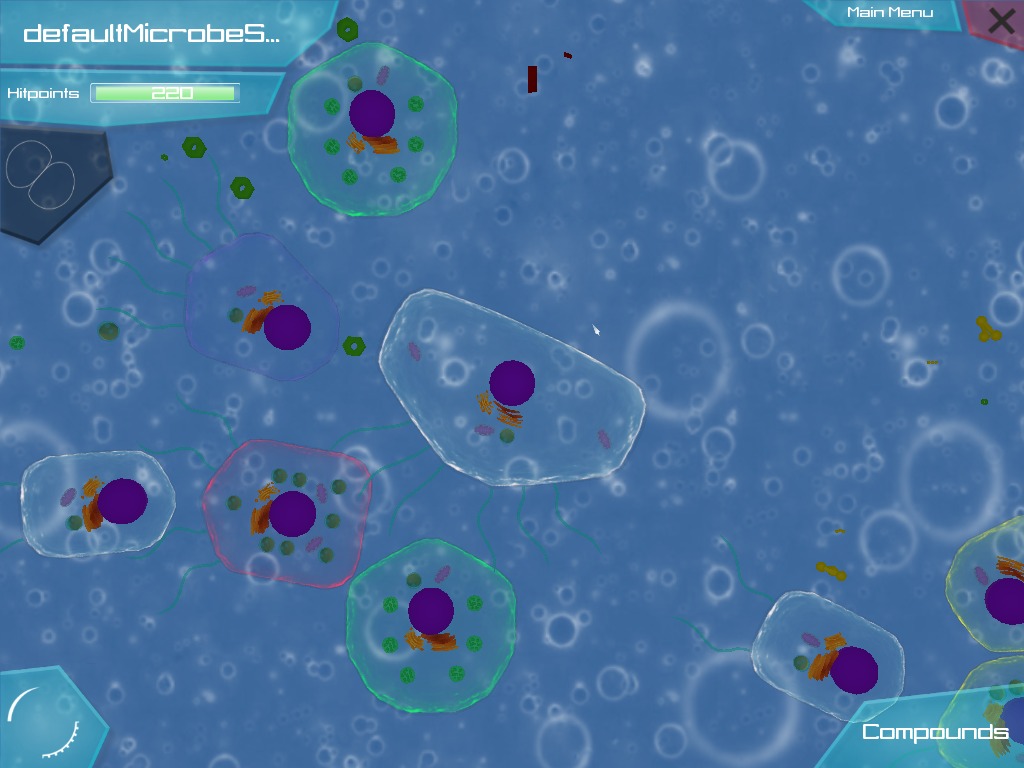
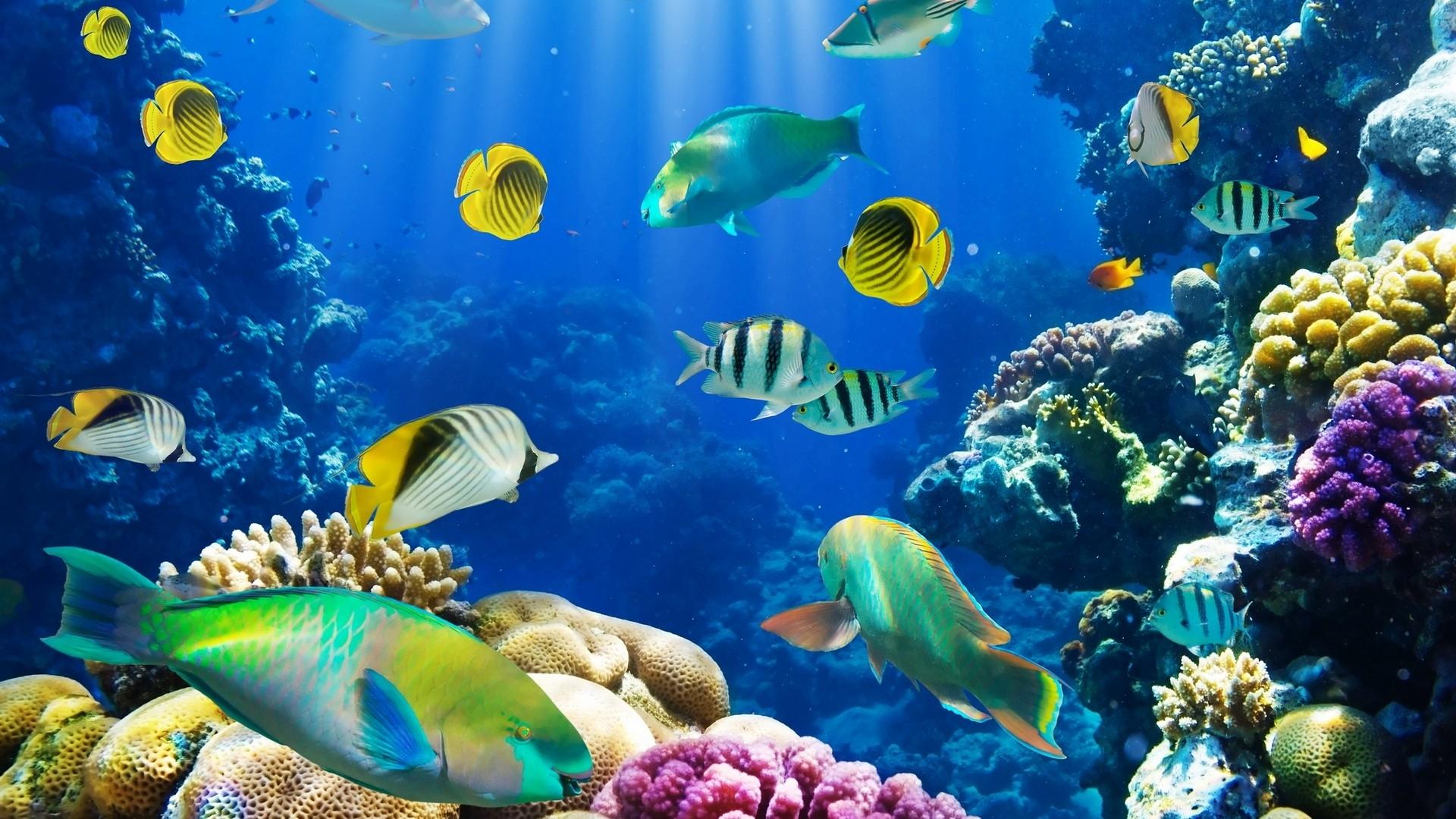
Not bad, but definitely could use some improvement in my opinion. For the first comparison, I will refer to the age old contender, Spore. Here is a pic from the Cell Stage. I will also throw in a pic from Flow, another similar game with fantastic visuals.
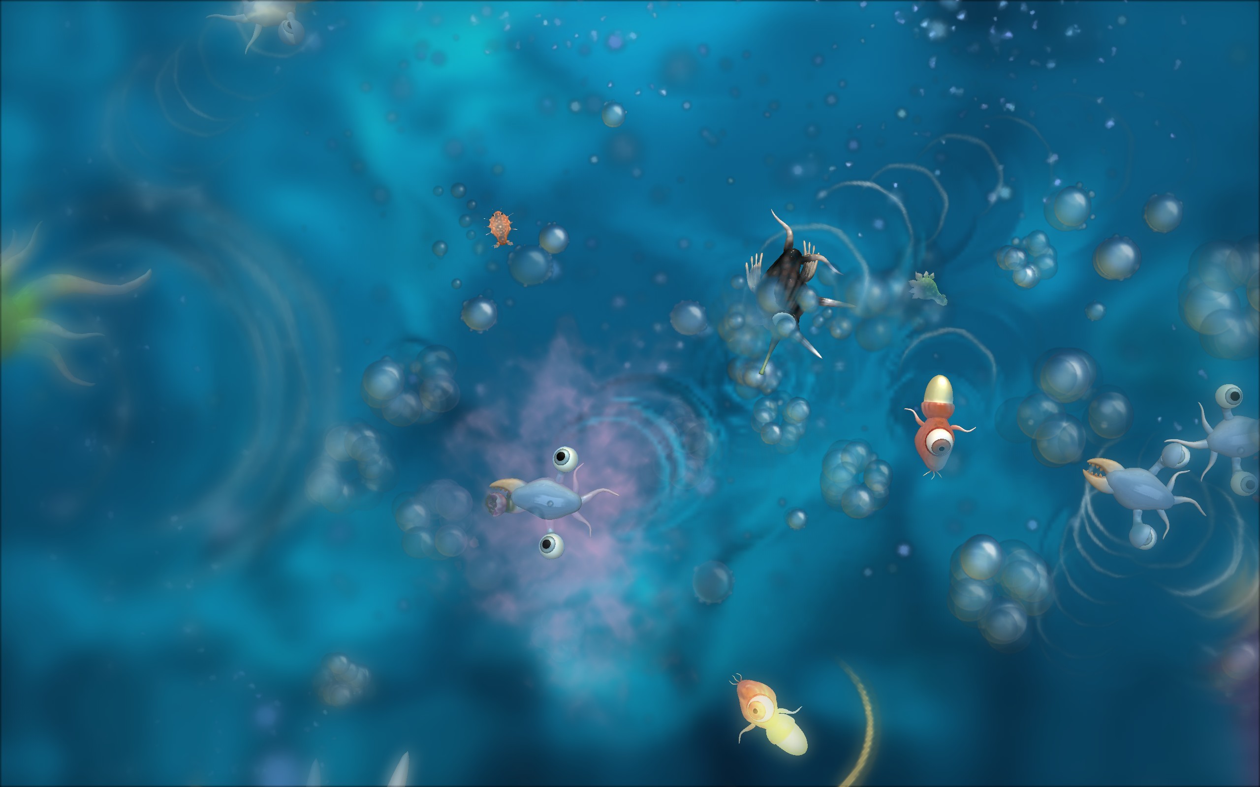

In my opinion, the visuals of these games can teach us a thing or two about what to do with our visuals. I’ll get to those exact things soon.
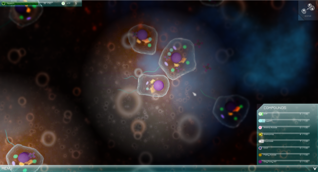
Next, here’s a picture of some fish and a reef underwater.
Alright here are my suggestions:
Background Blur
I think that if we could make successively posterior layers become more blurred, there would be a greater perception of depth as the player moves. You can see this in both Spore and Flow, and you can see the blur on the distant reef in the third picture. Then when you look at Thrive, all the layers have the same clarity and I feel it takes away from the sense of depth. Unfortunately, I’ve heard that Ogre currently can’t handle blur and motion effects. However, can’t we simply edit the background layers in GIMP or Photoshop to manually blur them before they are loaded into the game? I think adding blur would greatly boost the graphics and immersion.
Particles and Cells in the Background
In Spore and Flow you can see bubbles and particles and cells moving around in your layer and in regressive layers. We have this a little bit in Thrive as you can see, but hardly to the same effect because the bubbles are fixed into the layers since they are part of the drawing. My suggestion is that we make the bubbles in the background move around, even if very slowly, and collide if they interact. In fact we could entirely do away with having bubbles and other features on the background textures, and instead have the background just be gradients of colour with maybe some subtle rock soil designs in them, and then have the bubbles be independent entities. Additionally, I think we should add particles and cells in the background layers that also move around, but are also blurred like the background. Unfortunately, this still faces the same problem with Ogre not being able to handle blur.
Particles in the Midground
As the name suggests, it would be also nice to have particles in the player’s layer. I don’t know how realistic this would be, so someone will have to fact check me on that, but as you can see in Spore, Flow, and even in the little particulates suspended in the water in the third picture, it adds some life (metaphorically) to the environment. It would also be neat if the particles would collide with the player’s cell upon interaction.
Ripple/Flow Effects
This is one that only appears in Spore, and I’m not dead set on it, but what if we added in ripple effects or some other visual effect to show the movement and flow of water. Also, should we make player cells affected by fluid mechanics? (I think yes, but maybe this is a better topic for another thread).
Changing the Colours and Colour Variation
One thing that may not be apparent at first but that I definitely notice a lot these days is the lack of interesting colours and colour variation in the Thrive backgrounds. I feel like the default one shown above is a dull and monotone blue, whereas in the pictures of Spore and the fish you can see varying and rich shades of blue. Luckily, we also have the green and blue biome and the black and red biome, which I think do a better job of introducing some richer and more varying colours, but I think we could still make improvements.
Lighting/Shadow Effects
This I’m speculating on and am not committed to. Do you guys think there are any changes we could make to the lighting or shadows to make things look better. The lighting does look overall a little uniform, but I can’t really think of anything to improve on that and at such a microscopic level I don’t know if any changes would make sense/be realistic. Maybe light shafts?
On second thought though I think we could make changes to general lighting based on the biome. It’s kind of strange to see the cells so bright when swimming in the abyss biome with near black backgrounds. Some darkening of the cell in that case through dimmer lighting I think would help.
Even though there are definitely some big changes that we could make, like implementing fully dynamic cell membranes, that would greatly improve the game’s visuals, I think small changes like this can have a big effect.
Suggestions:
- Background blur
- Particles and cells in the background.
- Particles in the midground (or whatever the player layer is called)
- Ripple effects
- Changing the colours and colour variation of the background.
- Possible lighting/shadow changes
- Farther spawned and less condensed compound clouds
- More variation and turbulence in compound fluidity animations
- Dynamic background distortion with fluid dynamics


