As Thrive becomes ever expansive and complex, players new and old alike will be increasingly burdened with seeking relevant information for each design choice they make in creating their organism. This inevitably means that players will occasionally slip up and miss critical info.
Enter the editor helper tool, a UI widget dedicated to listing off any and all potential errors in an organism’s design.
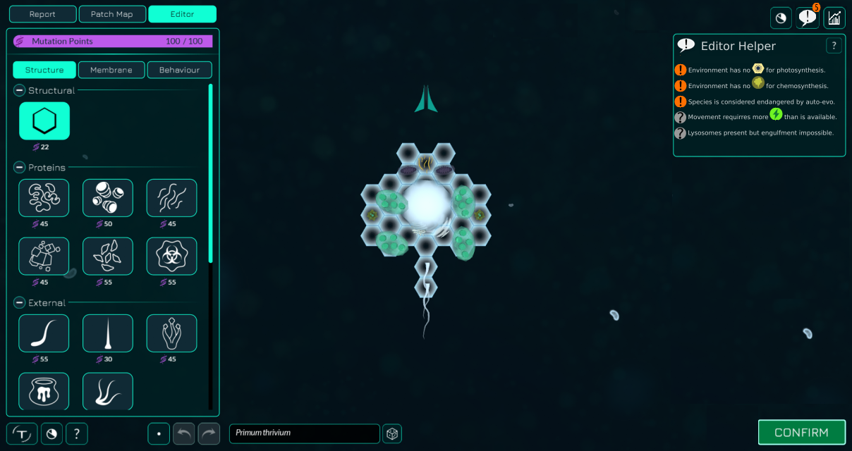
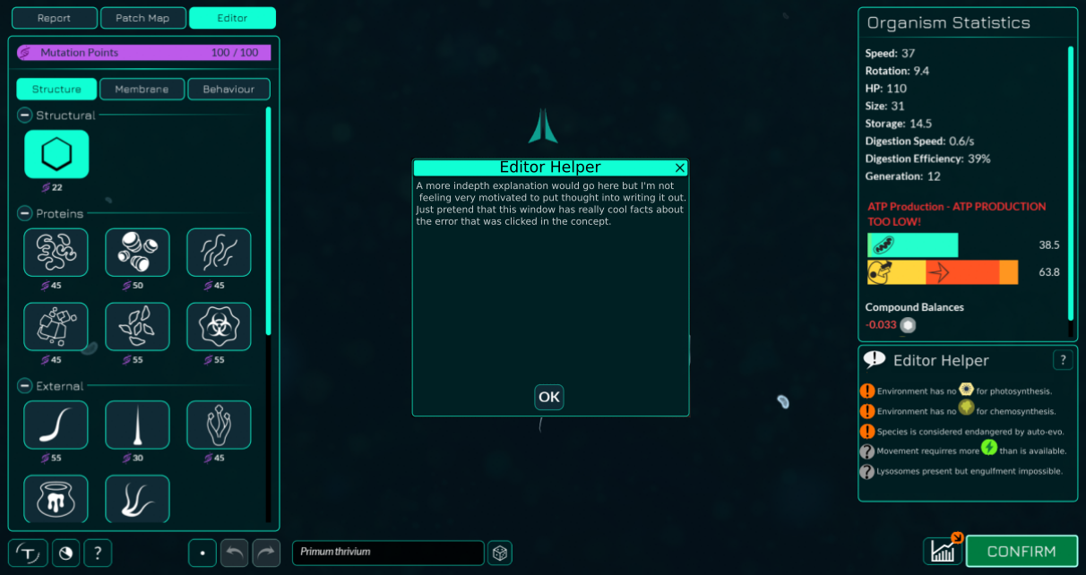
Should the player make a change that turns out to be detrimental, the helper tool will display a notification, and inform the player what is wrong. With several errors, the Helper will display each of them in a tidy list that the player will be able to review and resolve one at a time. Handy!
This tool could potentially even allow us to inform players on not just issues with their cell, but issues with auto-evo’s determination of fitness by explaining what points the player is doing poorly on. Trying to occupy a very competitive niche for example.
Location and UI
The editor interface is already quite crowded as of late, so finding a home for the Editor Helper is a challenging prospect. It needs to have a noticeable presence in the editor, but we won’t want it to be overbearing for the player. It is my personal opinion that it should be tucked away in a helpful button or collapsed somewhere when not in use for this reason. In my concept, it’s a button that will replace the warning functionality that we have present on the “Confirm” button when something is wrong.
Concept art by MirrorMonkey12 and me, Buckly.
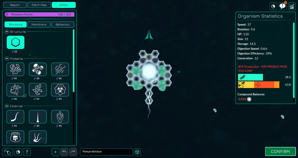
The helper displays some information critical to the player’s design, and is something they will want to check on before confirming their changes, so I think it best that the button be located somewhere close to the “Confirm” button. In my concept, that’s right next to it, but the helper could also potentially find a home located just underneath the auto-evo help button on the right.
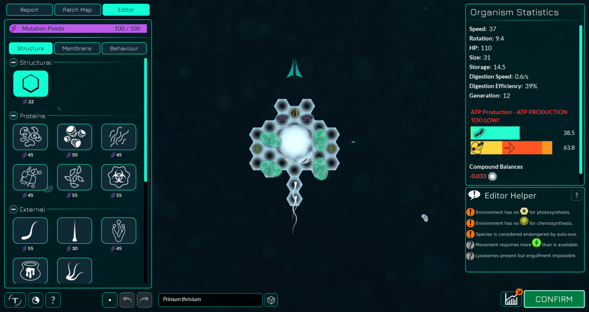
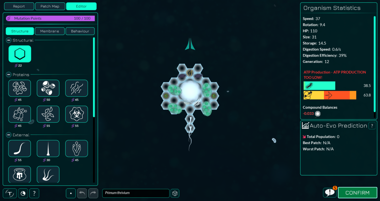
When clicked, the helper button should reveal the Editor Helper screen and any potential errors in a neat little list. At this point the player’s viewpoint is already fairly narrow in the editor thanks to all of the panels on either side of the screen, so in order to preserve the player’s view of their organism I’ve opted to temporarily replace the Auto-evo Prediction with the Editor Helper when active. This method would allow players to easily review their design while going through each error in the list.
Afterwards, they can freely switch back to the Prediction by pressing the same button. Any notification bubbles present would be hidden after viewing, until a new error emerges.
Error Types and Priority:
There are at least two types of errors that the helper will point out to players. All of them can be ignored, but some really shouldn’t unless you have something deliberate and unorthodox in mind (Such as placing thylakoids on your cell before needed, in anticipation of needing them later).
( ! ) Urgent errors are notifications that require immediate attention or else they could have significant consequences should the player confirm their changes. These include not producing enough resources for processes, not having access to necessary compounds, and anything else that should concern the player’s livelihood.
Urgent errors are represented by an exclamation point upon a red or orange backdrop.
( ? ) Informative errors are dedicated to miscellaneous details that may not actually be immediately concerning to the player depending on their design, such as not producing enough ATP to fuel movement.
Informative errors are represented by a question mark upon a grey backdrop.
Do these error types seem good enough? Or would we need more specific variants?
Error Explanations:
To many in the Thrive fandom, our warnings are likely to be quite self-explanatory, and going further will not be necessary. To those unfamiliar or outright new however, elaboration on the warnings will be crucial in furthering understanding of Thrive’s systems.
By providing a pop-up window containing an explanation on what exactly is wrong when interacted with, we could provide optional further assistance to those who need it.
This could be a great help to new players, teaching them how to solve the errors that may come up as they design their organism, and allowing them to graduate as a Thriving species in far less time!
Closing Thoughts:
While I’m happy to say that player understanding of the editor is already pretty good, I want to see it reach over 90% players with complete understanding before I deem it accessible. I believe that this feature could substantially improve our players’ understanding of Thrive’s editors and associated processes. However, implementing it might be very tricky for two primary reasons;
- Our editor UI is quite cluttered already, and finding a proper home for the tool will either require sacrificing even more of the player’s viewport, or pulling off some potentially tricky UI shenanigans that might make the programmers scream at me for suggesting them.
- Translating Thrive is a big endeavor, and this feature adds substantially more word bulk that will only increase as we implement it in later editors.
Not much we can really do about the translations I’m afraid, but I would like to know everyone’s thoughts on where the tool might find a home.