That could work.[quote=“NickTheNick, post:120, topic:111”]
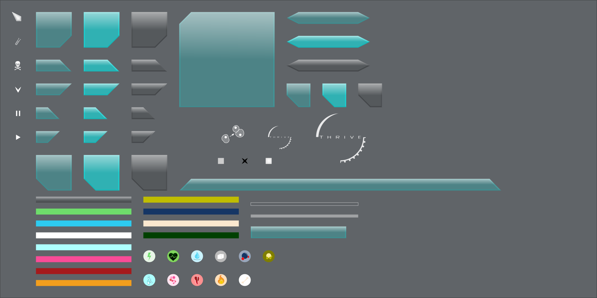
The compound icons used to be larger width than the bars beside them, which I think was far nicer looking than having the icons be the same width as the bar. I presume it was just a stylistic choice you made between them, so it’s your call.
[/quote]
With both next to each other I find the larger icons a bit clunky. The smaller ones came about due to the way I was snapping to pixel dimensions. They’re still clear even at such a small scale, but I can change it if people want it.[quote=“NickTheNick, post:120, topic:111”]
I’m a little undecided on the reproduction meter being represented by the editor button. I can see why you’d want to do that because it allows to drop the bar entirely, but at the same time it does make the Editor button look a little strange, and I think there are several checkpoints in the reproduction meter’s progress, that might not translate well into being visually represented in the editor button’s fullness.
[/quote]
True. The new design was based on @stealthstylel’s suggestion (with the orientation rotated to represent the button “filling up” with compounds. The checkpoints could still be added as markers on the button but I think that would be a little cluttered. Perhaps a bar is the best option after all.[quote=“NickTheNick, post:120, topic:111”]
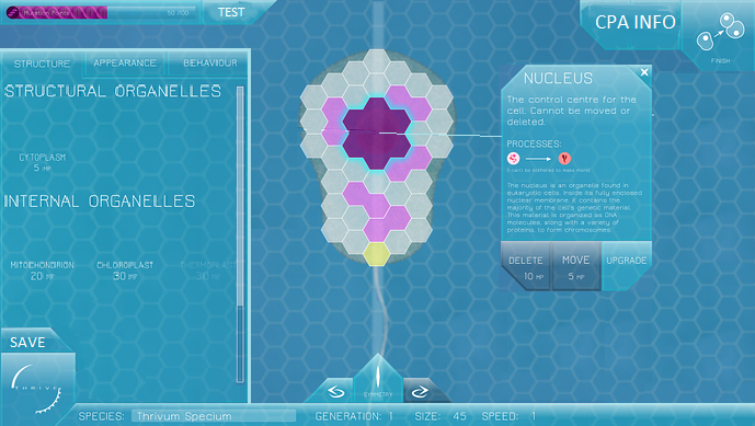
How is fossilize different from save?
[/quote]
For the NPC microbes, it is save. For your own, it overwrites the species details but unlike save doesn’t record the compound levels or other attributes of your individual at that moment.[quote=“NickTheNick, post:120, topic:111”]
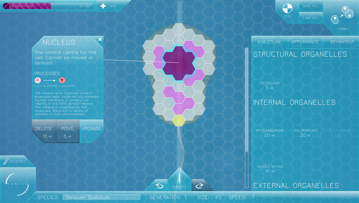
Fun fact, you misspelled compounds in the compounds panel  , but more importantly, is it necessary to have that panel titled “Compounds”? I ask because I’m undecided on the merits of that as well.
[/quote]
Derp.  Good spot. I mainly put a title there because there was a lot of free space at the top of the panel which couldn’t be filled by another bar (since it’s thinner than the rest). It could be removed really.[quote=“stealthstylel, post:121, topic:111”]
One thing, however, with the reproduction button, I don’t know whether the meter is coming down or up but the darker bit should be a lot more transparent because it doesn’t fit with the rest of the GUI. Maybe start with the button being a darker shade (but with the same transparency) when the meter is empty, but the button fills up with the same colour as the rest of the GUI, as the reproduction meter increases.
[/quote]
It’s supposed to be going up, as if liquid is filling it. Disabled buttons will be dark, so the logic was that the editor button would progress from grey to blue as it gradually approached availability.