@Oliveriver, if you’re working in photoshop can you send me the psd file to the gui? I have an idea for the options menu and I’d like to make it in the same style.
1 Like
Unfortunately I’m not, but I have kept a personal styleguide for the panels which should work for other programs:
- Build a shape based on squares (I’ve been using 1cm squares but this will change in future to a value based on pixels).
- Colour it #00FFFF then make it 80% transparent.
- Add inwards bevel with these properties: size: 0.11cm, contrast: 50%, light angle: 270 degrees (i.e. straight up) and light elevation: 32 degrees.
- Create a white shape over the top.
- Add linear transparency with the max transparency around the centre of the shape and min transparency half the height of the shape above the top of the shape.
It would be wonderful if you got me a new options menu (main menu) There are a few things I’m holding off doing because of it.
Also I have photoshop as well if you guys need me to do anything with it.
I really like the blue version too! Really nice work here! 
For the suicide icon, maybe a red button might be better. The skull and bones means more death to me
1 Like
So Nartoiza came up with these buttons and we played around with them in the game. I know its only the Main Menu, but this is a stepping stone into the Microbe GUI as well so I thought it should go here.
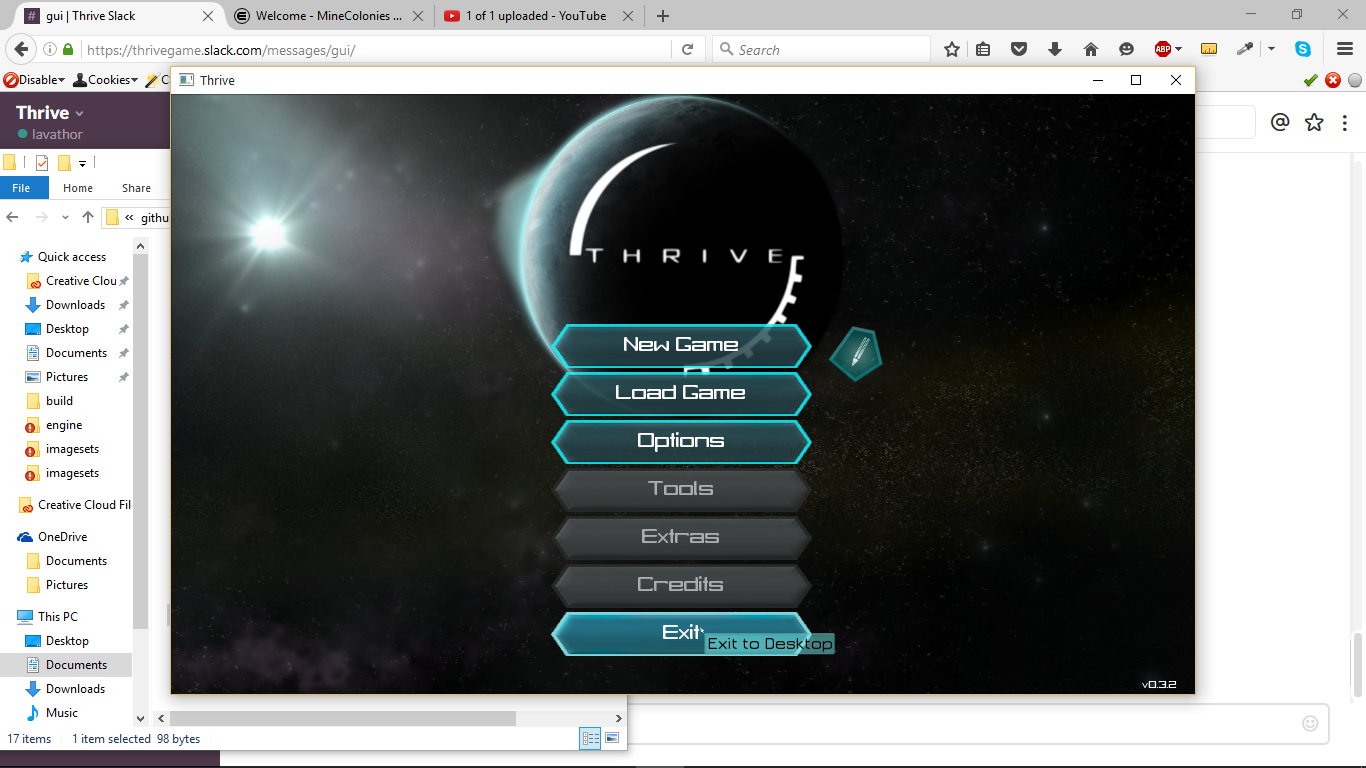
The 2nd one is at 1366 x 768
3 Likes
It looks awesome! I would suggest that the colour is a bit bright but that’s a choice for you guys to make. Great work!
2 Likes
That looks amazing, A bit of jaggedness however (like a tiny bit) would make it more Shard-ish, I mean it looks gread now just a bit hexagonal  Good job!
It’s ment to be hexy, but nar is already working on a darker one, it looks way better. I’ll try to get it in tomorrow.
I like the bright colours. Great job.
I’m not sure if i agree with having the symmetry button between the undo and redo buttons. It seems too exaggerated, as if it’s “the focus” of the editor.
But if it’s not between those then it wouldn’5 be symmetrical!
I’ve been working on polishing the GUI design by incorporating the above feedback. I wanted to get onto the editor too but at the moment don’t have time.
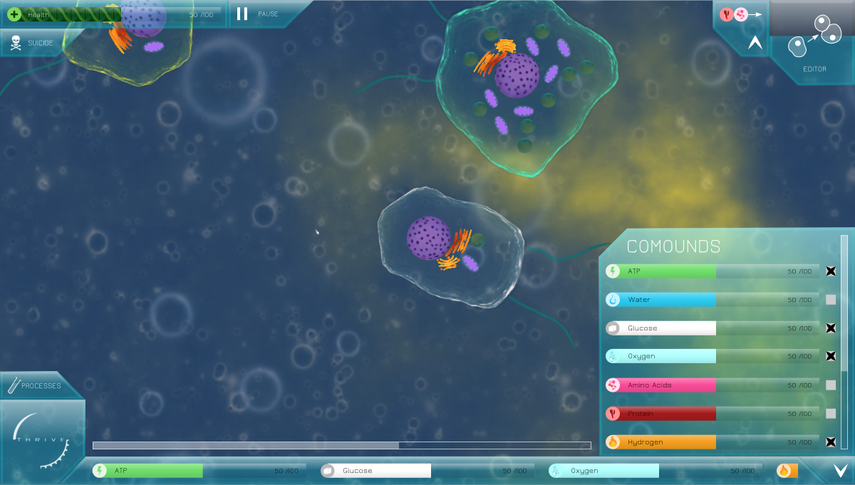
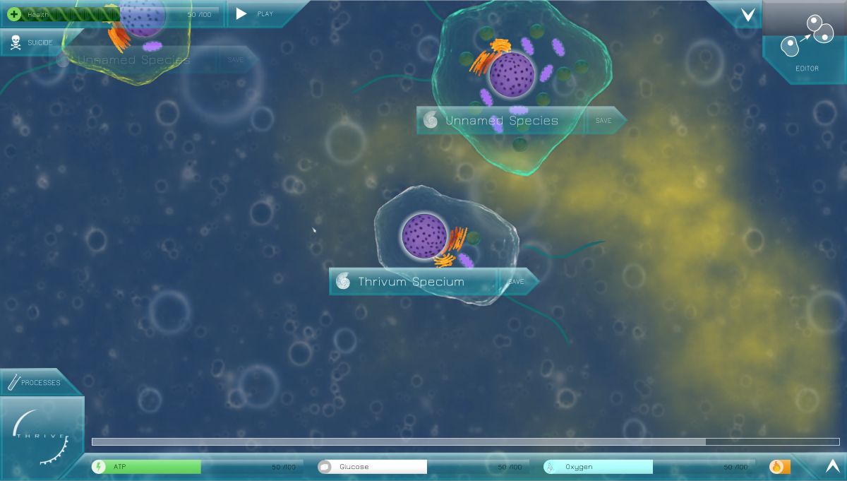
First off, the GUI with everything open. Aside from small dimension changes, you’ll notice a few differences:
-
ATP has been replaced with health (using @Narotiza’s DNA art for the bar). I had both ATP and health up there for a time but it felt too cluttered and too large, so I’ve relegated ATP to the main compounds list.
-
There’s now a pause button. I saw some discussion about this on Slack, and I think it’s worth considering having one. Now, to everyone who keeps insisting on hotkeys at the expense of buttons, I’m trying to make this as idiot-proof as possible. Yes, players could learn to pause with the spacebar during the tutorial, but even judging by the gameplay videos we have already, many people don’t pay attention and end up just as confused as they would be without one. We need to keep reminding them until they get it. Experienced players may find it annoying but I think the button is small enough not to be a problem.
-
The suicide button (also hot property in the hotkey debate) has been moved to make space for it. It could have been placed between them, but that creates the risk of players suiciding by mistake when they wanted to pause (of course, we’ll have confirmation boxes for these things anyway, so it doesn’t matter too much).
-
Rather than have a weird reproduction bar, the editor button is progressively filled in as the player gathers the necessary compounds. I added a button next to it to show the compounds required to fill it (again, idiot-proofing) with the option to hide it.
-
You’ll notice the hydrogen bar in the bottom panel is cutoff in a weird place. Unfortunately this is how the GUI will have to work unless CEGUI allows something different. Since the bottom panel stretches to screen size, the corners and centre will be separate images, with the centre image stretched to match. Therefore the compound bars can only inhabit the portion of the panel that’s the rectangular central block.
Here’s the same image with the game paused and the foldables fodabled.
-
The pause button has switched to a play button, which makes sense.
-
I’ve added fossilisation UI below each nucleus, which I suggest appears automatically when the game is paused. By clicking the text you can type a new name and that species is either saved to your files or overwritten. This is also a sneaky way to get the player species name back in the environment without it being intrusive. One issue is that boxes near the edge of the screen will overlap with other GUI elements, so my solution is to have the transparency of the fossilisation box scale with distance from the centre. I’ve no idea whether this is possible with CEGUI.
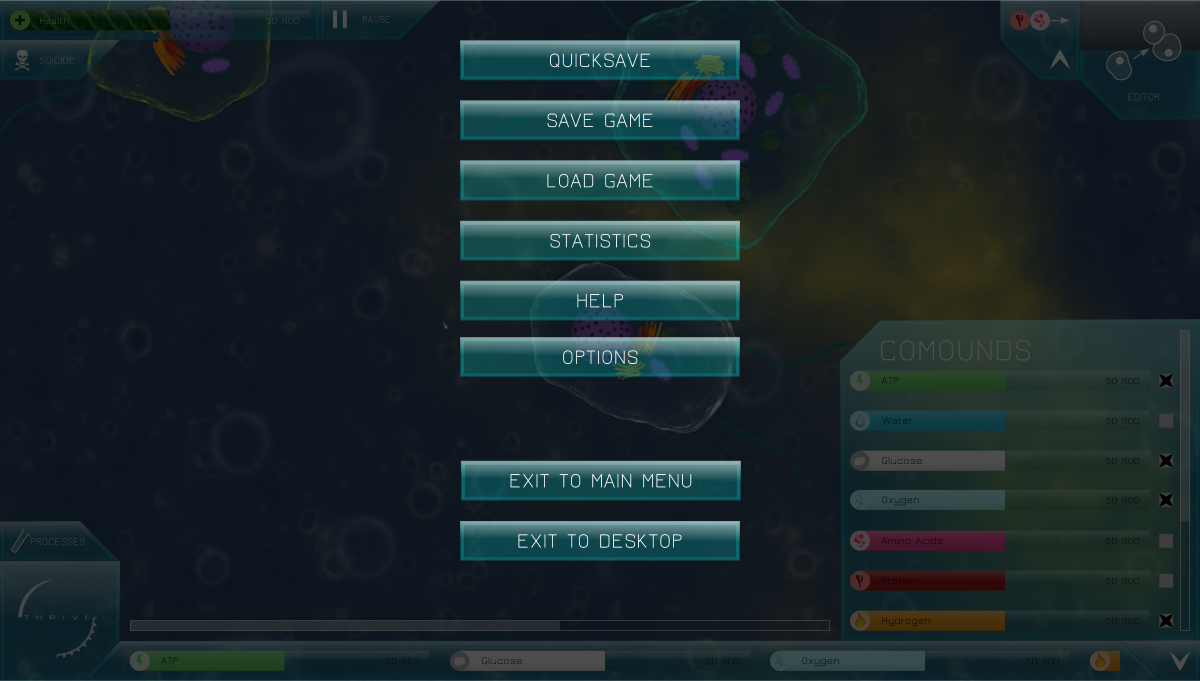
Finally, the overlay menu. Not much to talk about here. It’s only just occured to me that I didn’t add a resume button and I don’t have time to fix it now…Belgium. So really there should be one more button.
The font used throughout is Jura, which we’re already using for the compound list and such in-game.
6 Likes
Oh yes this is beautiful!!! 
The only criticisism I have is the Editor/Reproduction area seems off compared to the rest. It will probably work much better in-game though.
In my opinion, the pause button should be in the bottom left corner, since that’s where the menu button is.
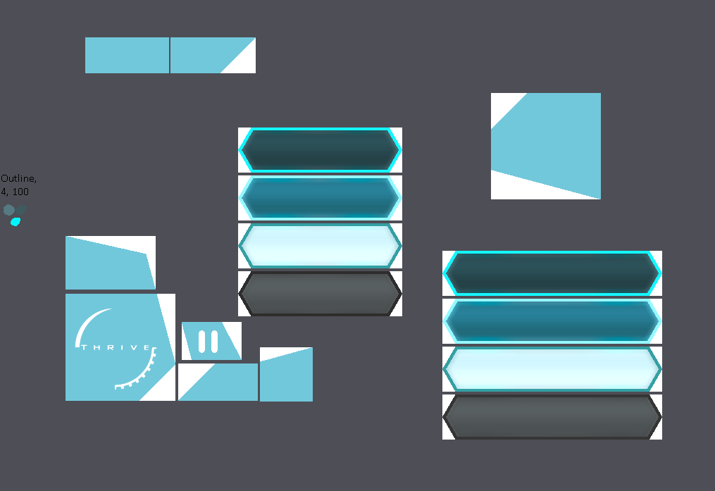
Also, I think it’s been a while since I’ve posted my progress on my gui here.
Here’s the imageset:
1 Like
Perhaps the processes tab could be replaced with the Pause button and moved over to above the compounds tab?
Not inside of it, but just sort of on top of it? I don’t think it should be hidden when the compound tab is closed.
Narotiza is a blind idiot
More on topic, i think the pause button could be placed more to the right of the menu button and scaled down.
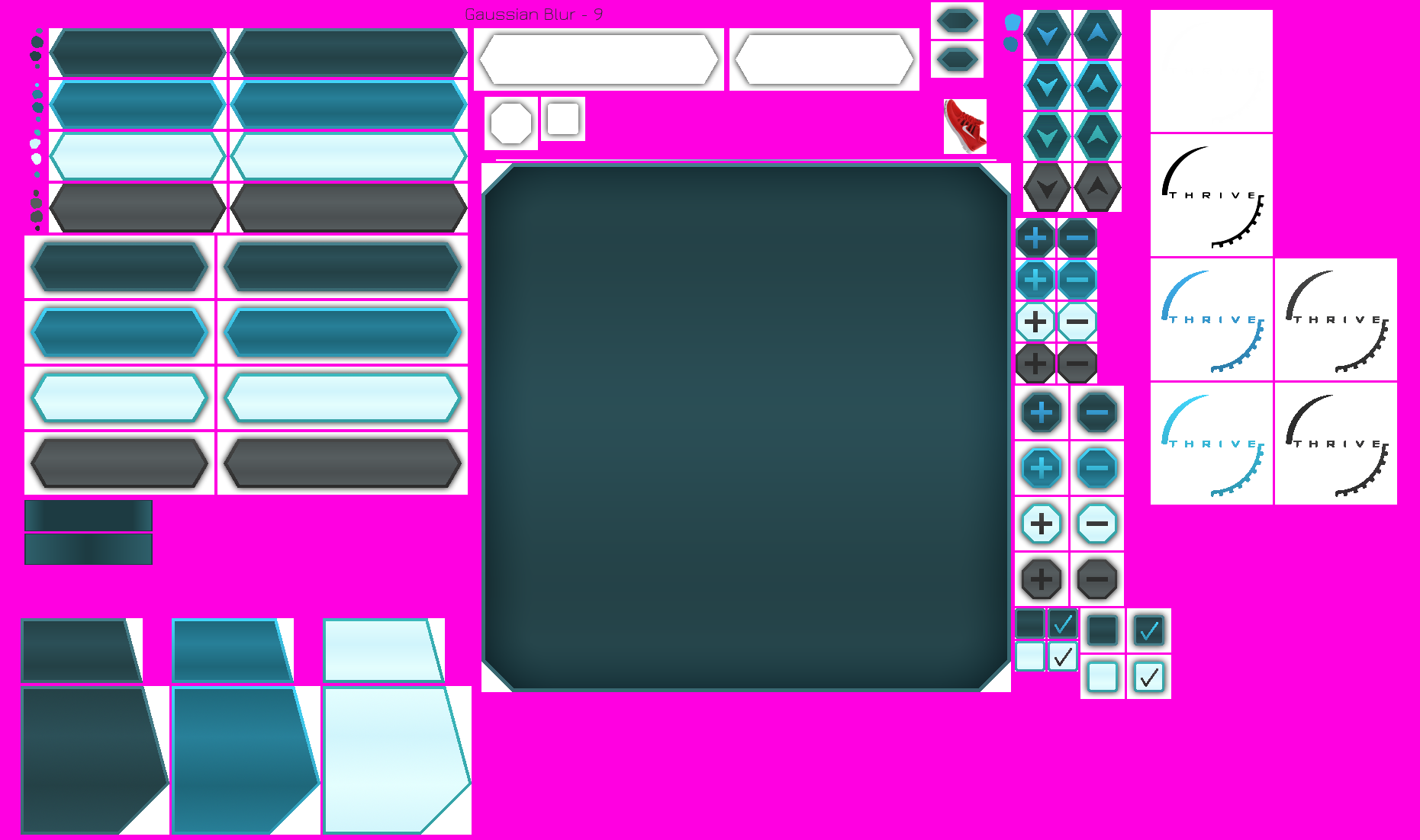
Pardon the mess of an image, but it has my ideas for the shapes of those buttons.
Look at the flat blue things, not the other stuff.
1 Like
Great work! I really like it, and the overlay menu is very sleek and nice as well. I do have a few gripes though:
The compound icons used to be larger width than the bars beside them, which I think was far nicer looking than having the icons be the same width as the bar. I presume it was just a stylistic choice you made between them, so it’s your call.
I’m a little undecided on the reproduction meter being represented by the editor button. I can see why you’d want to do that because it allows to drop the bar entirely, but at the same time it does make the Editor button look a little strange, and I think there are several checkpoints in the reproduction meter’s progress, that might not translate well into being visually represented in the editor button’s fullness.
How is fossilize different from save?
Fun fact, you misspelled compounds in the compounds panel ![]() , but more importantly, is it necessary to have that panel titled “Compounds”? I ask because I’m undecided on the merits of that as well.
, but more importantly, is it necessary to have that panel titled “Compounds”? I ask because I’m undecided on the merits of that as well.
I do prefer the grey theme, but that’s easily moddable so it doesn’t affect the discussion on the interface itself. Anyways, it’s looking good!
EDIT: Here are the checkpoints.
2 Likes