Then they won’t really be shard-like. More like… rectangles with occasional rounded corners.
The one thing I can say about the Metro and Shard difference is that Metro seems to sacrifice that unique feeling that the current shard based GUI has, making it more blocky (in my opinion) makes it fit into a more generic type. I understand that it is giving it massive amounts of usability but we should strike a usability to aesthetic ratio in order for it to work. While shards may currently be clunky and unusable thats because they are very big and very erratic, if they were more uniform spaced shards (with some inter lapping such as when buttons seem to press to each other (like//this)) with less jutting out spike areas then we could have form and function while not sacrificing the unique aesthetics.
@Atrox That is good as an example, if the shard was more refined and well-shaped then it could fit right in, not just be a regular looking button.
I am sorry if this has been stated like this before but that is just my twenty seven cents.
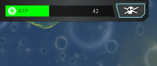
Another crappy 30 second example with the atp bar. Obviously this is really bad, but I feel like if the shapes were refined slightly, we could get a nice blend.
I love it, but can we try the t bone protein icon? I think that one is a little more obvious. The current one looks kinda like a red shoe
[quote=“Moopli, post:12, topic:207”][quote=“TheCreator, post:11, topic:207”]
Nike shoe
[/quote]
That would be a slab of meat.
[/quote]
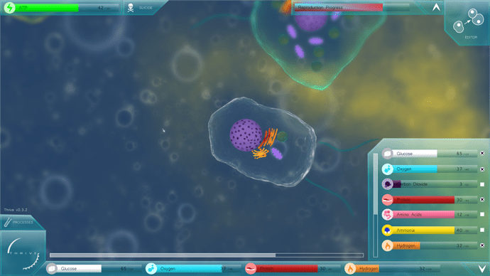
In Oliver’s mock ups, why are their two bars for certain compounds?
Scrollbar. It only appears when there are too many to show on a single screen.[quote=“TheCreator, post:68, topic:111”]
- The top left corner should feature an HP bar in addition to the ATP bar.
[/quote]
I thought the decision was to use ATP as a kind of health? Or did I miss something?[quote=“TheCreator, post:68, topic:111”]
2) I feel like the reproduction bar should always be on screen and the player shouldn’t be able to hide it. On the reproduction overhaul thread I believe we also decided that it should be one long bar rather than multiple smaller ones. Might be worth it to have it extended to fill the whole top row and have the ATP and Health be under it.
[/quote]
What would the single bar represent? I thought the player needed enough of several compounds to reproduce. I tried to combine them in a way that is closer to a single bar.[quote=“ThreeCubed, post:82, topic:111”]
The one thing I can say about the Metro and Shard difference is that Metro seems to sacrifice that unique feeling that the current shard based GUI has, making it more blocky (in my opinion) makes it fit into a more generic type. I understand that it is giving it massive amounts of usability but we should strike a usability to aesthetic ratio in order for it to work. While shards may currently be clunky and unusable thats because they are very big and very erratic, if they were more uniform spaced shards (with some inter lapping such as when buttons seem to press to each other (like//this)) with less jutting out spike areas then we could have form and function while not sacrificing the unique aesthetics.
[/quote]
This is exactly my opinion. I like that the GUI would be unique, but it sacrifices far too much in terms of usability as it is now. If there’s a way to use shards that doesn’t look tacky, is intuitive and can be made modular for panels and things, then I’m all for it.
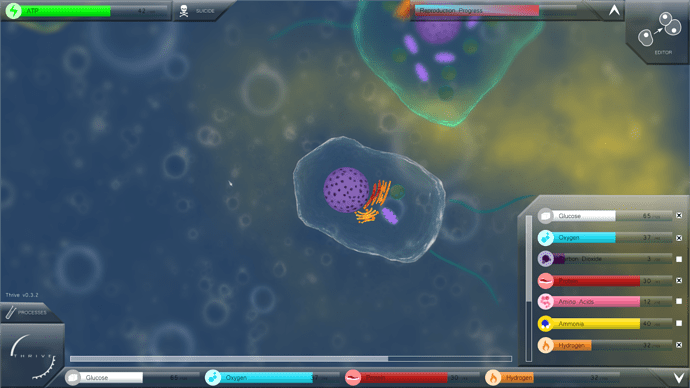
The box on the right can be pulled up to show all the compounds in a scrollable list. The player can then click on some to attach them to the scrollbar at the bottom of the screen to see at all times, and clicking them again will remove them. It’s so they can choose which ones they’d like to see at the current time, instead of having us do it for them which may not be applicable to all situations.
Ok, that sounds reasonable, thanks!
I kind of like the idea of instead of having a reproduction bar we have it represented on the split button. So, the line moves from left to right depending on how close you are to being able to be reduced and anything to the right is faded until you are able to reproduce and the button is completely coloured. Perhaps there should be a glowing outline on the button when it is ready, for emphasis.
I think this would look neater and fancier.
I had a go at making a compromise-type design and put effort into making everything look good to remove any pure visual bias, and I think it worked out pretty well.
Here it is with everything open on a mid-size screen:
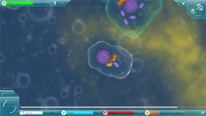
And with everything closed:
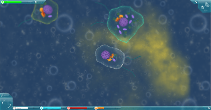
And on a 1920x1080 screen:
Also, an interesting thing I found: you’ll notice the edges of the gameplay screen are slightly blurred. I did that to define the GUI elements a little more and remove some messiness, but it actually helps give a feeling of smallness to the entire game in my opinion. Something to note for the future.
I really like the blur effect! I think it negates the concerns I voiced about transparency, and actually this design has really brought me to the hybrid shapes camp.
Oliver! This looks so good!! The blur is an excellent touch man this is great! Oh the screen is so clean and clear!!
A few things that are not all necessarily criticisms:
• Perhaps the logo should be moved slightly to the left, to center it better with that corner. Same with the down arrow next to the reproduce button.
• Will CO2 clouds be changed to purple as well? Or will that meter be eventually changed to dark blue. I’m okay with either.
• I thought the previous cursor was rather nice. I’m not a fan of the thin ones; they’re a little hard to see.
• For cases in which the compound bars do not exceed the length of the bottom panel (as seen in the mid-sized screen), the horizontal scroll bar should disappear.
• Hydrogen is invisble?
• Nike shoe.
• Perhaps the suicide icon could be changed to a popping icon or something?
But yeah these are just my personal things and questions. You did a fantastic job.
I really like this last design although I think I have a neater idea than a reproduction bar.
Oliver that looks great, exactly what I was imagining/thinking of! If it’s possible can you expirament a bit with other color shades? Such as a grey or gunmetal color?
I had to turn the transparency down to show the grey more, but it works too. I still prefer blue. In the blue design the disabled buttons would turn grey anyway.
Yeah, the centering with non-regular shapes is irritating (another argument against a pure shard design). These are just sketches anyway, once a new GUI is actually put in the game things like that will have a lot more attention.
Oops, my fault. I accidentally made CO2 purple based on one of @braguy.j’s icons.
That’s still the existing cursor, I forgot to add a new one.
Definitely, and you can see that with the bigger design.
No…? Well, in real life it is, but not in-game.
Nike shoe.
I’m not sure that screams DEATH quite so clearly as a skull and crossbones but it could be replaced.
[quote=“Oliveriver, post:94, topic:111”]
I still prefer blue. In the blue design the disabled buttons would turn grey anyway.
[/quote]Yeah the blue color works well with the design.
[quote=“Oliveriver, post:94, topic:111”]
No…? Well, in real life it is, but not in-game.
[/quote]So hydrogen will be in game as an orange compound cloud? Sweet 
One final thing that has nothing to do with you or the GUI really, but don’t you think the icons are a bit inconsistent? We have glucose, oxygen, protein, and hydrogen being represented by sugar cubes, air bubbles, meat, and fire respectively, but for the rest we just have their molecules.
See this thread: Iconography
Examining the colors and comparing it to the blue one I can say that the blue one is slightly better. Probably because it fits the area more and because gunmetal grey would fit something more in the future… Just speculation however, It looks great ![]()
In all due respect, both look great and better than what we have.
Oliver that looks fantastic, and I’d agree that blue looks better. Also although the blur effect is nice I recall that TheCreator said Ogre currently can’t handle blur effects. However can’t we just pre-blur the backgrounds the game uses (I know it’s not the same as the edge blur which you showcased, but blur nonetheless)?
EDIT: @Oliveriver I don’t think the version number should be on the game screen. It’s not information that is relevant to gameplay. Typically it appears in a corner in the main menu, and if wanted the pause menu as well.
I remember there was a protein icon that was fixed to not look like a shoe. I too like the blue theme more. We definitely did not decide to use ATP as a health measure. Health shows how well all of your organelles are working and how damaged you are in general, and works in conjunction with ATP. Check out the bottom half of this post.
I also really like the suggestion of using a hotkey for suicide and having suicide pop out only if you have a small amount of compounds.
Anyway, I think what you did looks great and very professional. Nice job.
