Currently, the tabs of the Thrive websites look like this:
I’m glad that we’re trying to make the tabs easier to identify, but the icons could use some work.
The tab icons for the Dev forum and the Revolutionary Games site are just opaque squares with the Thrive logo in them, with the “THRIVE” text barely visible. The icon for the RG site is the worst - at a glance, it’s basically a black square.
Should we do what we did with the game’s shortcut icon and use different (T) logos on transparent backgrounds? This may make them easier to identify at a glance.
I’ve made a couple things.
[details=Examples?]https://i.sli.mg/AAinmH.png


Plus some RG logos:


https://i.sli.mg/JZXcMH.png[/details]
Here are the icons on their own, in the same order as ‘Examples?’
[details=Icons]

 https://i.sli.mg/wtb7Y4.png[/details]
I think the icons for the Community forum and the Wiki (which just now updated for me) are perfectly fine. If the icons I made are little too boring, we could always use more pictures of concept art.
1 Like
I think in my opinion that the revolutionary games studio site should have the Chrysallis as its icon, if that is able to fit. Another suggestion was just the simple T shape for the tab but that’s generic.
I tried adding the crystals, but

Maybe just having the Revolutionary Games Lettering can work better in that regard then.
Hey! We have actual tab icons now! Awesome. I’ve been wanting to suggest them for a while.
I feel like a transparent background is better in all cases. Really like the new T and RG logo you did. The crystals are a tad too small, but they’re not terribly bad. For the disturbance and galaxy image, I’d suggest curving the corners (to make it look like, say, the amazon tab icon.
I’d say the transparent RG be used for the website, the transparent T for the wiki, and then development forums have the galaxy the fan forum the disturbance.
For reference, this is how you make spoilers here:
<details><summary>Spoiler Title</summary>Spoiler Contents</details>
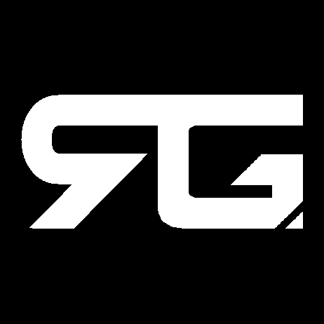
I think the T logo could work but the “arms” of your version look too blocky and don’t really fit the aesthetic of everything else. I realise that’s probably to make them bolder when the logo is small but I think the normal arms are visible enough too. I don’t think we’ve actually used the RG logo outside the shards one for years, so I vote shards for the main site.
Also I know I was the one to add the concept art for the Wiki and community forums, but I’m not sure it fits. I first tried using differently coloured versions of the logo, but maybe if I try again with colours that actually fit our general colour scheme it would work.
EDIT: I’ve updated them to be more coherent while still distinguishable. Transparent backgrounds are a bad idea because people have different browser styles (case in point, I have dark blue tabs, which makes a black icon with transparent background difficult to see).


