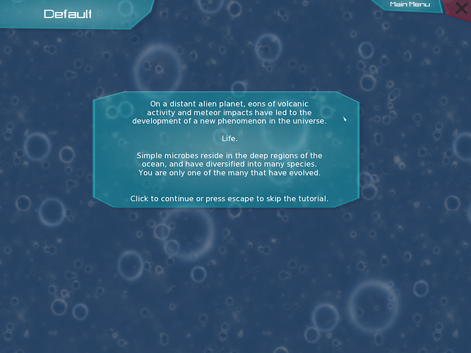
Tutorial

Thanks! I’ll try to use one of the non-Thrive fonts. As I mentioned on the slack channel, the compounds list actually uses the same font; it’s just easier to read because its only one word.

I’ll send you the dimensions when I have some time, do you want all of them, or just the ones that are stretching the most?

Probably all of them, but it might be a good idea use the same sized panels in multiple places so there are fewer overall.

Are you sure it’s worth it? I mean, we’ll probably be using a completely different GUI design in the next few releases.

Had this really great idea:

2 Likes

Awesome, some good use finally for the tooltips.

There’s something about the Thrive font that makes it unappealing to me when used in long sentences. For single words it looks good, though.

1 Like

Yeah, I tried, but I couldn’t change the font and color for tooltips :frowning:

In the Thrive looknfeel file, there’s a section where tooltips are defined. I presume changing the font there changes it for every tooltip.

@TheCreator

Could you give me a list of all the panel dimensions you need? If some are relatively close, it would be more convenient to change all of those that are similar to the same size.

Also did you ever get around to changing the font via the looknfeel file?

I’m currently using this font:

Here is a list of all the dimensions:

    ("{{0,500},{0,390}}", "Size")
    ("{{0,600},{0,260}}", "Size")
    ("{{0,600},{0,220}}", "Size")
    ("{{0,400},{0,80}}", "Size")
    ("{{0,500},{0,140}}", "Size")
    ("{{0,500},{0,100}}", "Size")
    ("{{0,600},{0,140}}", "Size")
    ("{{0,600},{0,140}}", "Size")
    ("{{0,600},{0,160}}", "Size")
    ("{{0,600},{0,80}}", "Size")
    ("{{0,600},{0,220}}", "Size")
    ("{{0,600},{0,100}}", "Size")

I just copied and pasted the lines, so as you can see, there is quite a bit of extra information.

Edit: Oh wait, did you mean change the font for the tooltips? I’ll do that right now.

Edit2: Okay, fixed the font.
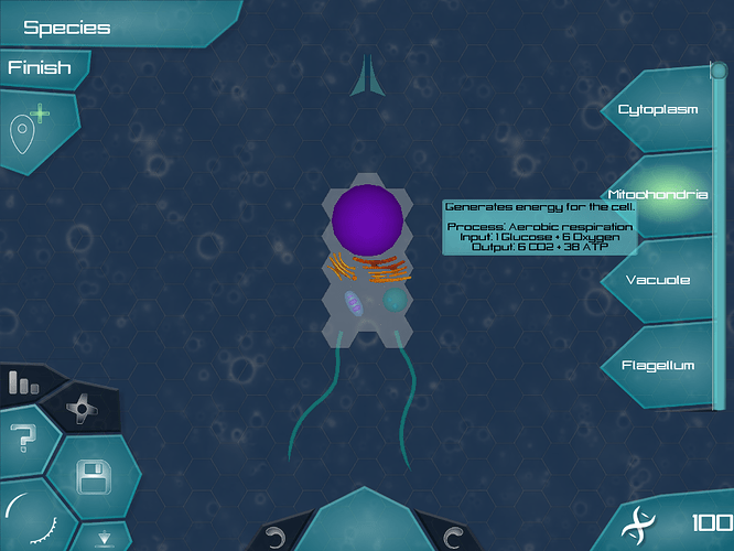
I might have to make the ThriveGeneric dimensions bigger to fit them all in, but I can otherwise easily add all those panels to the game files without stretching. I’ll edit this post when they’re done.

I’ve thought about this for a bit and come up with a simpler solution: one panel without borders. The shadow effect made getting the dimensions correct difficult, so I abandoned it and the borders completely and went with a simplified box which won’t ever look stretched.

Here’s the updated png, and I’ll send the imageset file via Slack. All you’ll need to do is change your layout file to say “GenericPanel” wherever it currently says “HelpPanel”.

Wait, did you get rid of the cut-off corners? It’s just a rectangle now.

Yeah, that’s the idea. Without the corners it doesn’t appear stretched when different dimensions are used.

I see. It should be done now.