I’ve seen, and agree with, some feedback that the auto-evo prediction is too difficult to use currently.
I think something that would help would be to expand on this already opened issue:
by updating the tooltips to show on each organelle the population change it causes. This way it’s faster to compare different organelles the player might want.
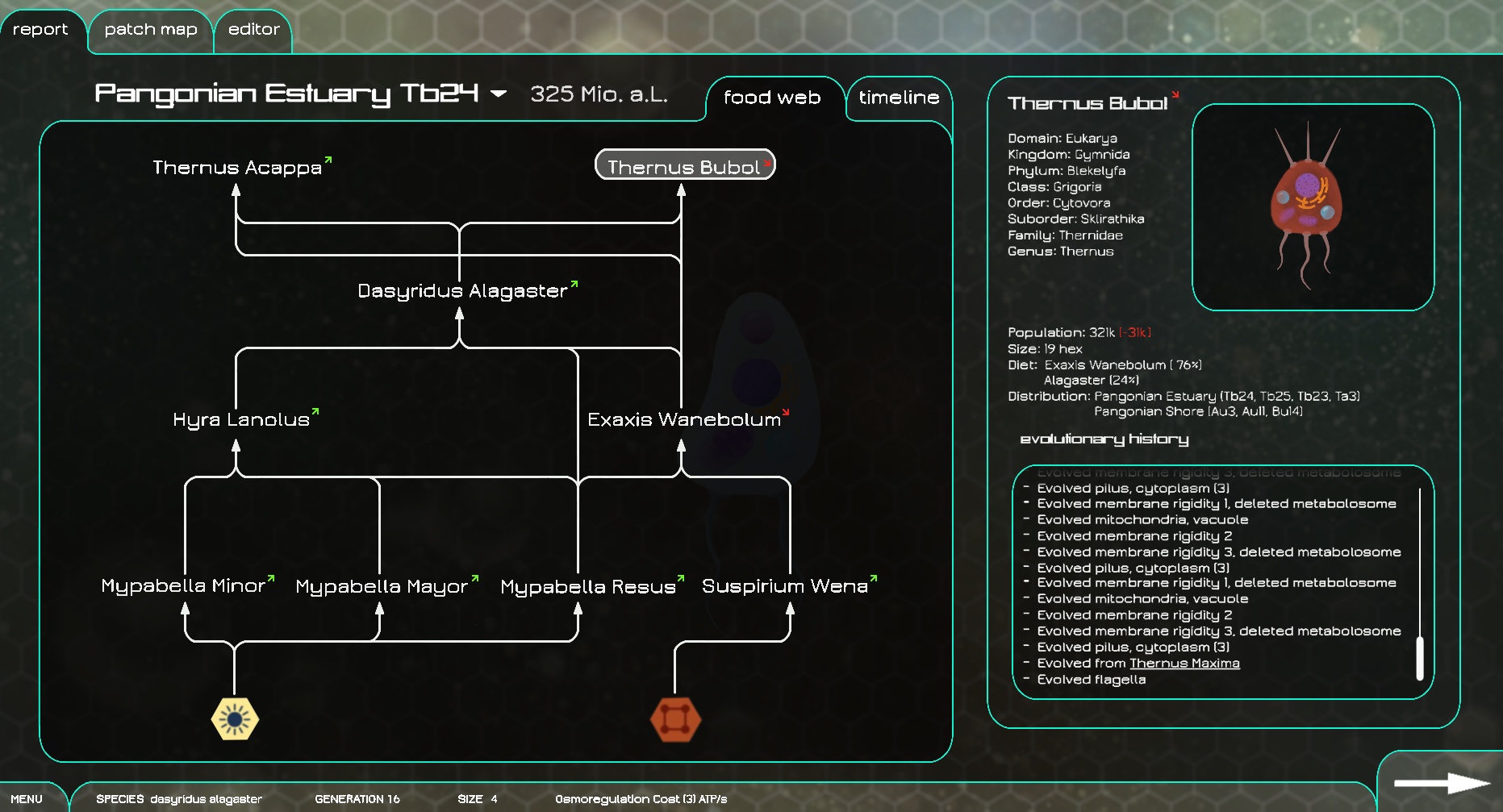
One more idea I have is that we add a “details” button to the auto-evo prediction and/or on the auto-evo results page which explains which food sources each species uses and how much the total competition is in a patch. Perhaps we even could have a graph showing the available energy amounts per type (when current species in that patch are taken into account).
Actually we have the “food chain” button on the report page that would be a pretty good place to show the species energy sources and which other species they eat.
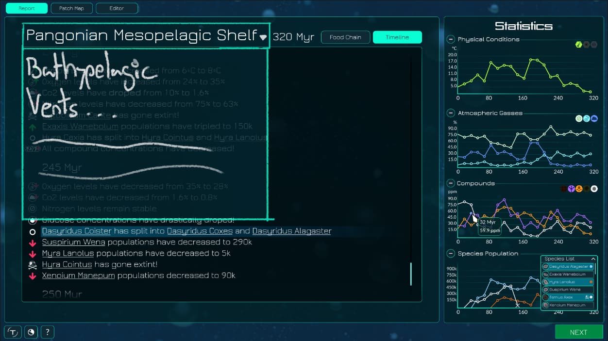
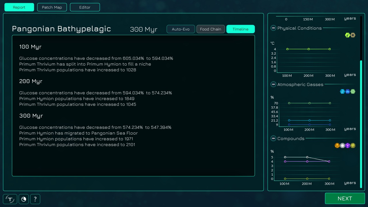
Also in general regarding the auto-evo, I think we should consider moving away from the text based description.
My idea regarding this is to basically have vertically scrolling list of boxes, where each box has a single species in it. The box would have the name, total population, and then icons to show which patches it is in, migrations, a big X could be over the box if it is extinct. There’s also be probably good place to put a picture of the microbe in the box, and perhaps a picture of the species before/after a mutation.
I think that way it would be much more visually interesting to see the report. Perhaps lines between boxes could also show prey/predator relationships, and the box could show the maybe top 3 food sources the species uses in auto-evo. I think with icons and small numbers (with tooltips explaining what the parts are) we can make a lot more useful information available in a digestible way to the player.
If people think this is a good idea, I could throw together a quick mockup in Godot showing how I would roughly make it.
I agree, the completely text-based auto-evo report could be complemented by a lot of graphic representation.
Currently the patch report has three sub-sections (auto-evo, food chain and timeline), although only one section is currently working. If I understand you correctly you‘d like to keep to only one screen instead of adding the missing sub-sections. This would be great, I only hope it won‘t end up looking confusing or overwhelming.
I could also try to make some mock-up designs of such a interface. It will probably have some similarities with my earliest concepts of the patch report, but it will be greatly updated as this concept is pretty old:
There‘s a bit of confusion about the timeline section I think. In my original concept art there were only two sections: Food chain and timeline. The current auto-evo section does the same as I originally imagined the timeline section would. @Kasterisk seems to have gone back to the original proposition in that regard.
In the light of Kasterisks timeline mockup I suppose what you were proposing earlier was to implement something along the lines of the food chain section, while keeping the timeline as a secondary section. If so that‘s great too and I‘ll work on an updated food chain concept!
(Or maybe you‘d like to give that new section another, more general name than food chain?)
That’s the wrong image. That’s the image showing the idea that on the report screen you can select a different patch to view there.
I guess it uses the timeline concept image as a base, but there’s a separate image about it.