With the continuing development of many distinctive features and mechanics in Thrive, we have become increasingly aware of the difficulty of properly informing our players about how each feature works. While the tutorial does an okay job, it cannot contain all the details without either becoming a massive essay, or railroading the player through many stages of tutorials at every turn. It is because of this that we have decided that implementation of the Thrivepedia should be done in the near future.
While many developers have had lots of ideas regarding the layout, content, and design of the feature, they have yet to be consolidated into a proper design. With that said, I have decided to try my best to bring all the ideas I have encountered together with my own concepts to form a concrete proposal for the Thrivepedia. If there is anything I have missed or you find disagreeable, please voice your opinions.
Layout:
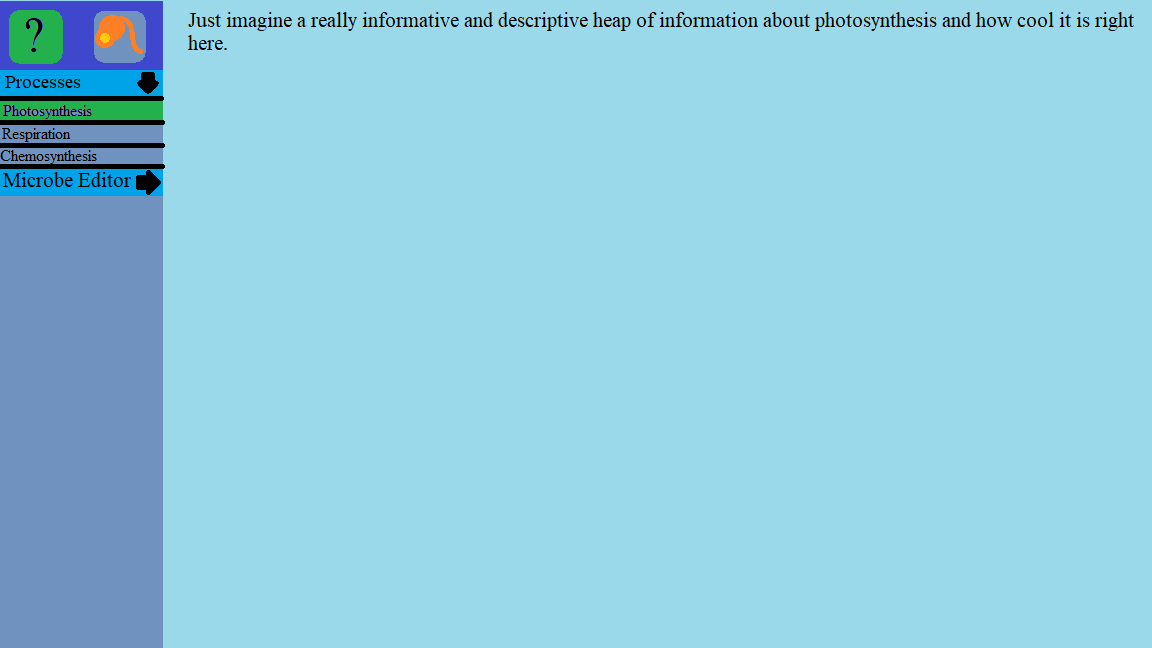
The standard layout of the Thrivepedia will feature a relatively simple design, with the window taking up the entire screen and pausing the game when opened. At the top left of this window will be a set of buttons used to navigate between different sets of information. These sets will be the “Bestiary”, and “Features”. These buttons will allow players to quickly navigate between the main types of information they would like to see.
Below this, the left side of the window will feature a navigation list featuring collapsible category tabs (when necessary) that when clicked will collapse or expand to reveal their associated navigation options.
Clicking any of the buttons contained within the expanded categories will display the contents to the player in the remaining window space, the organization of which will be discussed later.
Alongside the primary Thrivepedia button which will allow players to open it at any time, there will be additional methods of reaching the feature. By clicking special buttons depicting question marks (Could be located beside complex features such as the MP bar and balance bar) the player will be brought straight to the associated Thrivepedia page. It may also be worth considering a method of allowing players to “inspect” species ingame which would bring them to the species’ entry in the pedia.
Content:
The contents of the thrivepedia are divided into two major sections (Unless we think of more) that pertain to information the player may be interested in, and which cannot be easily conveyed in a nonintrusive way in regular play.
Feature/Mechanic Information:
This is information regarding the many features of Thrive in fine detail. The purpose of this section is to provide additional indepth information to players that the tutorials and tooltips cannot quickly convey. Content can include categories such as cellular processes, UI, resources, and even less obvious things like autoevo. This section will also include information on how certain features work or are theorized to work in reality when applicable.
Information provided in this section will mostly be text based with occasional images if necessary. The general layout of information should be provided as follows within each page when possible:
- Summary of function and when it is best used.
- Explanation and strategy guide providing tips on how to succeed using the feature.
- Important information regarding how the function works in reality or theory (Where applicable).
Bestiary:
The bestiary will be a section dedicated to allowing players to view indepth information that the generational report cannot easily provide on species they have encountered within the game.
Unlike the feature section, content in the pages of this section will mostly be dominated by visual references for the creature. Information such as the creature’s processes, health/speed/mass, population, generations survived, list of relatives, and behavior will be listed in a window located on the right side. (Much like the stats window in the cell editor.) Players will also be able to rename species from this window to a name of their choosing (Perhaps in later stages), and perhaps tag them so they are easier to identify in-game.
It is possible that the bestiary may benefit from a sort of visual card view for easier navigation, instead of the listed compendium featured by the features section. The left-located navigator should still remain though, for quick sorting.
I hope that this concept is easy to understand. Hopefully once I figure out inkscape I will be able to provide more substantial concept imagery (Because of course it is the software and definitely not the limited talent of the user).
