The Thriveopedia

Fossilisation requires a barebones implementation of the Thriveopedia (or Thrive Content Library or whatever), so it’s about time we figure out how this thing should work.

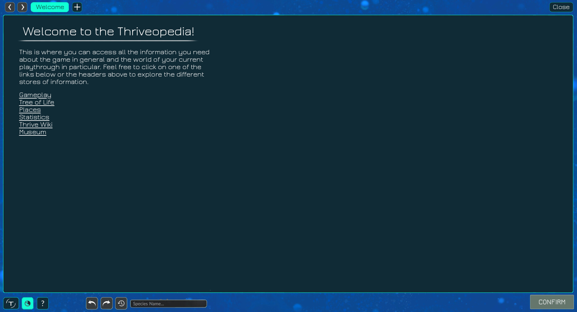
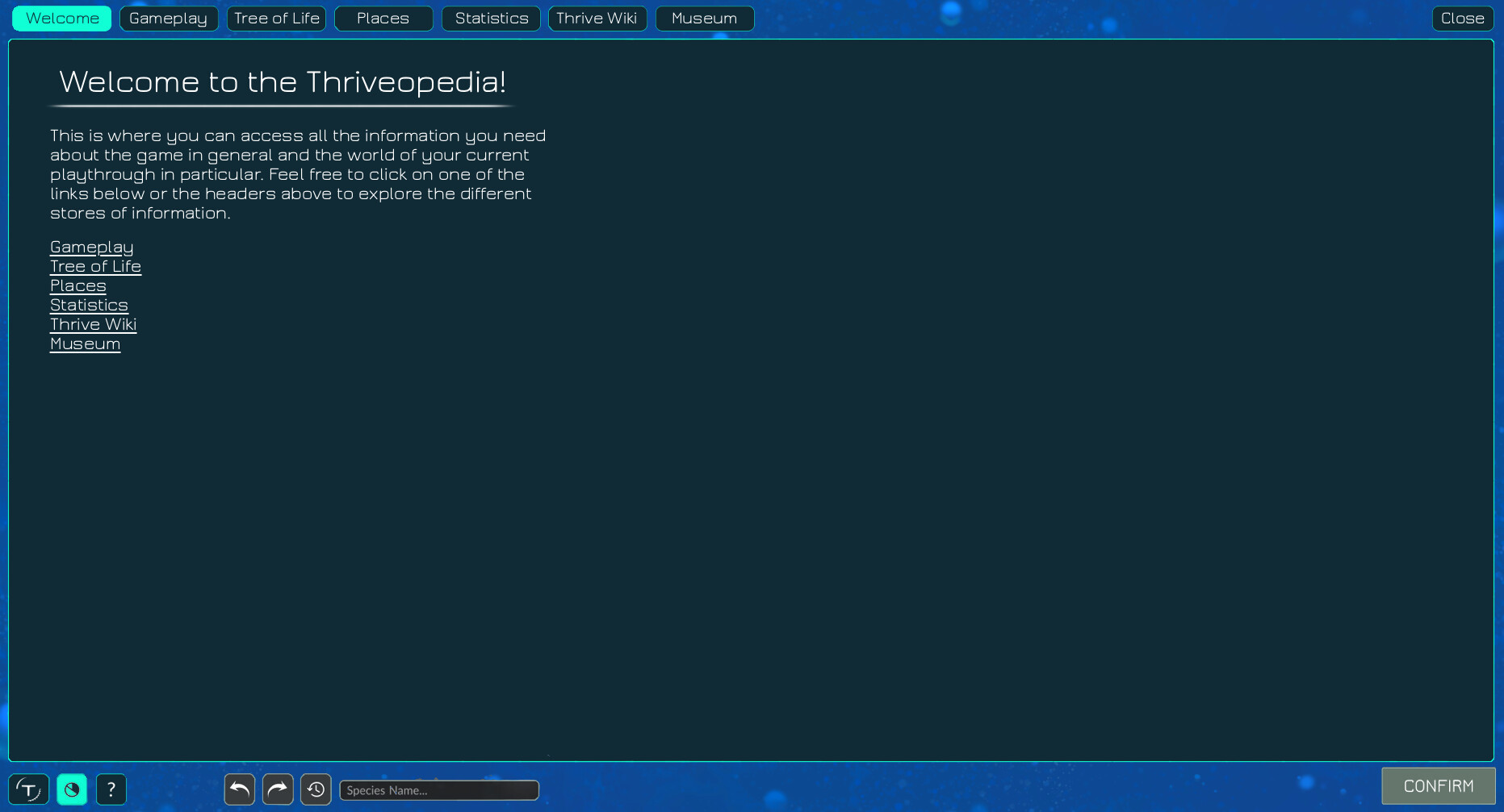
The Thriveopedia is, as far as I can tell, a bit like Cilvilization’s Civilopedia and Spore’s Sporepedia thrown into one. It’s a store of general game information and saved content for players to browse at their leisure.

I think we should think a little (but not too much) about the name. Thrivepedia was explicitly rejected back on the old forum. They preferred Thrive Content Library, but that refers only to the user-uploaded content. Given the fossilisation theme for saved organisms, I’ll quite stubbornly defend ‘Museum’ as the name for that section.

The name for the whole thing though is up for debate. I don’t have any good suggestions yet, but I’ll keep thinking. I just know I’m not that keen on Thriveopedia.

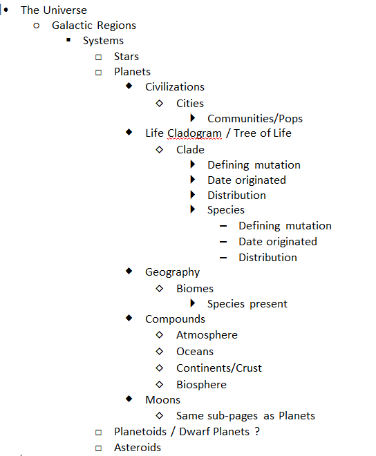
As for what’s in it, here’s a list of things I’ve thought of or remember being mentioned:

  • Museum
  • Museum content from other players, loaded from a server
  • Gameplay guides and help
  • Scientific background for game concepts
  • Statistics and world settings for the current game (including the evolutionary tree, as recently pointed out here)
  • Info on Thrive as a project (where to get it, how to help, history, etc.)
  • Art gallery (moved here instead of as its own thing)
  • Links to all online Thrive content
  • Pages from the wiki

Please add other suggestions below if you have them. We need a central list of these somewhere to make sure nothing is forgotten.

One thing that strikes me immediately is the distinction between what I’ll call game-specific and game-independent sections. Game-specific sections are those containing details relevant to the current game in progress, and as such would only be available in the game itself (i.e. not from the main menu). Game-specific sections include world settings and statistics. Game-independent sections are static and could be viewed anywhere, and include pretty much everything else.

Now, I think it would be more consistent if we moved game-specific content out of the Thriveopedia and into a separate tool only accessible in-game. That way, the Thriveopedia would be the same wherever you view it, and it would line up better with the expected behaviour based on the Civilopedia and Sporepedia. I believe @hhyyrylainen disagrees, so opinions here are welcome.

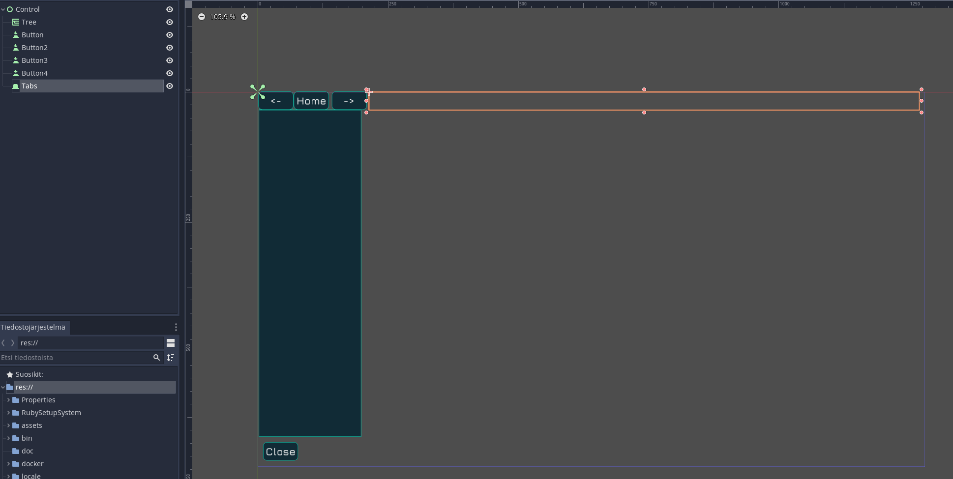
In terms of what we need in-game soon, I think it’s just a skeleton main page linking to the museum and the evolutionary tree (if game-specific content is kept in), which I can add as part of my fossilisation PR. Anything else is in my opinion overkill for the time being, unless someone really wants to implement other parts.

3 Likes

Wow, reading that link sent me down a brief rabbit hole of remembering what the game and project was like back then. Crazy to think how much has changed and yet the same game is now becoming a reality.

But anyways, I’m surprised that they all agreed on TCL, I feel like it’s a bit of a boring name. I think Thrivepedia or Thriveopedia is much more intuitive (like Civilopedia, Sporeopedia, Wookiepedia, Wikipedia, etc.)

I think HH’s suggestion of having the Thriveopedia contain both in-game information and game mechanic information is the best outcome, I don’t think it would make sense to have two separate tools. Plus it would allow easy navigation and cross-linking between the two. For example you might pull up the page of the species Maximus Rex, and it’s described as a “Carnivore” in its auto-generated description. You then click on the hyperlink of “Carnivore” and it takes you to the Thriveopedia page on Carnivores, explaining how they’re defined in-game and how they’re defined in real life.

We could label the two divisions of the Thriveopedia as “The Universe” for in-universe content, and “The Game” for game related content.

A while back we had a discussion on how to organize the contents of the “The Universe” section of the Thriveopedia. The idea was brought up that the player may not just want to be able to refer to fossilized species, but also to discovered star systems, planets, civilizations, biomes, compounds, etc. This was the page structure suggested at the time:

But as you said this would not be viable for the initial implementation. I think what you suggested as the initial implementation sounds good.

1 Like

There’s already a thread discussing this previously by @Buckly, Informing Players and the Thrivepedia, thought it might be useful linking it here.

1 Like

On these forums though I think Thriveopedia got basically the victory by concession as nothing else really describes the overall thing as it has current game world info but also general info, and if also included things, as you suggest, loaded from other playthroughs or even online, it’s even more of a general collection of stuff.

Unless we mention the name somewhere in the Thriveopedia (perhaps a welcome page) players won’t actually know what it’s called and might just refer to it as the ingame wiki or something.

I still think it should be accessible from the main menu at least. Also it would require gameplay code refactoring to be able to switch between the art gallery music and stage specific gameplay music.

I think that is a pretty comprehensive list. I’ll just add that each game mechanic, organelle and process should have its own dedicated page.

We’ll also obviously need a search function for players to find what they need quickly.

And also we’d want some kind of hotkey or something to open the wiki page for whatever the cursor is hovering over.

I do disagree. I think it’s much better to design one view as a one stop shop for everything. If we make the Thriveopedia available from the main menu, then we should just gray out the sections that relate to current game.

One big thing is that if the player can view current world info in the Thriveopedia it is much more likely they open it and will eventually subconsciously realize that there are help topic pages in there which they might read.

:+1:

This remind me, we need 3 overall navigation buttons for going back to the previous page and going forward in history (like a web browser) and a home button (though this is probably optional). But the home page could have quick links to some of the most interesting things and have an overall introduction to what the player is looking at.

I think overall we should plan for some kind of tree structure, though I’d like to reduce the top level nesting as much as possible, so I think top level items should maybe be something like:

  • Welcome
  • Gameplay
  • Tree of Life
  • Places
  • Statistics
  • Thrive Wiki
  • Museum

And all the subtrees should be collapsed by default so that the first glance at the Thriveopedia navigation bar would give an overall impression of all the things that are available there.

1 Like

Huh, I guess I missed that by searching ‘Thriveopedia’ instead of ‘Thrivepedia’. We need consistency there, so which should it be?

I would say Thriveopedia rolls off the tongue better.

3 Likes

Agreed, I think I like it better.

I was trying to mock this up in Godot but it looks like the tree and tabs containers can only be set through code so I couldn’t get more than this:


(the middle bit I left blank would obviously contain the text, images and other content for the selected thriveopedia entry)

I think there’s two possible ways to use the tabs at the top, either they are the top level items for quick swapping (in which case the left tree view would depend on the active tab), or we could actually make this like a tabbed browser kind of thing, so the player could have like 3 info tabs open and switch between them quickly. I got this idea when I noticed that Godot seems to have an option to show a close button on the tabs container.

2 Likes

I think that would be the most flexible and intuitive approach imo.

1 Like

So I made some quick mockups of possible Thriveopedia layouts which correspond to possible systems of functionality.

Option A: Very browser-like as proposed by hhyyrylainen


One upside of this is that the welcome page is functionally better integrated. Clicking one one of its links would either turn that welcome page into whatever page was chosen or it would open another page in addition to the welcome page.
A downside of this approach would be that it wouldn‘t be very clear how this would relate to hyperlinks which aren‘t within the Thriveopedia itself. The way I understand it each species name in the patch report will be a hyperlink leading to the species corresponding Thriveopedia page. Would these pages remain open in the background even if you closed the Thriveopdedia? This could lead to multiple tabs of the same kind being open at the same time which could be confusing.
What would happen if you accessed the Thriveopedia through a link from outside of it and then clicked „previous page“? Would this close the Thriveopedia? This could also potentially be confusing.

Option B: More static page types


This approach wouldn‘t allow multiple pages of the same type to be open at the same time. Form example clicking on the „carnivore“ link on a species page would send you over to the „gameplay“ tab and open the „carnivore“ page. Clicking the „herbivore“ link on another species page would send you to the „gameplay“ tab again and override the „carnivore“ page with the „herbivore“ page.
I‘ve drawn this version without „previous page“ and „next page“ buttons, but they could also be implemented in this approach. But they would only ever work inside the same tab type. So in our example, clicking „previous page“ would send you from the herbivore page to the carnivore page (within the gameplay tab) instead of sending you to the species tab where you were immediately before.

Maybe I‘m overthinking this… I just wanted to lay out some visual suggestions^^

You didn’t include the tree of topics on the left side in your mockups.

I mean optimally yes. I was thinking that even over game restarts the open tabs could be remembered.

I think we should take a page from Jetbrain’s book by having a tab limit which works so that when a new tab is opened and the limit is reached, the least recently open tab is automatically closed. That way manual tab closing is not required.

Not really. I think the tab names should be clear enough for what they are. And also this would allow the player to for example open a tab for their own species and another species and quickly swap between them to compare.

It should literally go to the previous page in the Thriveopedia. This is why I added the explicit back / exit button in my mockup. The back and forward navigation buttons would only be for the Thriveopedia and not the entire game GUI system as a whole.

I think you are a bit overthinking it… The browser tabbed interface is very widely used by basically everyone and I think if we lean on that familiar UI we can make something that immediately makes sense to basically everyone.

3 Likes

Damn, you‘re right! I didn‘t understand what that narrow „window“ you created was for, but now I do. I‘ll make sure to include it in my next mock-up.

Thanks for all the other responses. They alleviate all my concerns about the possibility of confusing the player.

Totally agree. Thats also the reason I put the „close“ button on the top right, as that‘s where it always is in all browsers I know.

Yeah, sadly it looks like it’s not possible to fill up a tree view in the Godot editor, need to use code for that.

That’s the kind of thing that the tree view would show.

Usually in our subviews the close is in the bottom left, so I followed that convention. That way we can also squeeze in one extra tab on the top row.

1 Like

Alright, I‘ll try to put it down there in my next mock-up. One concern I have about this is that it may clash with the other UI elements which will remain on the screen (presumably?) such as the main menu button, pause button etc. I wouldn‘t want to make a second gap there soley for the close button, and on the top there already is a gap for the tabs etc. But I‘ll try to find a way to bring it all together!

I think the Thriveopedia is such a big and important thing that it should take up the entire screen whenever it is opened.

Though I guess an additional feature to open it up in a popup window would be pretty handy.

I agree that it should take over virtually the whole screen, as indicated in my mock-ups. But note that while the Sporeopedia does the same in Spore, the GUI elements at the very bottom stay the same wether you‘re in the Sporeopedia, in environemtal gameplay or in the editor.

I think this is a very smart choice as it makes it so opening the Sporeopedia doesn‘t feel like it‘s taking you ‚out‘ of gameplay. It‘s essentially part of the smae whole experience as gameplay, it’s just an informative overlay.
It‘s for the same reason that you still see a bit of the editor background at the top and at the bottom when you‘re in the patch report.

That’s different. We are trying to put the Thriveopedia in our pause menu. Also designing the Thriveopedia to fit the overall GUI of 8 stages is going to be a nightmare and heavily constrict the designs that can be used elsewhere.

I see… I always assumed that we‘d want to have it be accessible with one click from gameplay. But the thing about the 8 stages is a very compelling argument.

Could we make it accessible via a keyboard buttton in that case? That would totally make up for having it accessible via an on-screen button.

If this is done:

that would be possible.

1 Like

Given that this PR adds a GitHub button among all the social links, we’ll end up with duplicate links to GitHub on the main menu. I think it therefore makes sense to replace the ‘View Source Code’ button with a ‘Thriveopedia’ button, making it more prominent than if it were contained in a sub-menu. Please let me know if there are objections.

1 Like